In-Between
Motion Graphic | Morning Giants Studio
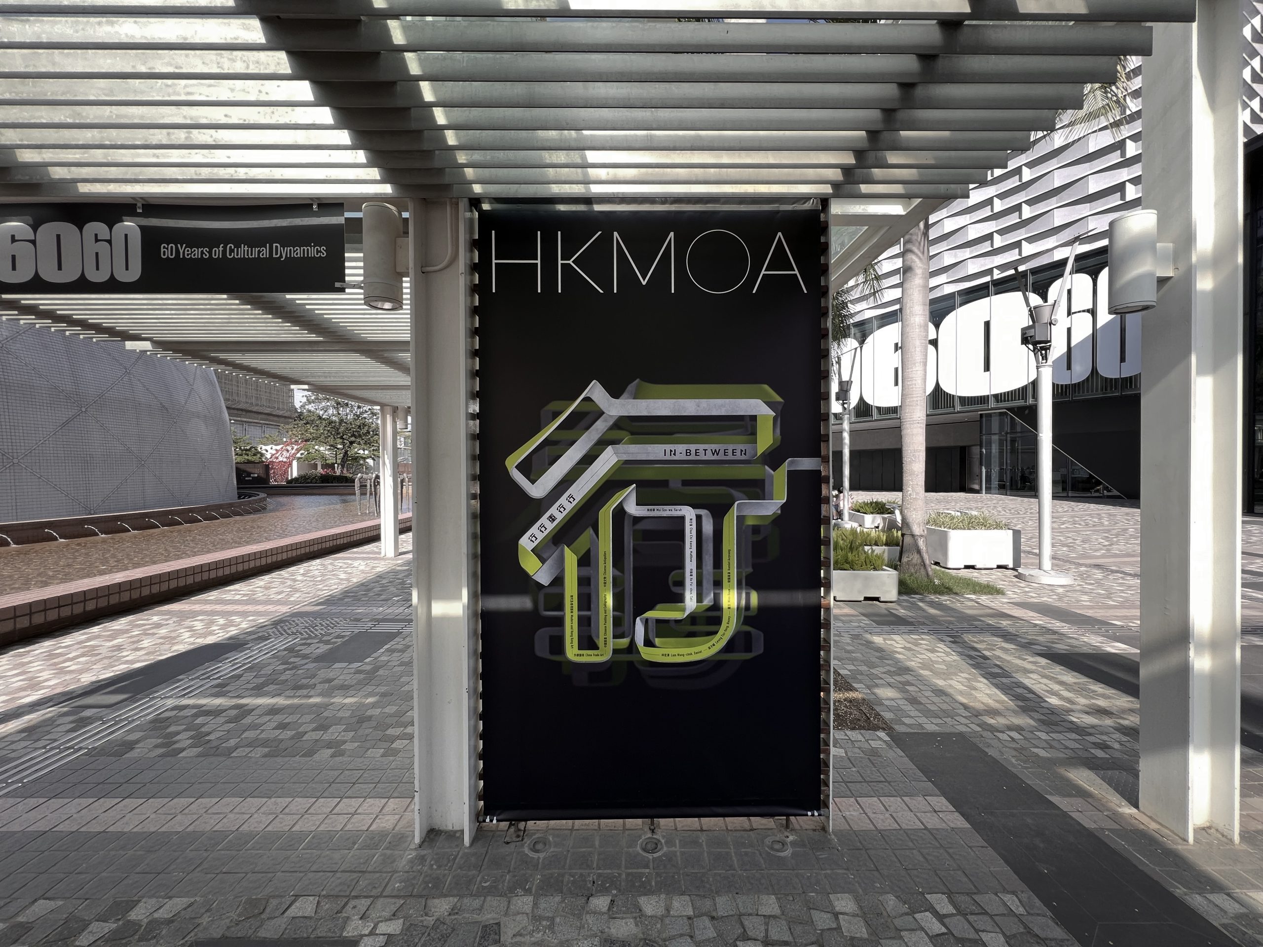
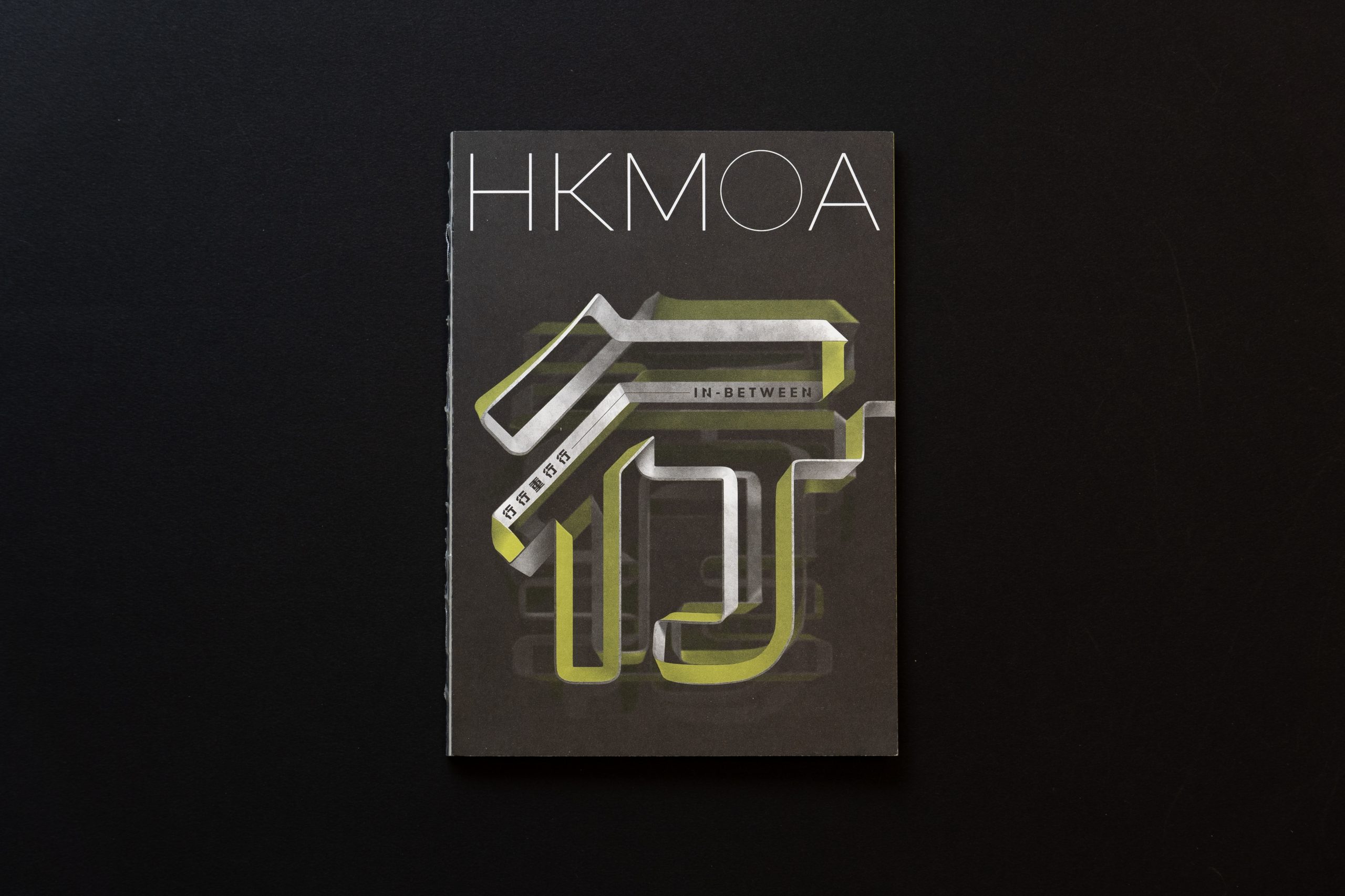
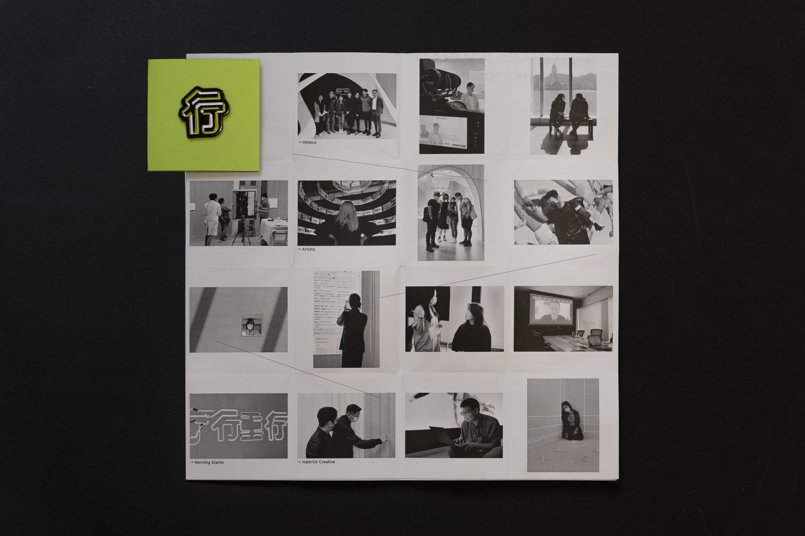
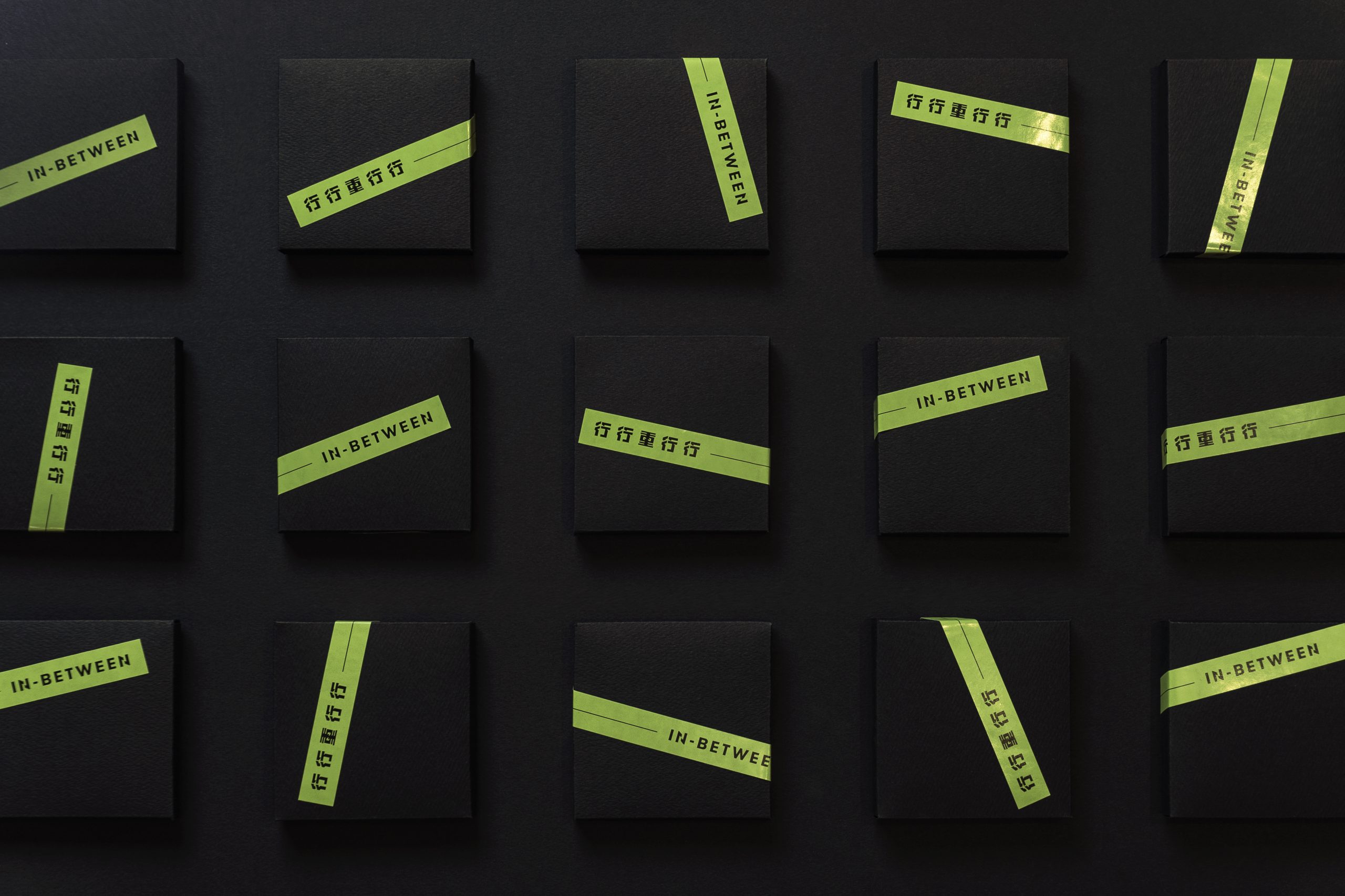
“In-Between,” a celebratory thematic exhibition marking the Hong Kong Museum of Art’s 60th anniversary, used “road” as its core visual concept, dynamically illustrating the exhibition’s Chinese title and theme in a three-dimensional space. The exhibition’s visual identity was seamlessly integrated into both the curatorial direction and the spatial design.
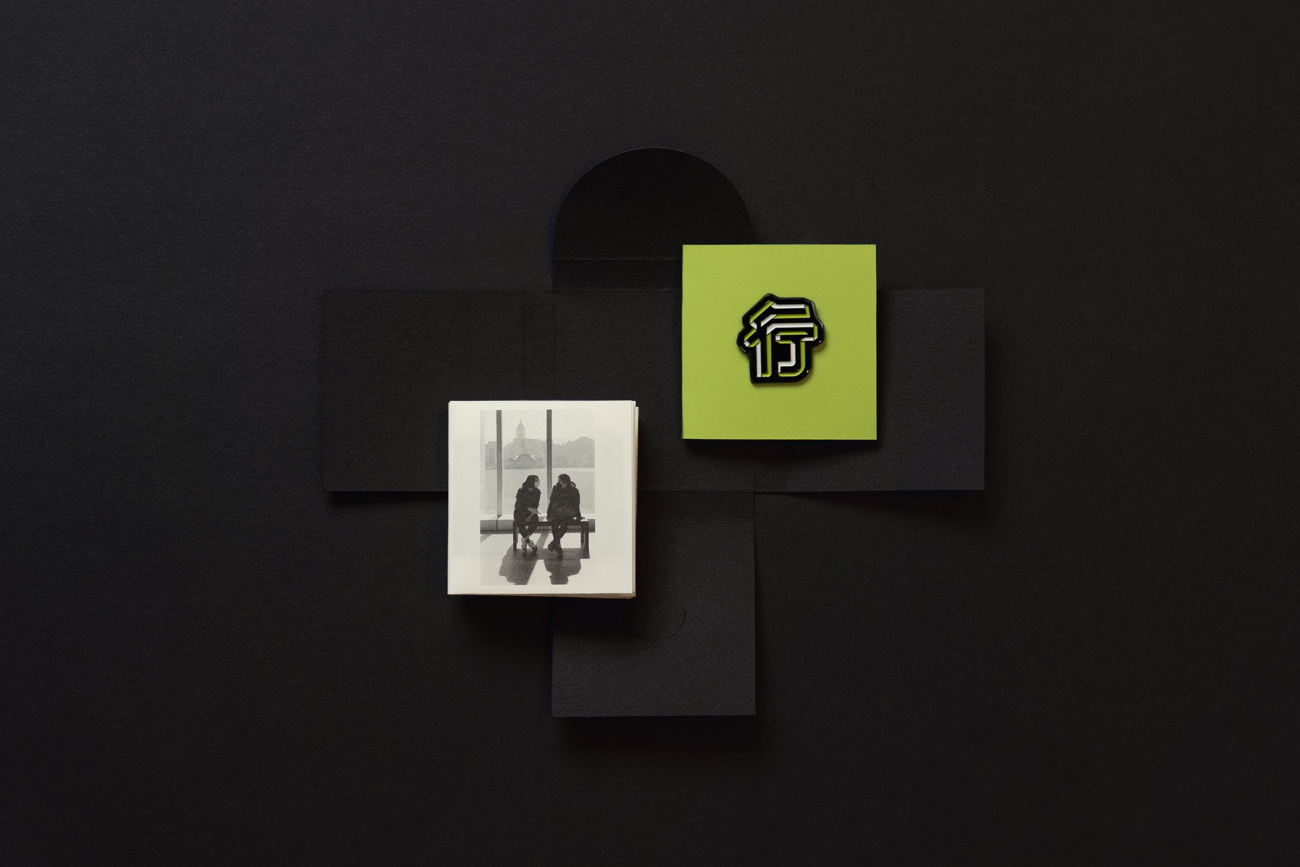
The overlapping continuous Chinese typography “行行重行行” embodies the exhibition’s core concept of “Art is Practice”, mirroring every artist’s journey and inner world. The typography itself serves as a visual pathway, guiding visitors through the exhibition and into the artist’s perspective.
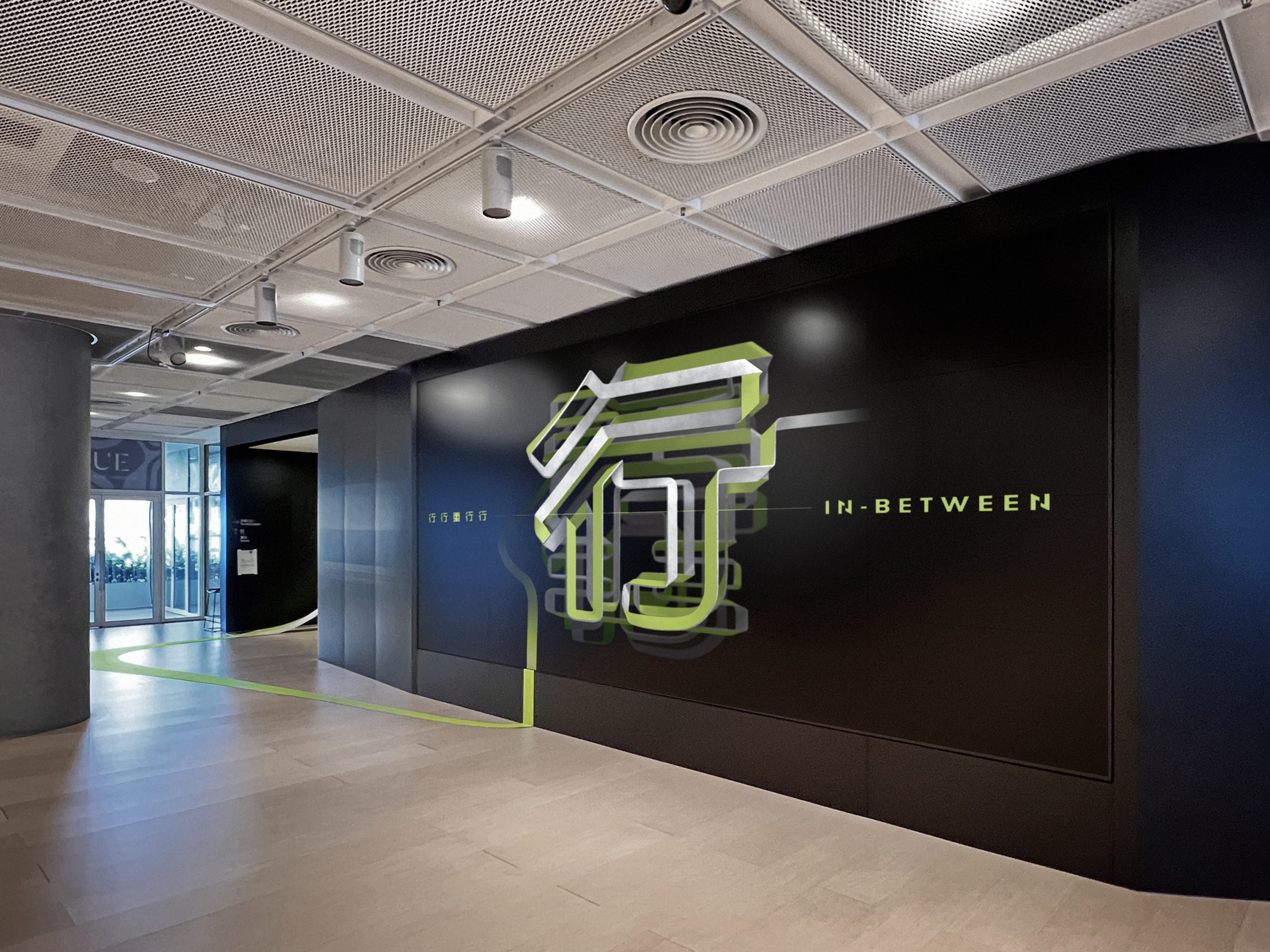
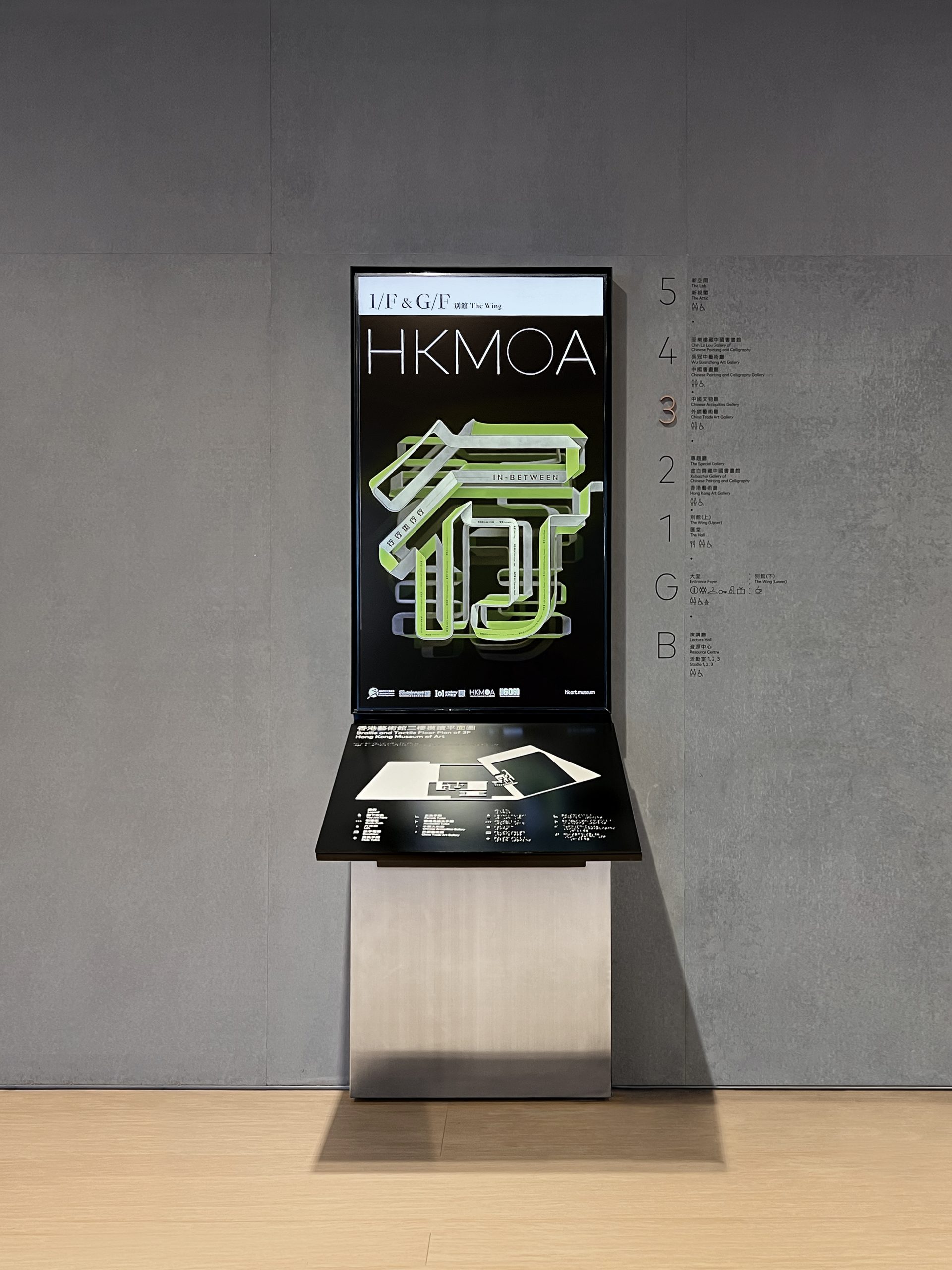
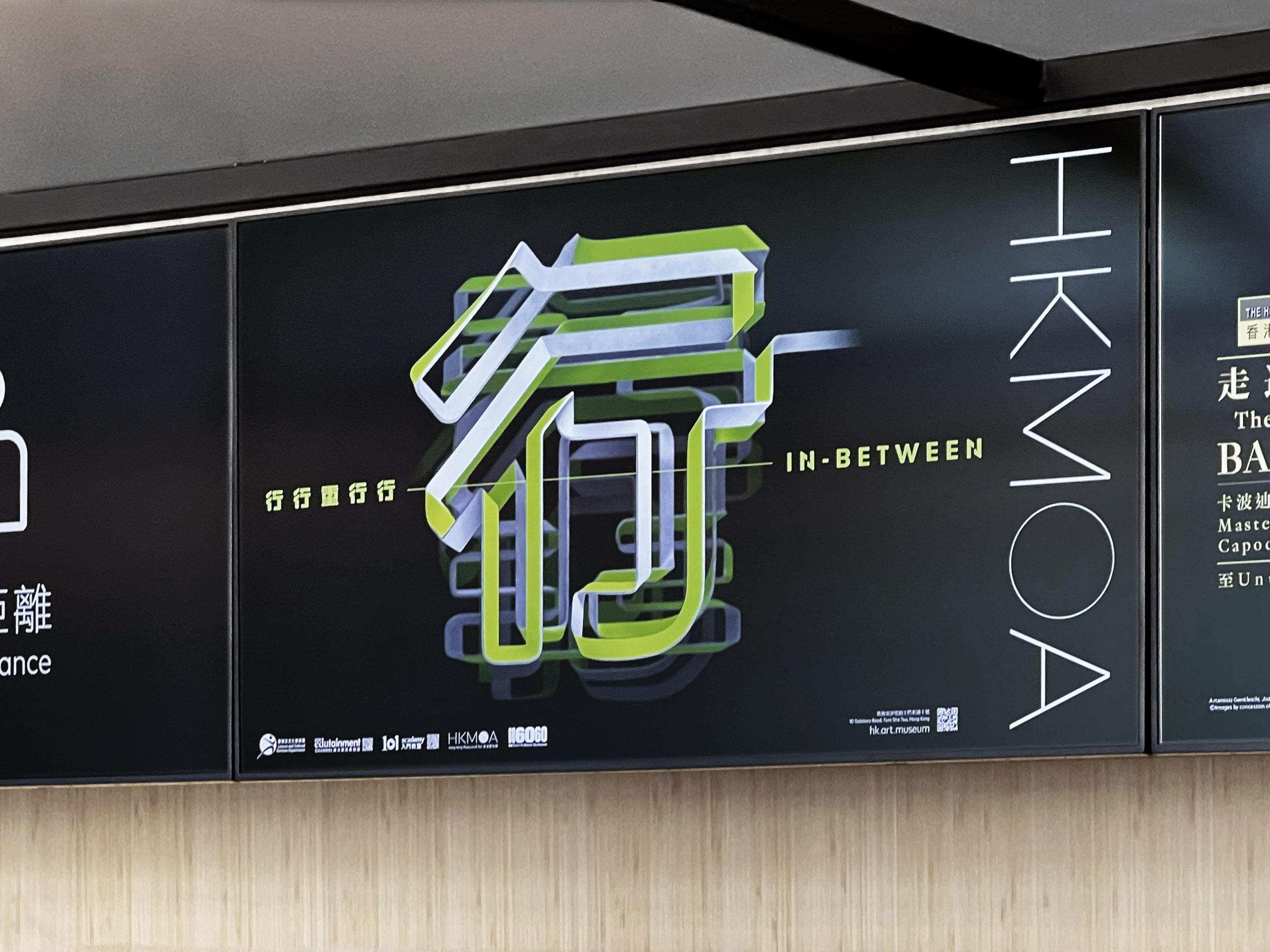
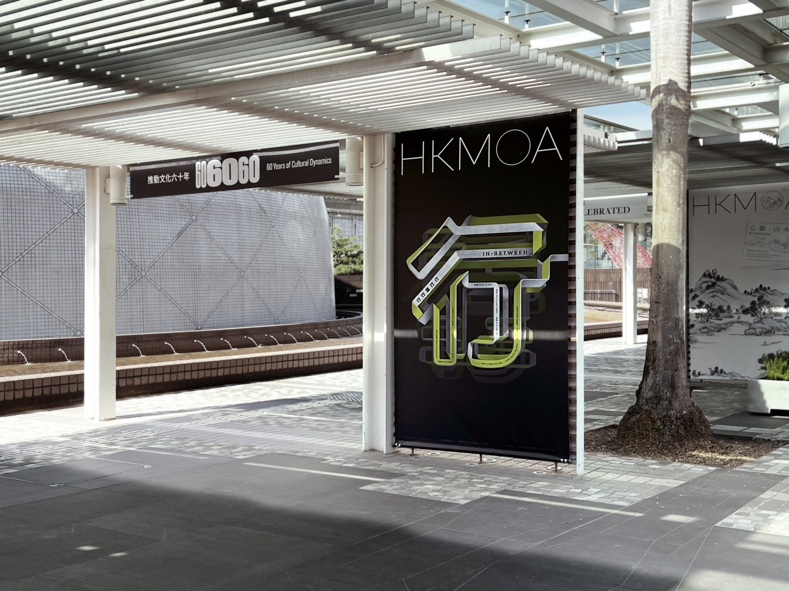
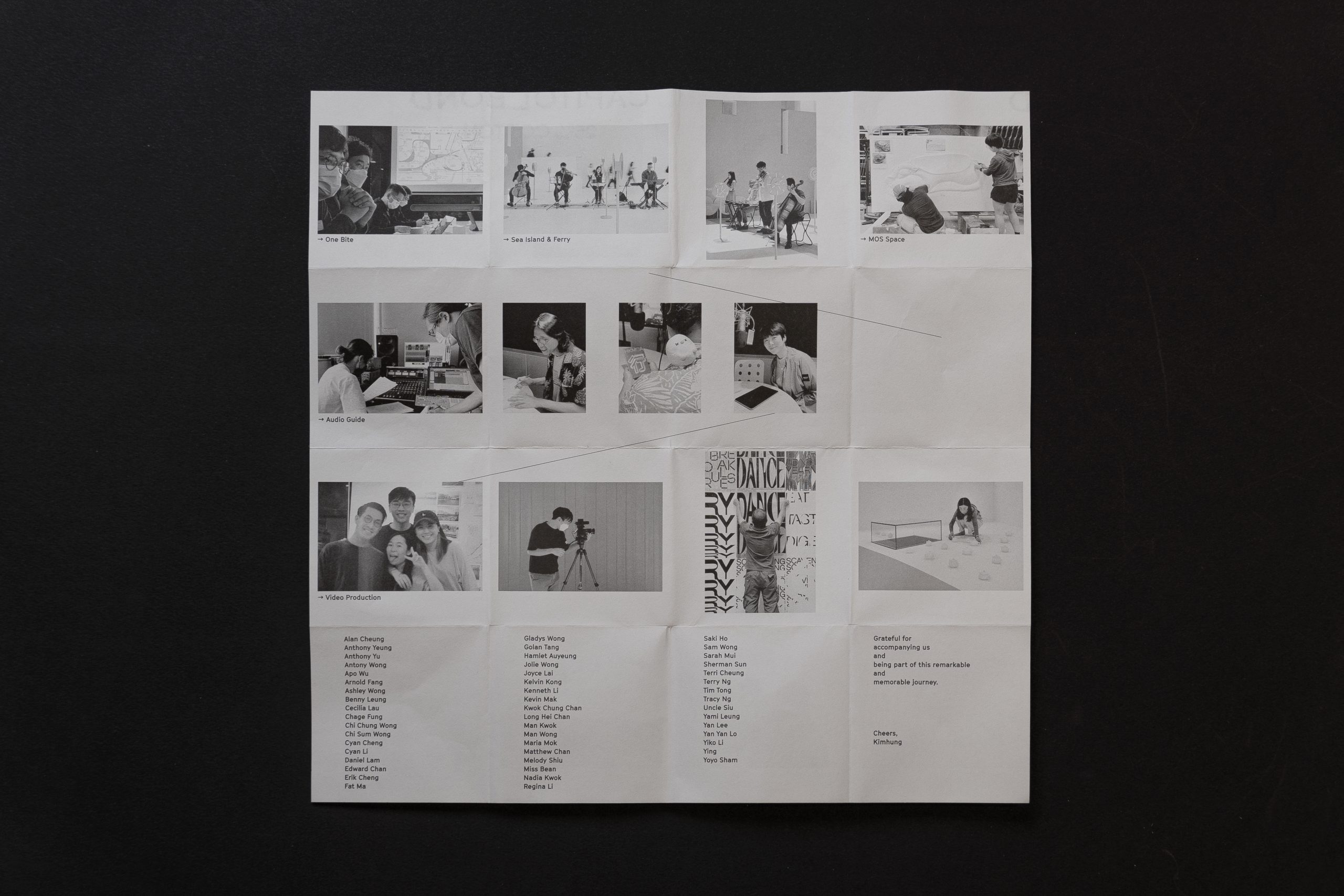
The visual identity for “In-Between” extended from printed publications to motion graphics and the exhibition space design, creating a cohesive and impactful experience, unified by a consistent color palette that reinforces the exhibition’s themes.


rchitect")

