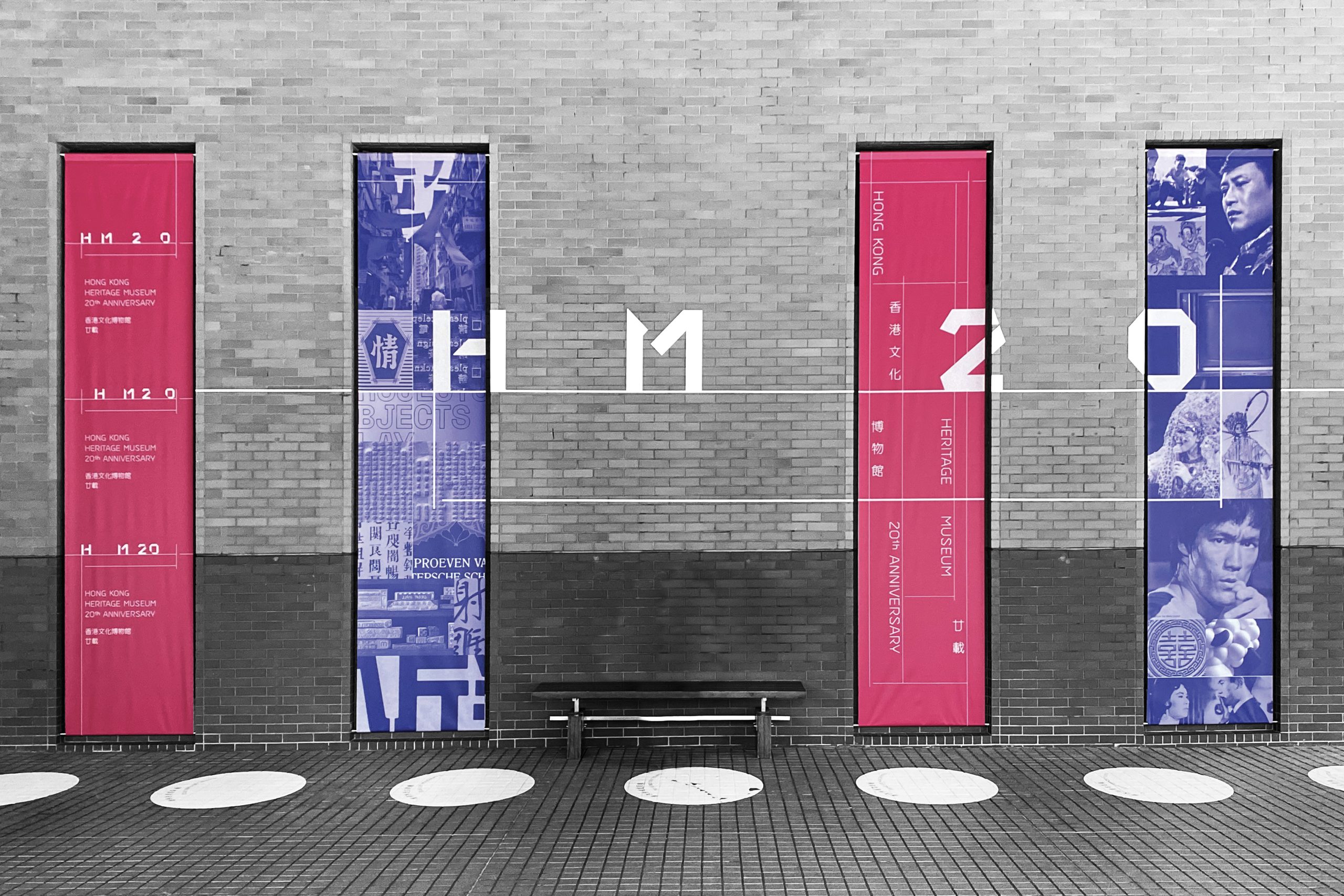
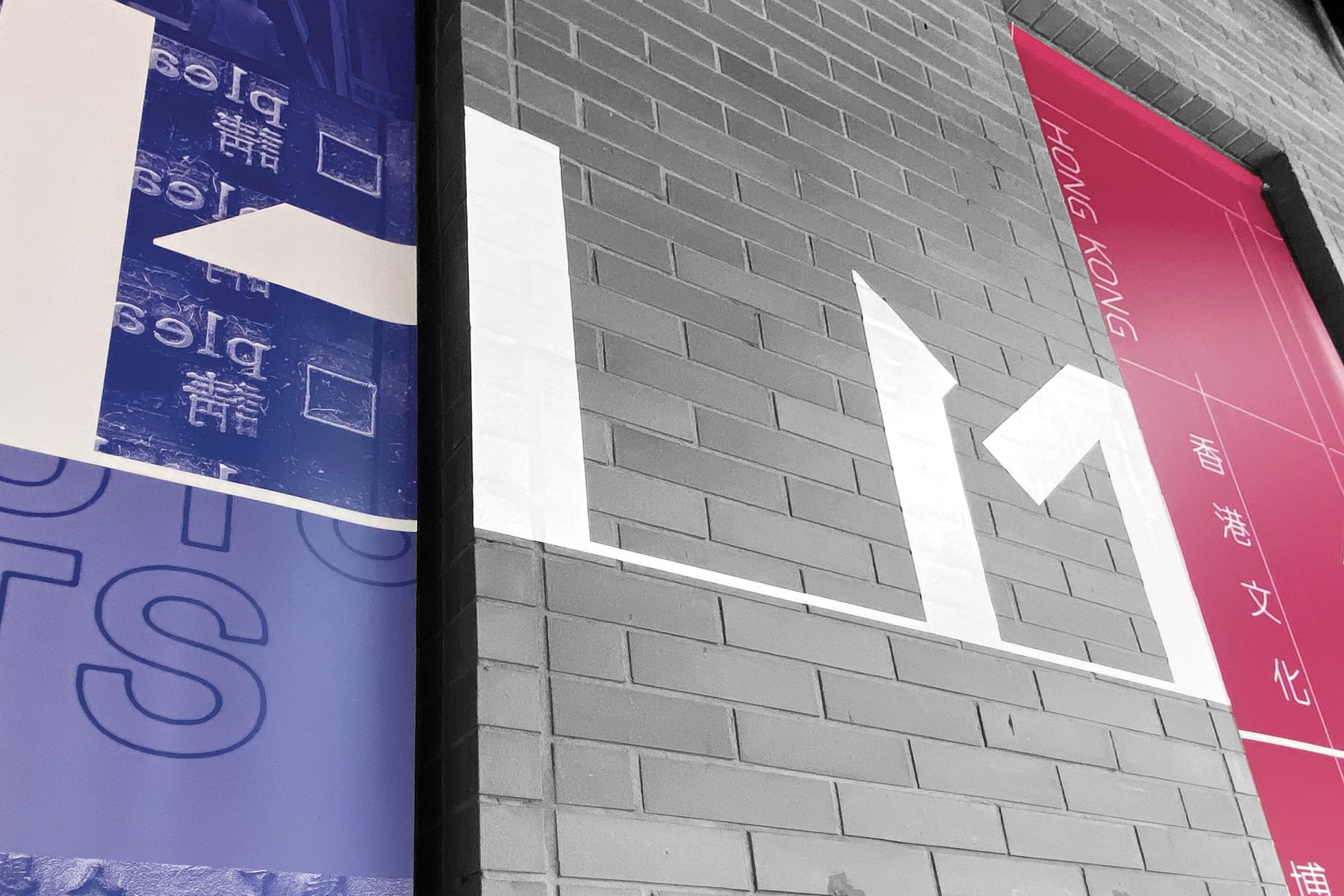
HM20
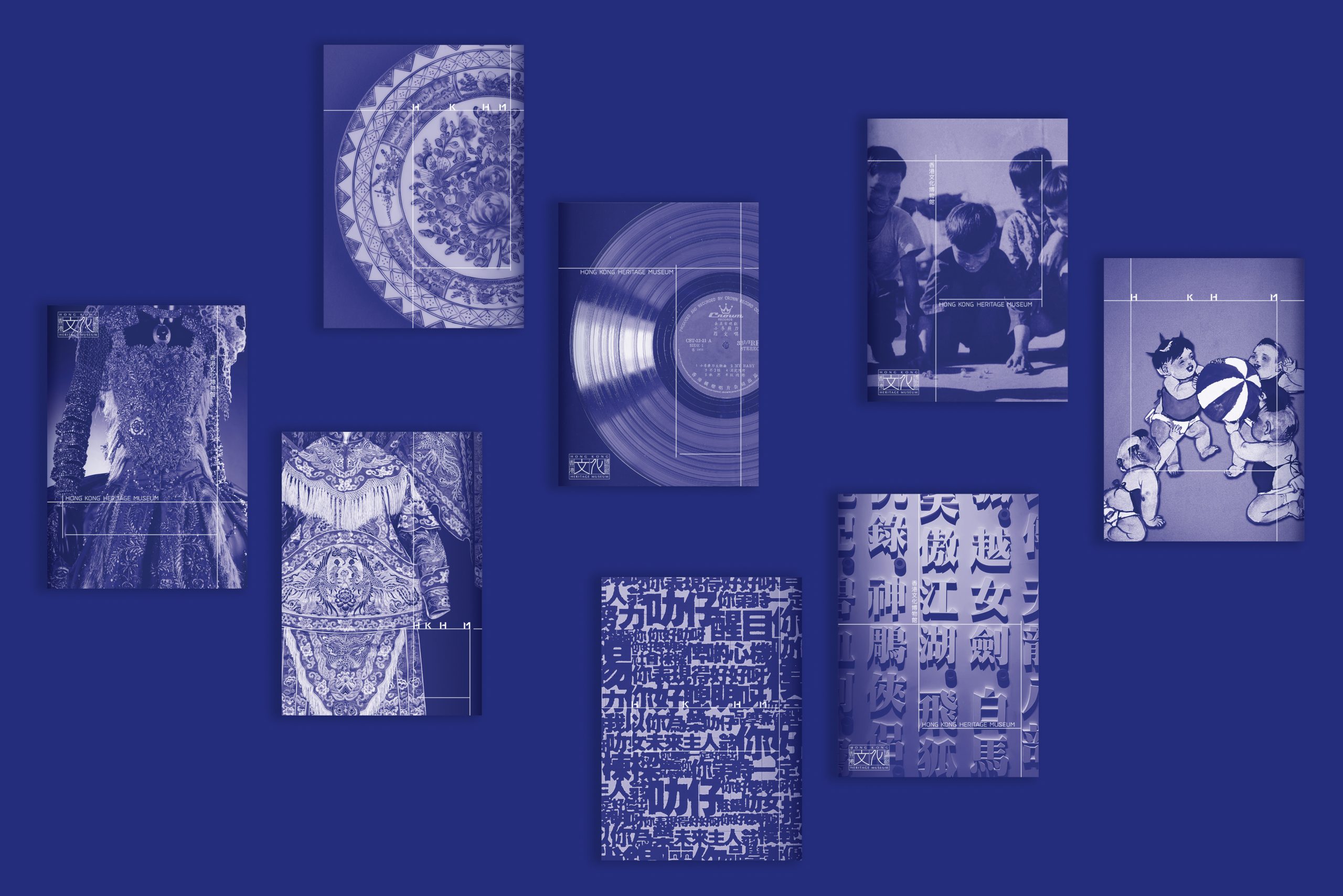
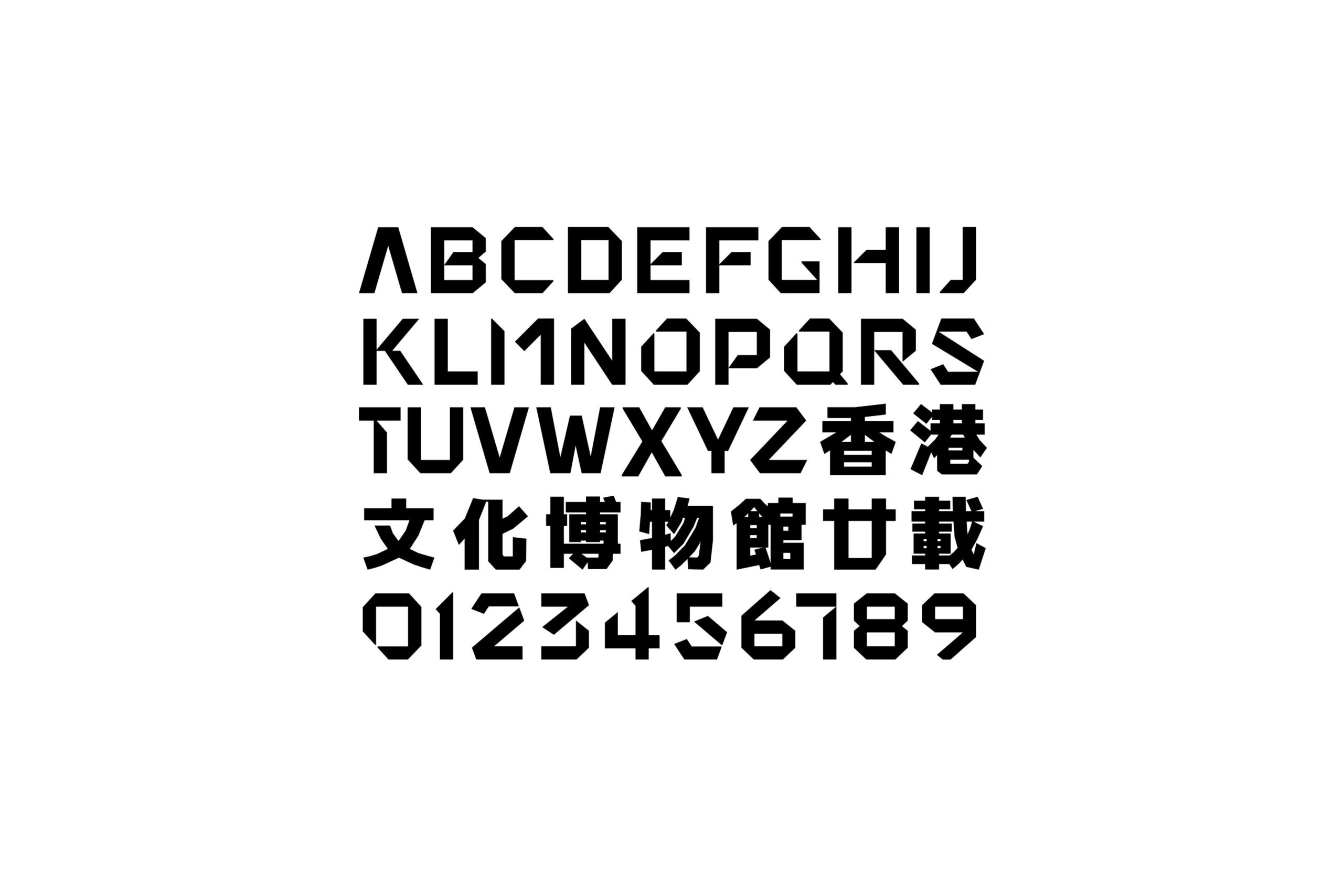
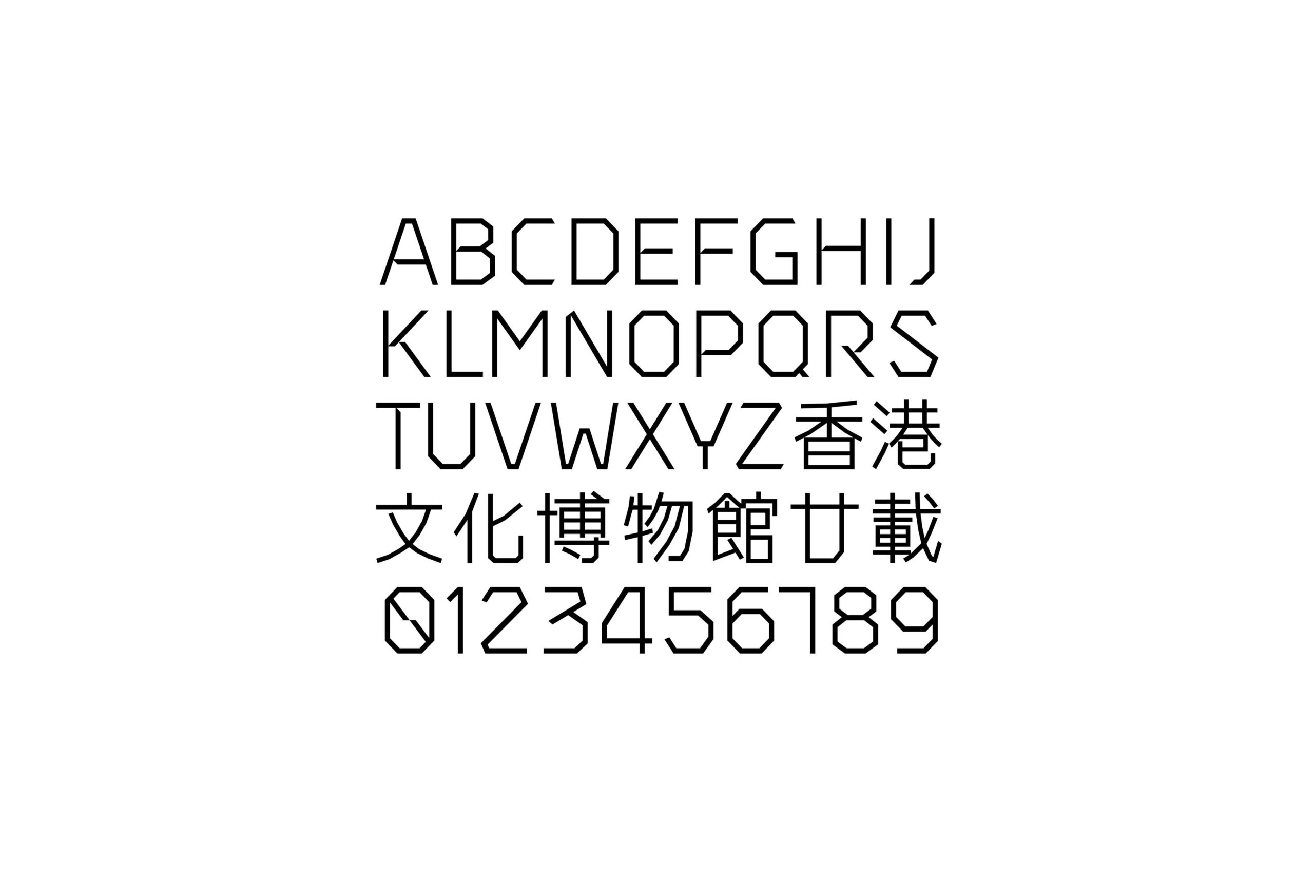
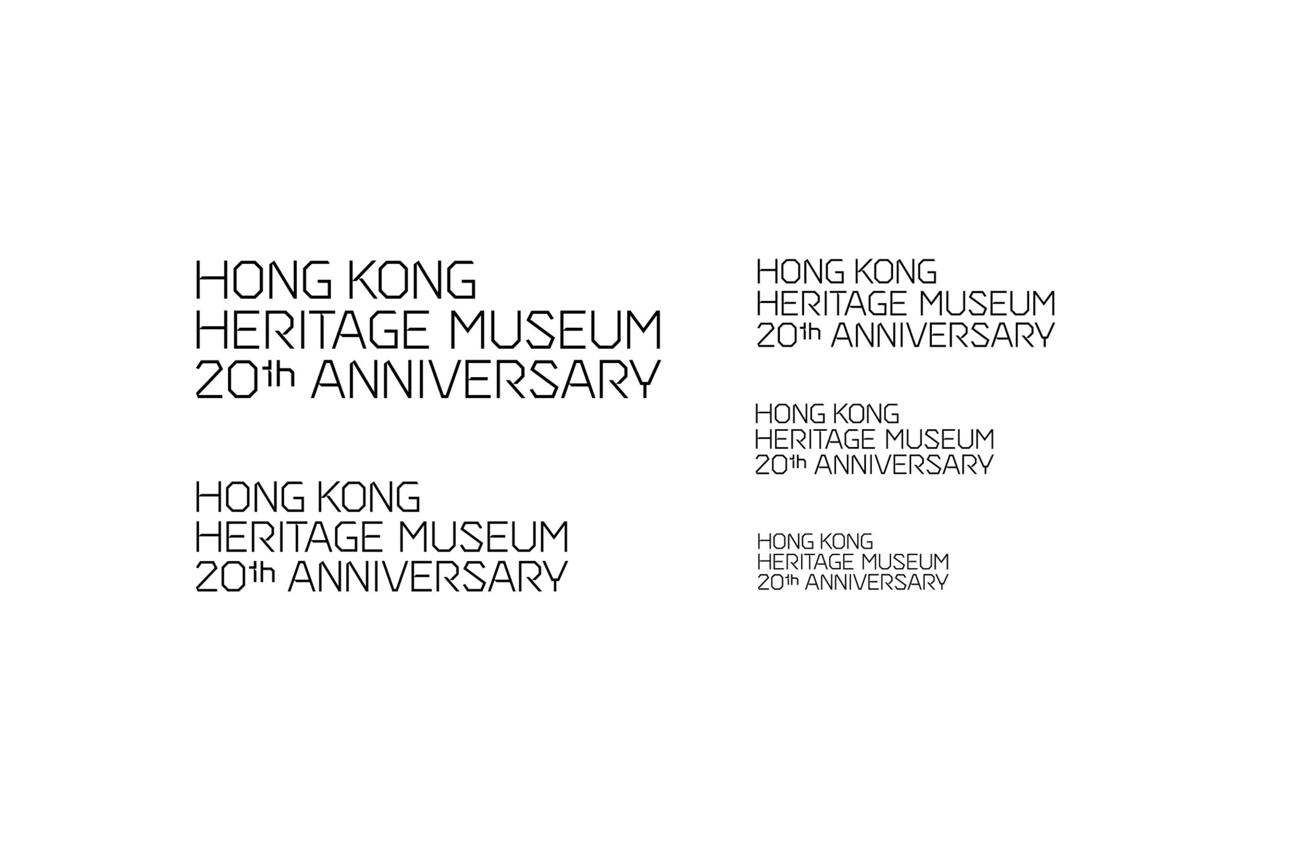
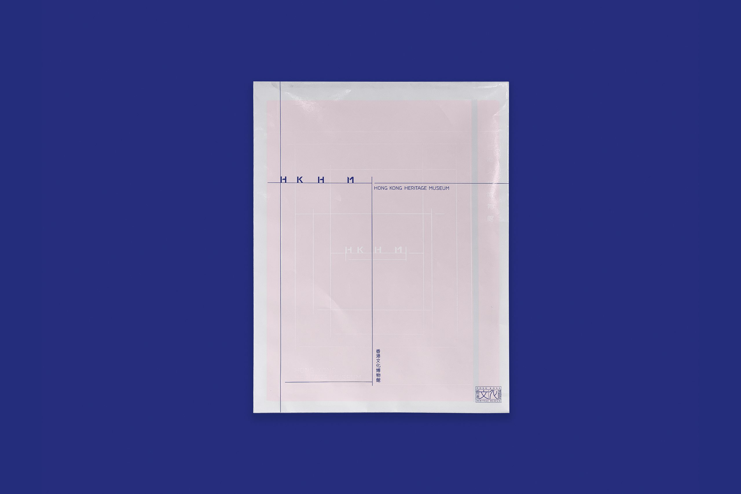
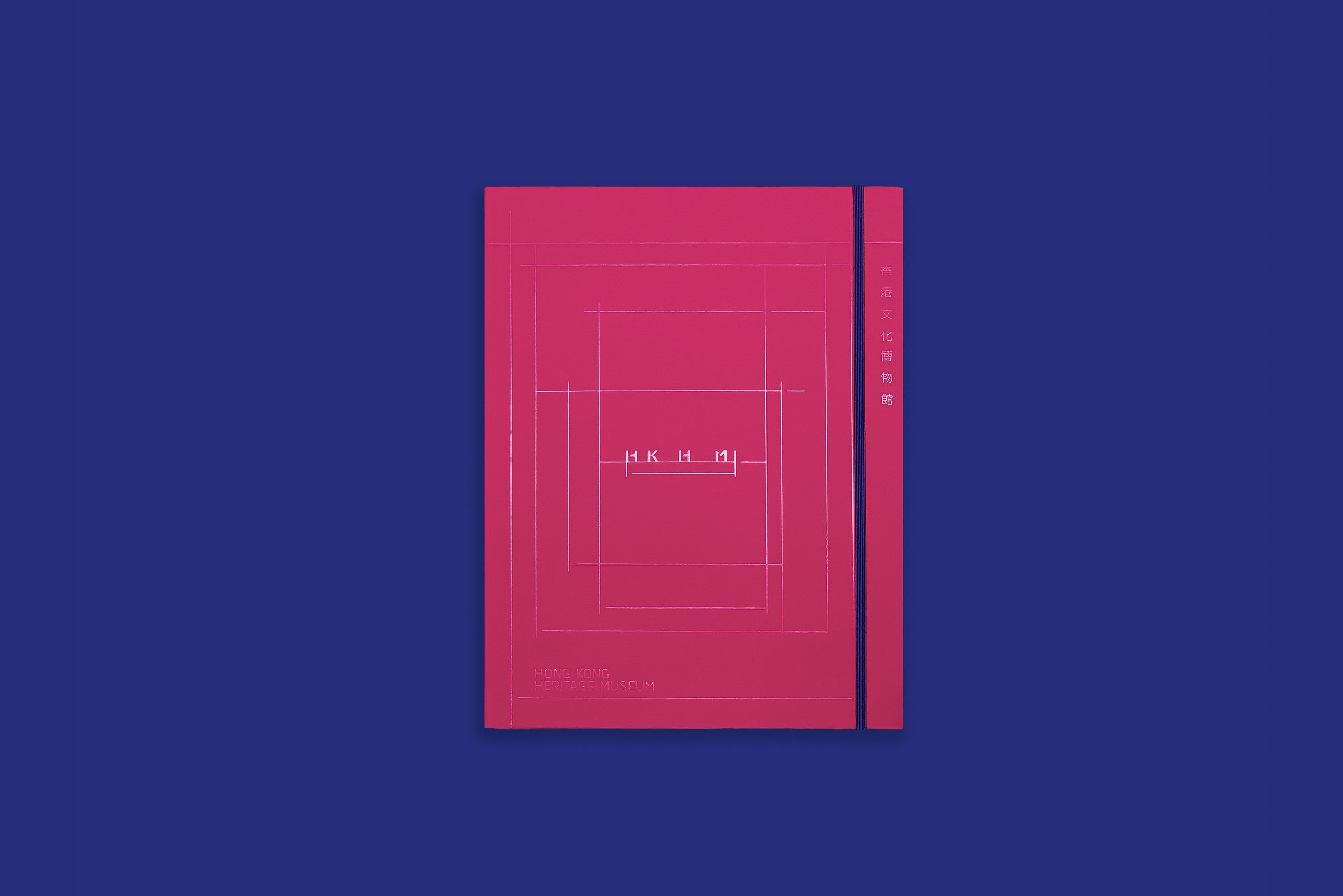
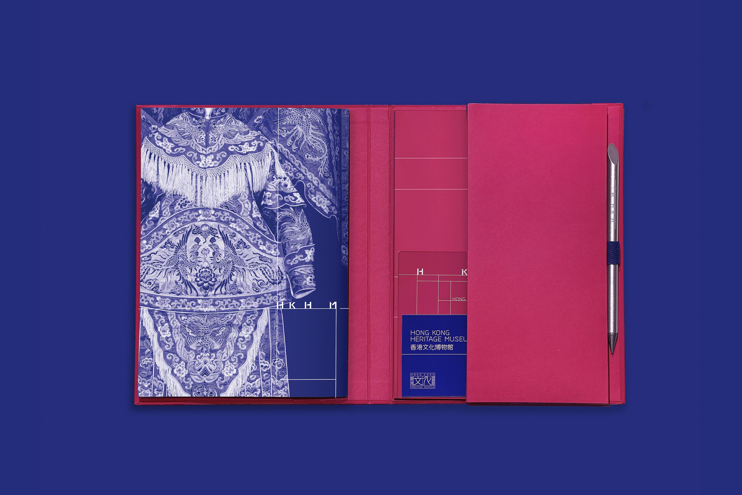
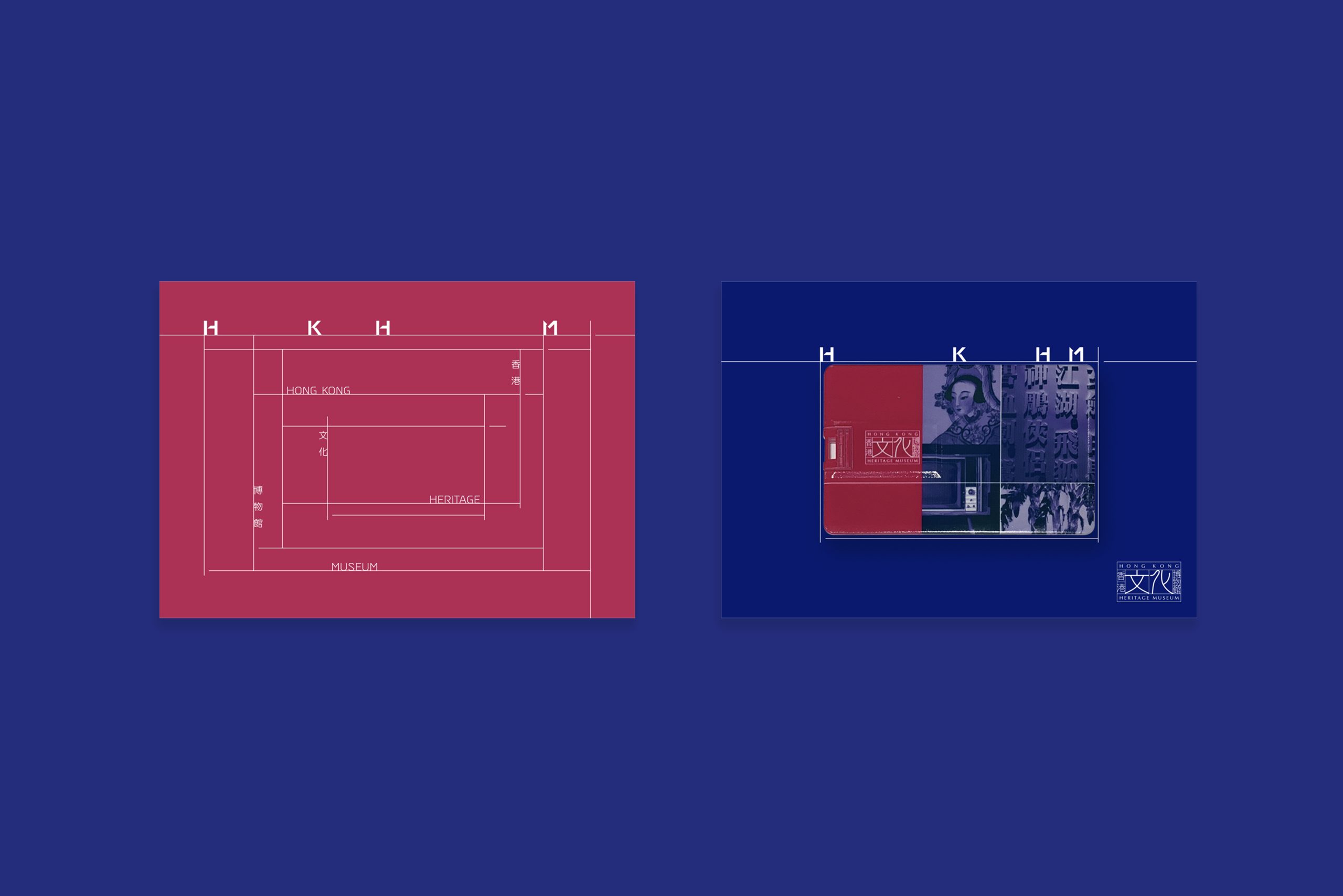
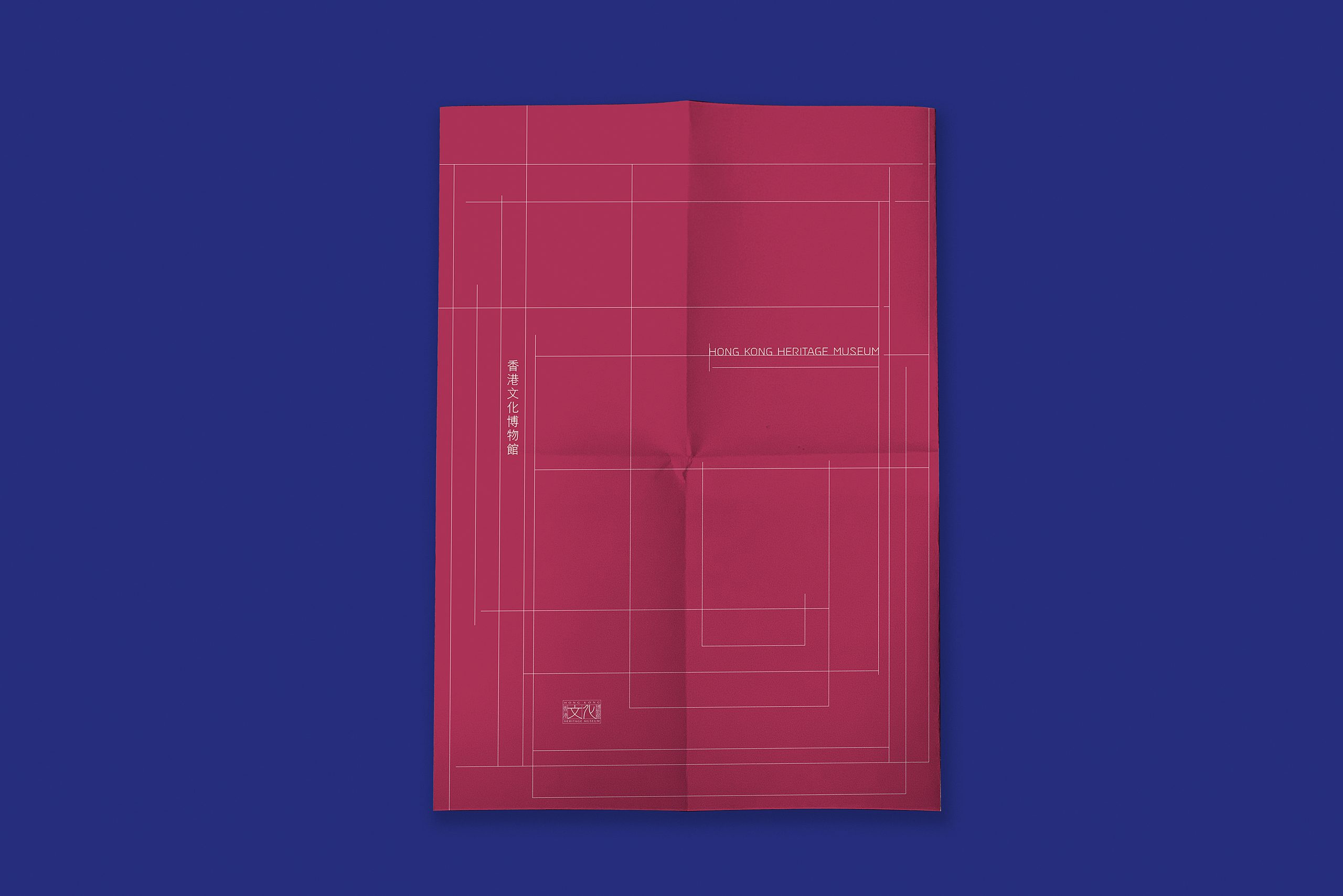
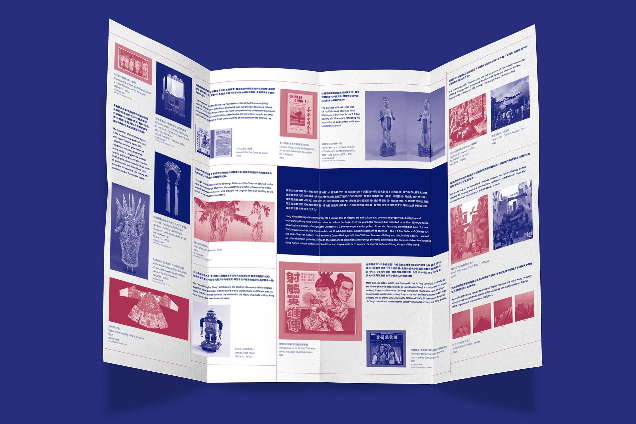
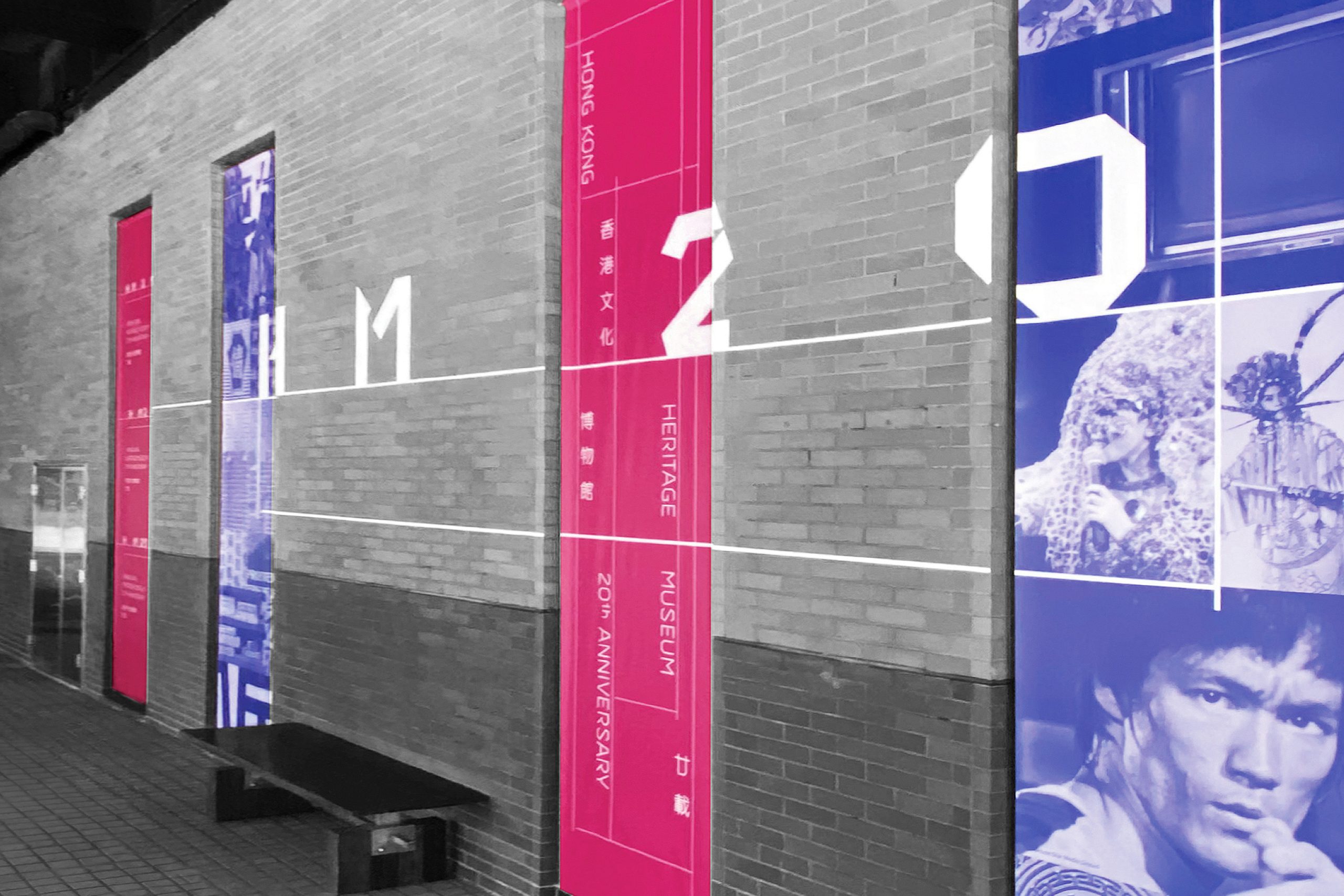
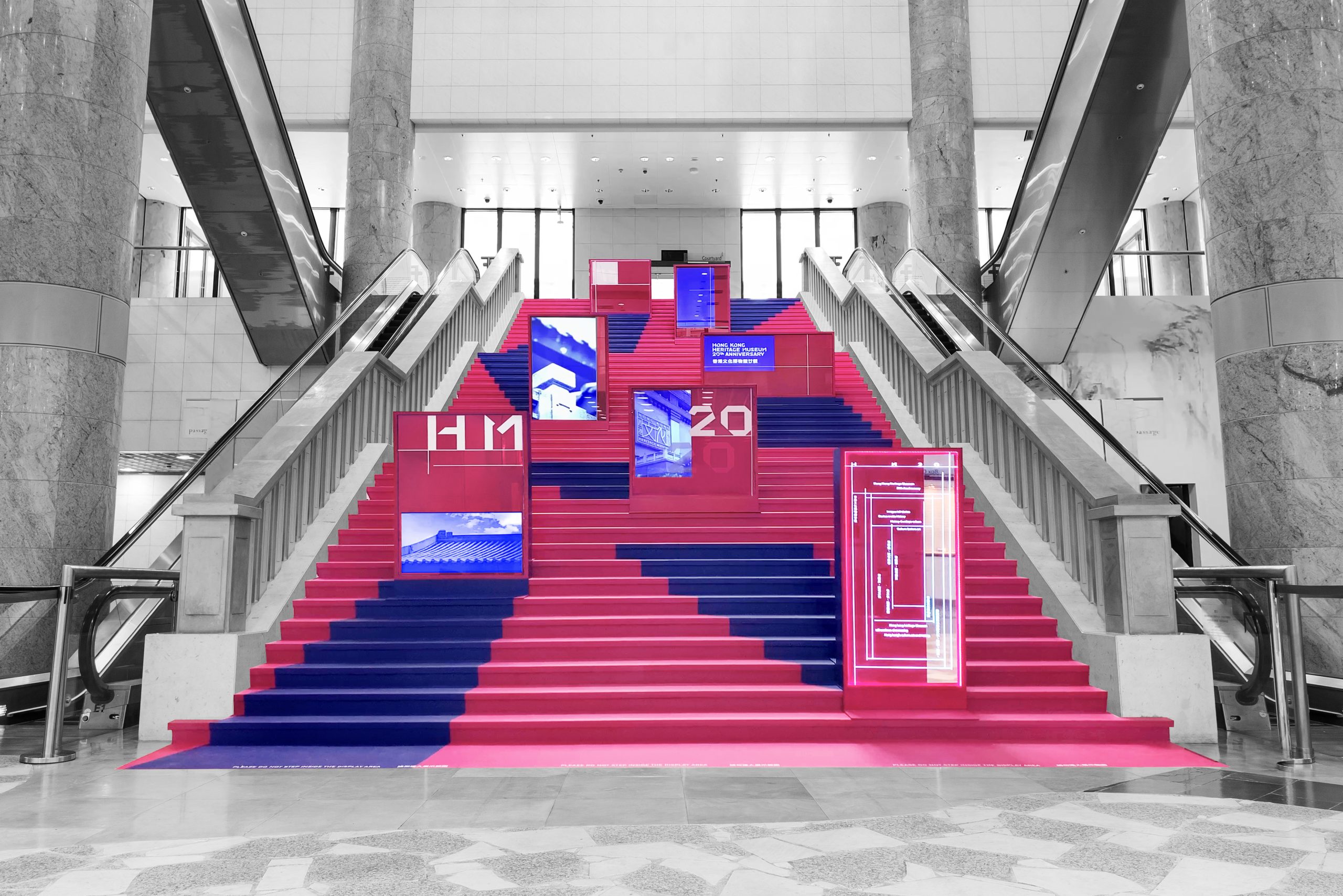
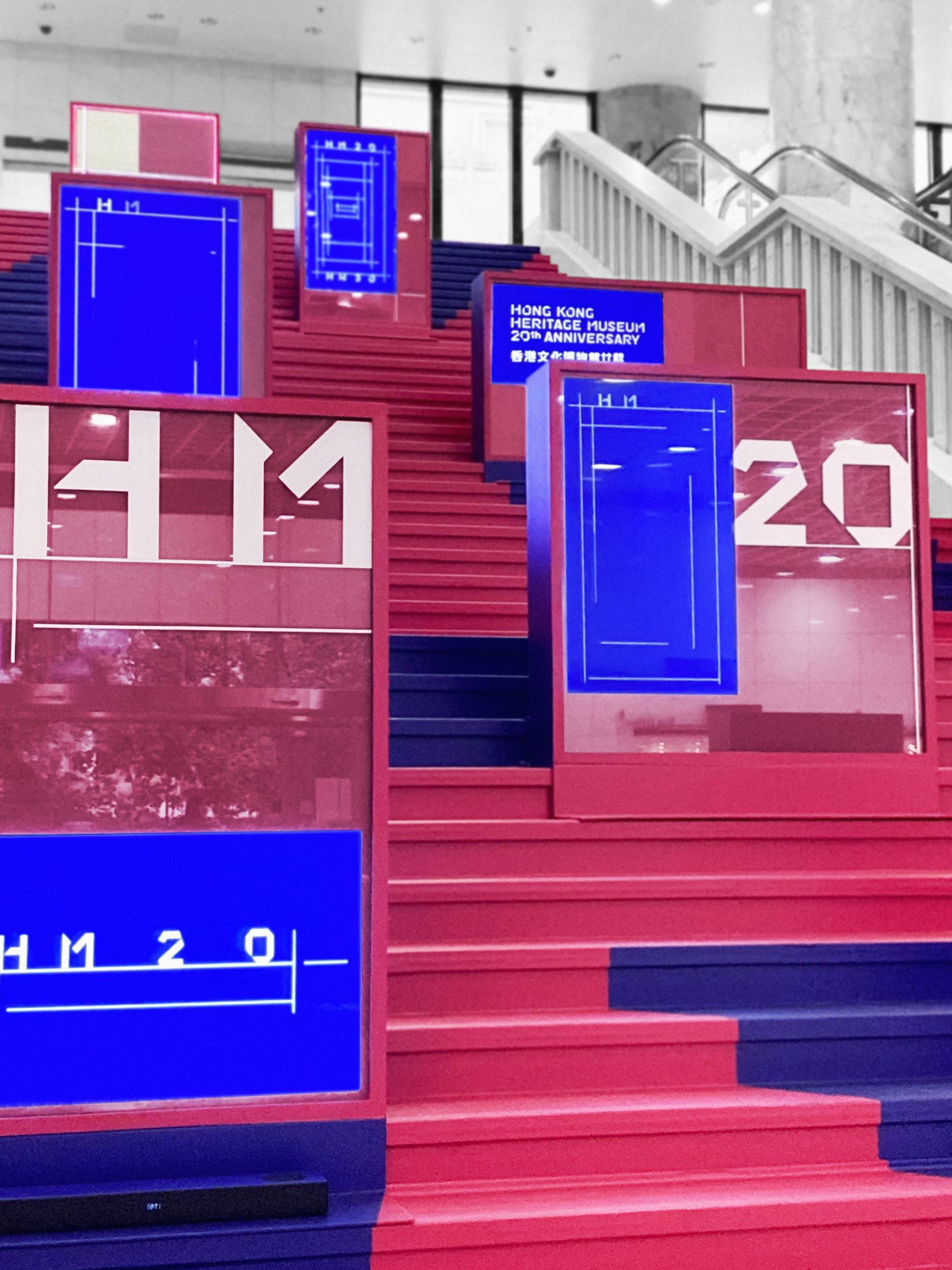
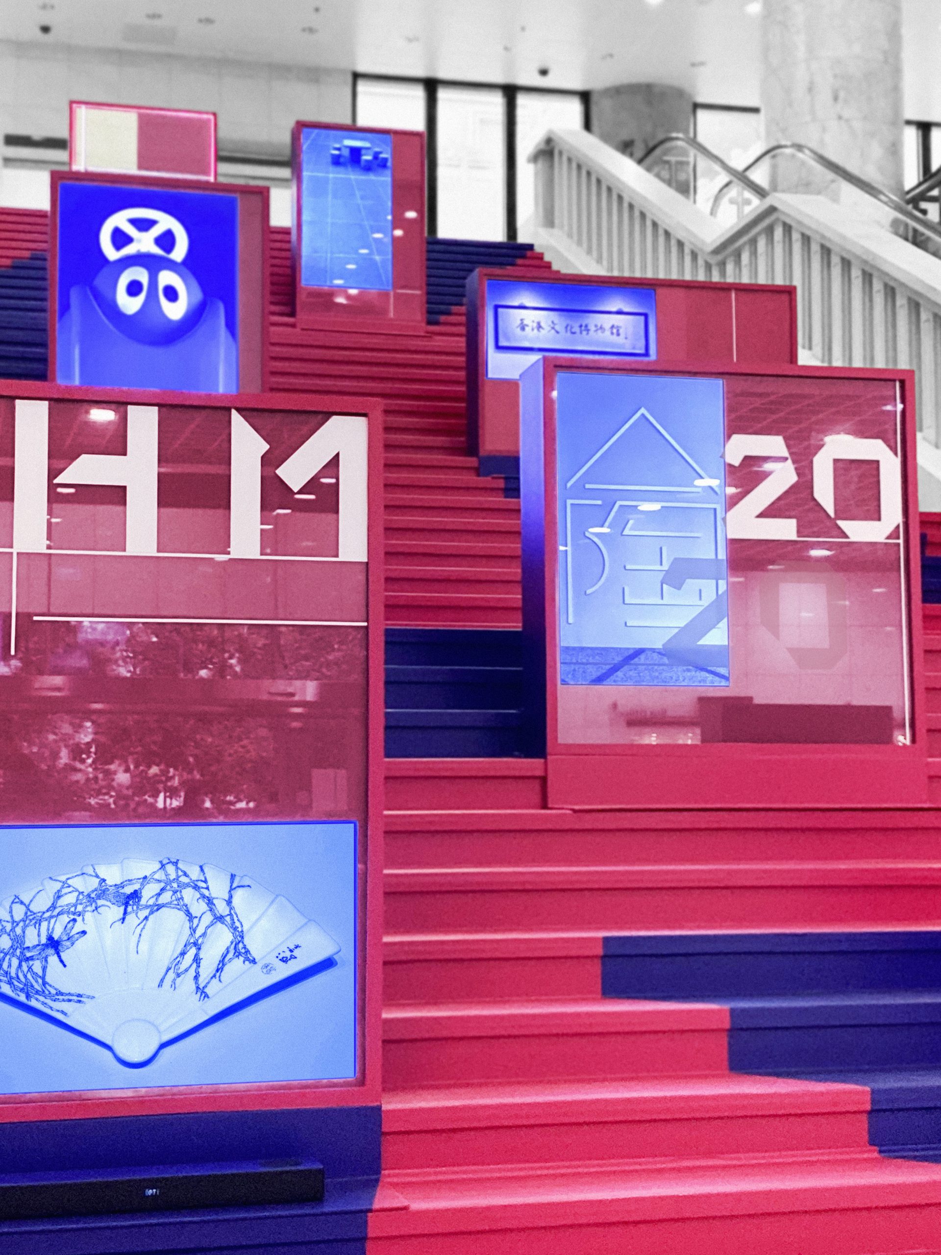
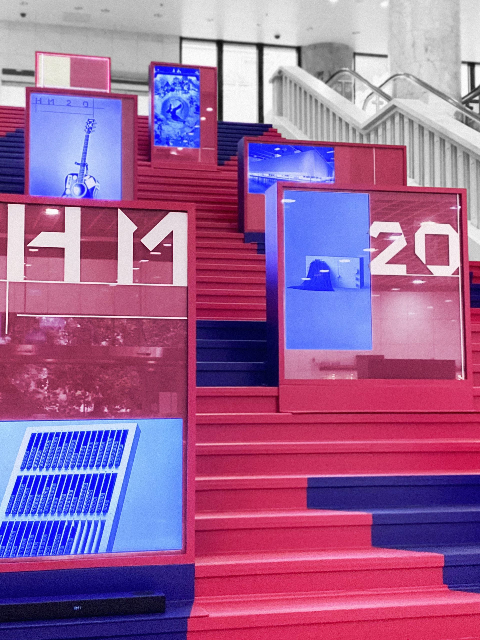
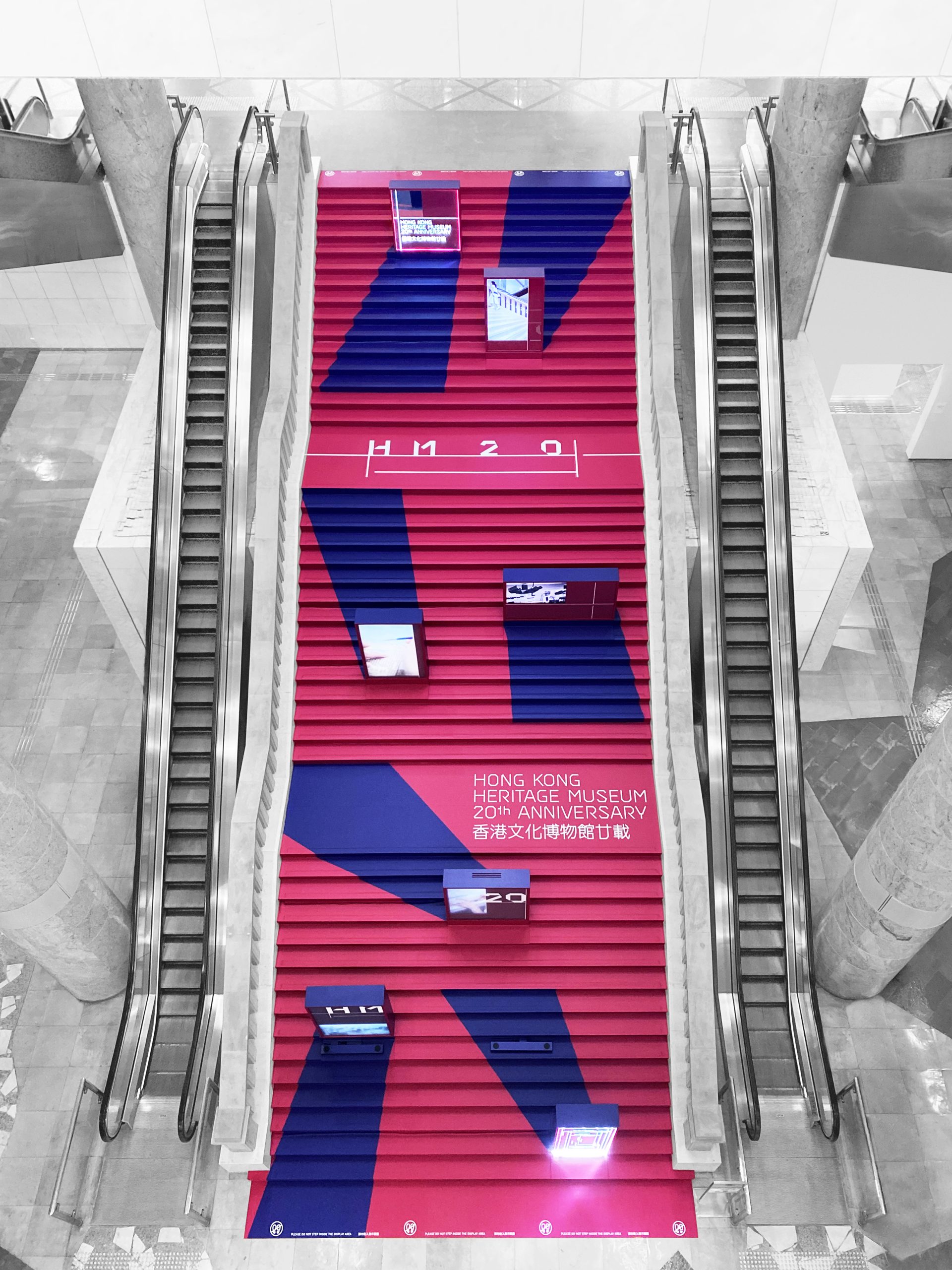
The Hong Kong Heritage Museum (HKHM), a museum of history, art, and culture, celebrated its 20th anniversary with a series of special events and exhibitions. The visual identity for this milestone occasion centred around the Chinese character “廿” (20) and the project title “HM 20,” forming the foundation for a distinctive grid system and custom-designed typeface.
The visual identity drew inspiration from the calligraphic form of “廿,” transforming it into a flexible and modular grid that underpinned all visual applications, from the anniversary logo to exhibition graphics and marketing materials. This grid structure provided a cohesive framework, unifying the diverse elements of the 20th-anniversary campaign.
rchitect")


