Oi!
Project by c plus c workshop
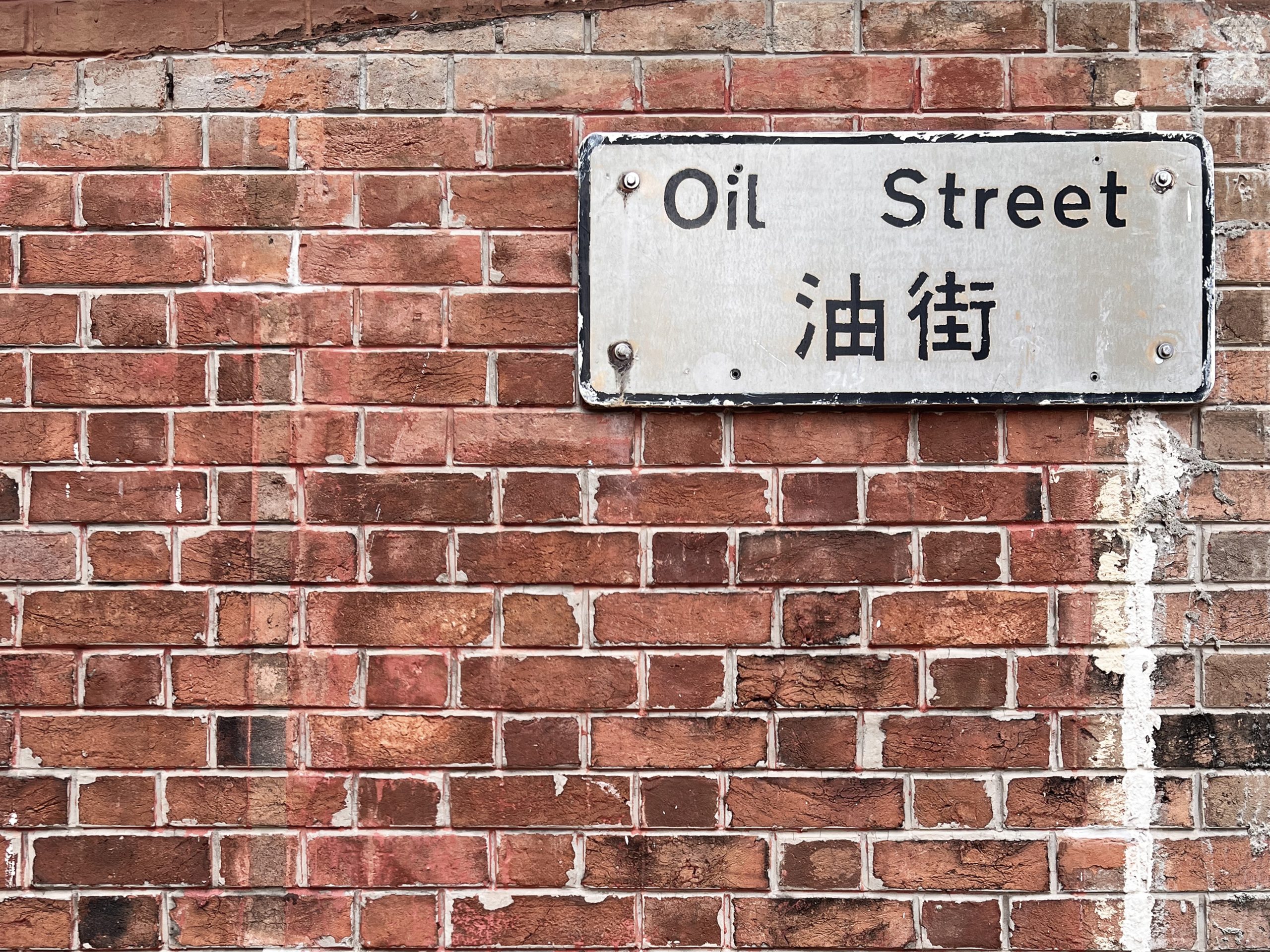
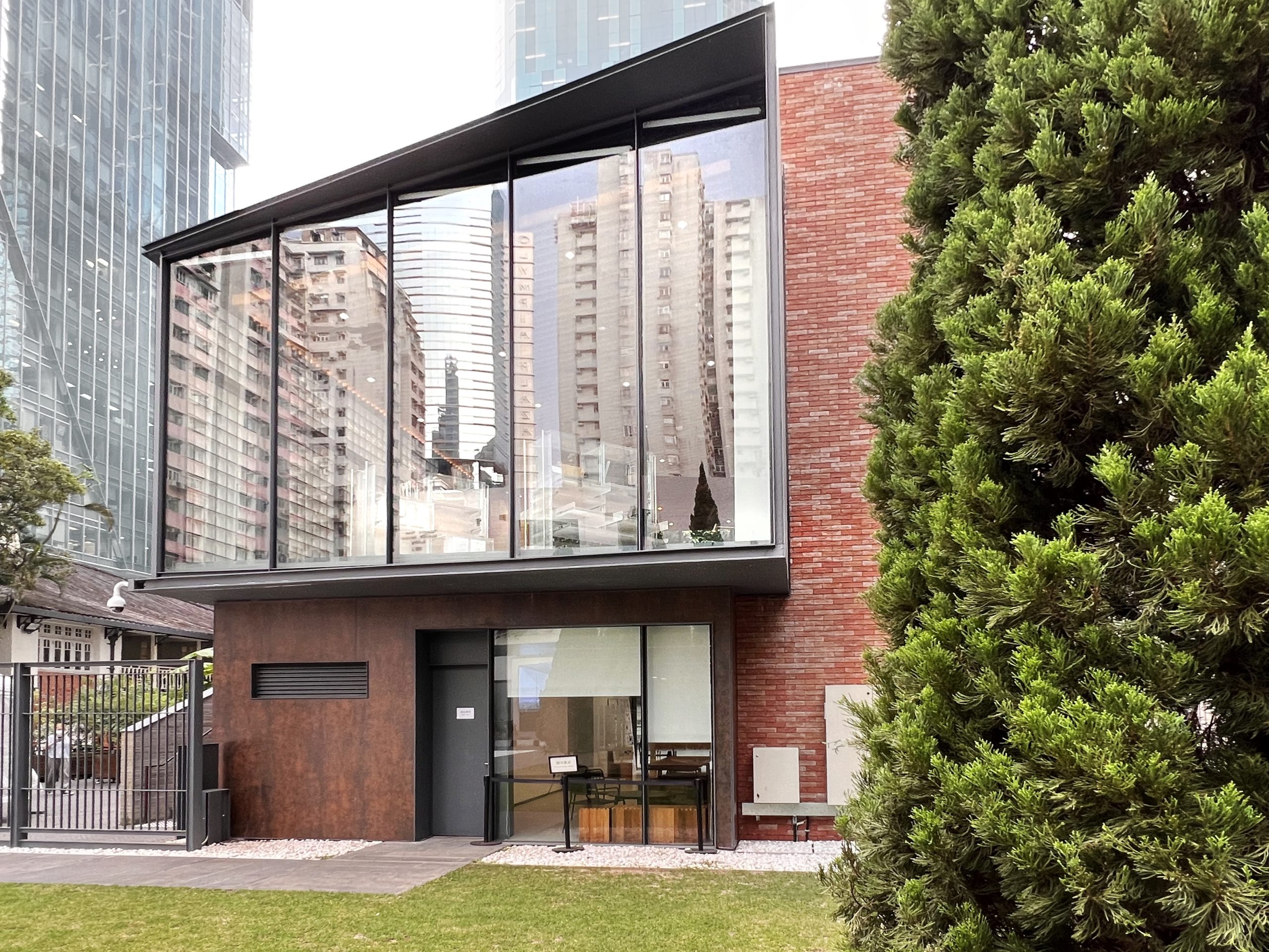
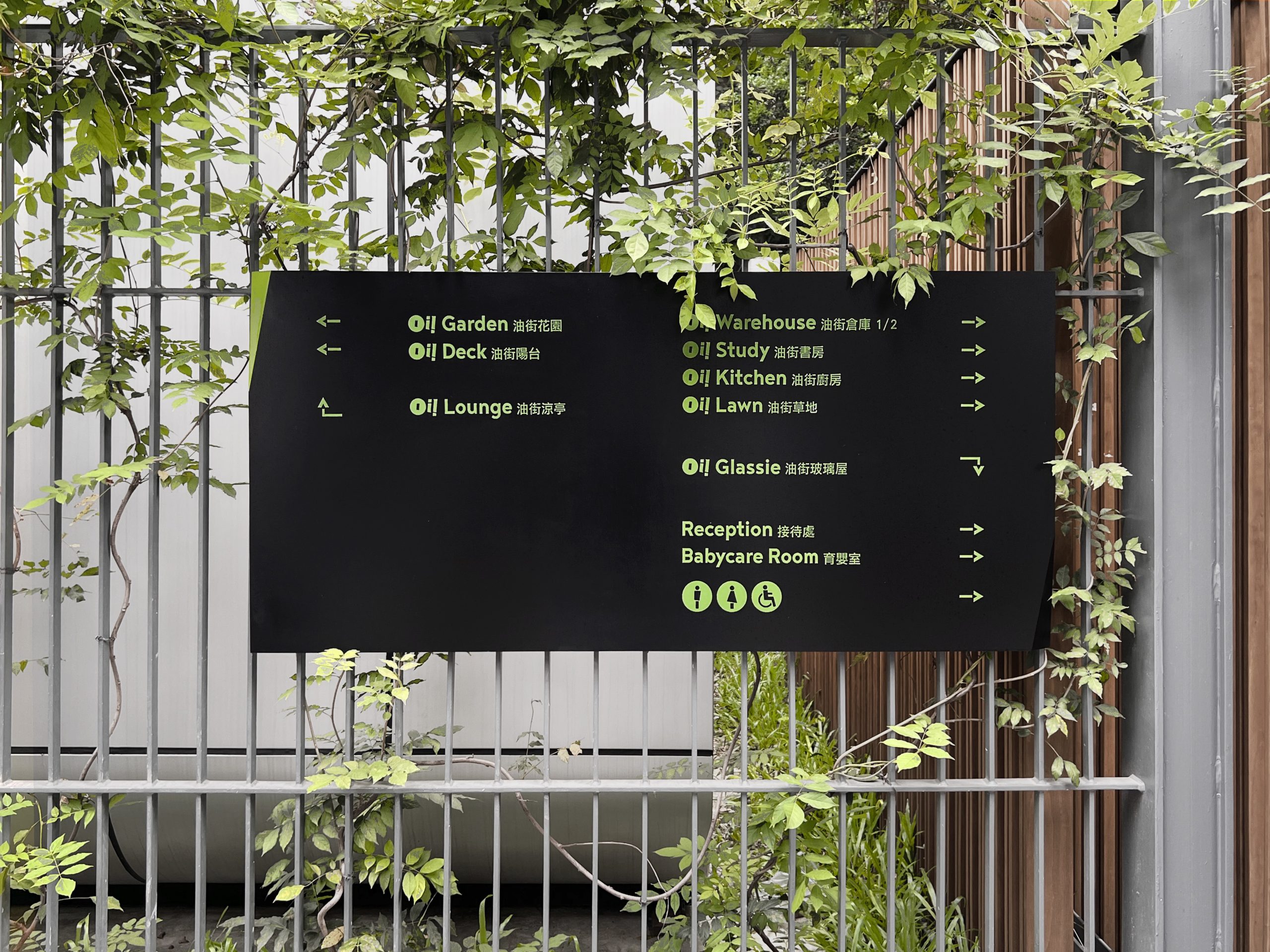
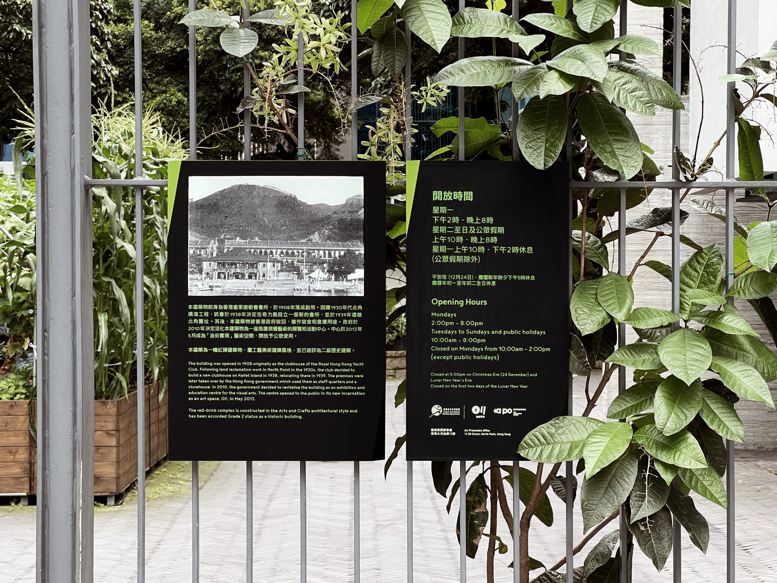
Oi!, an art oasis in the heart of the urban city, is housed in the restored and revitalised former clubhouse of the Royal Hong Kong Yacht Club. This community leisure and cultural space promotes collaboration in the arts, providing a platform for interaction between artists and the public.
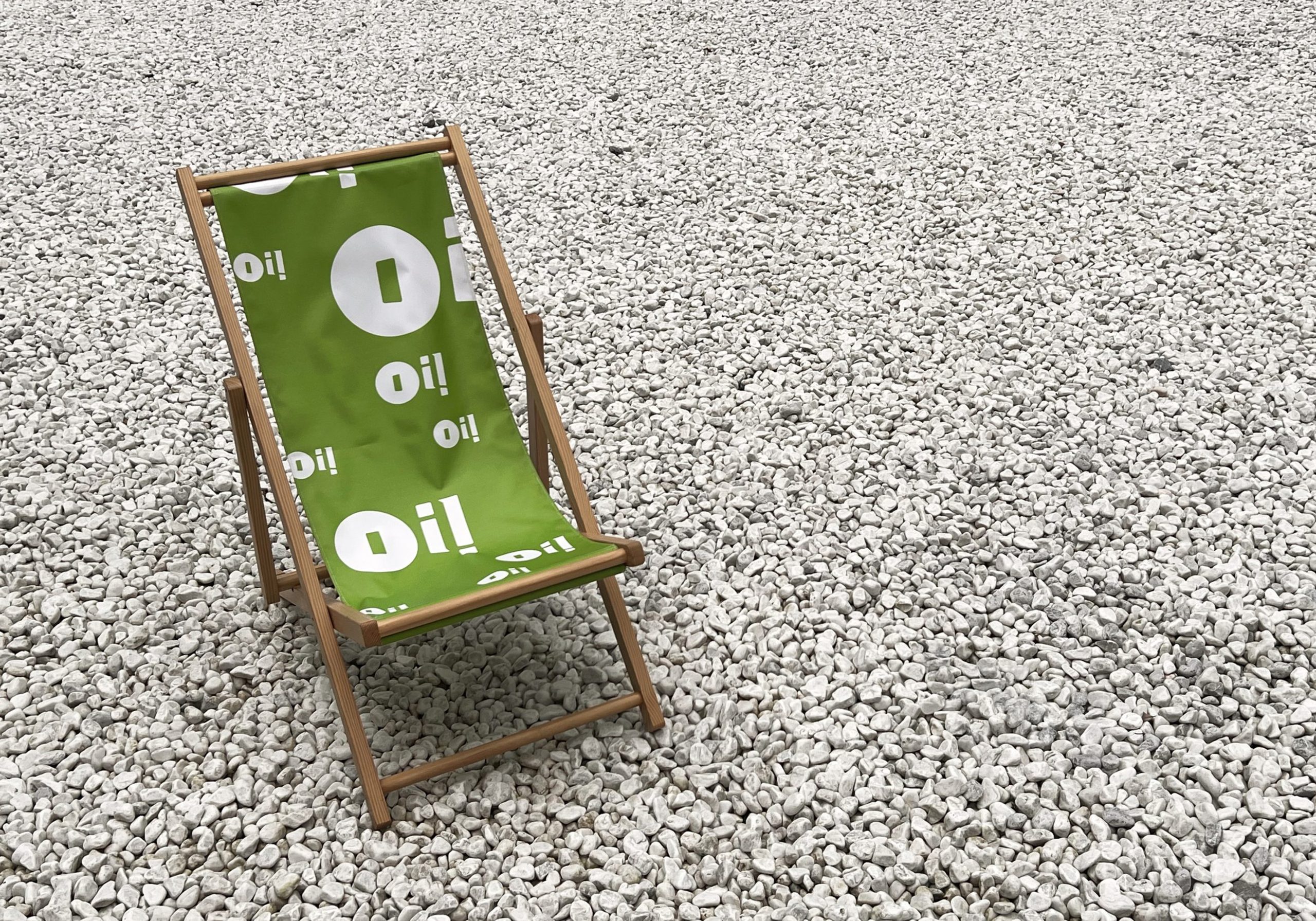
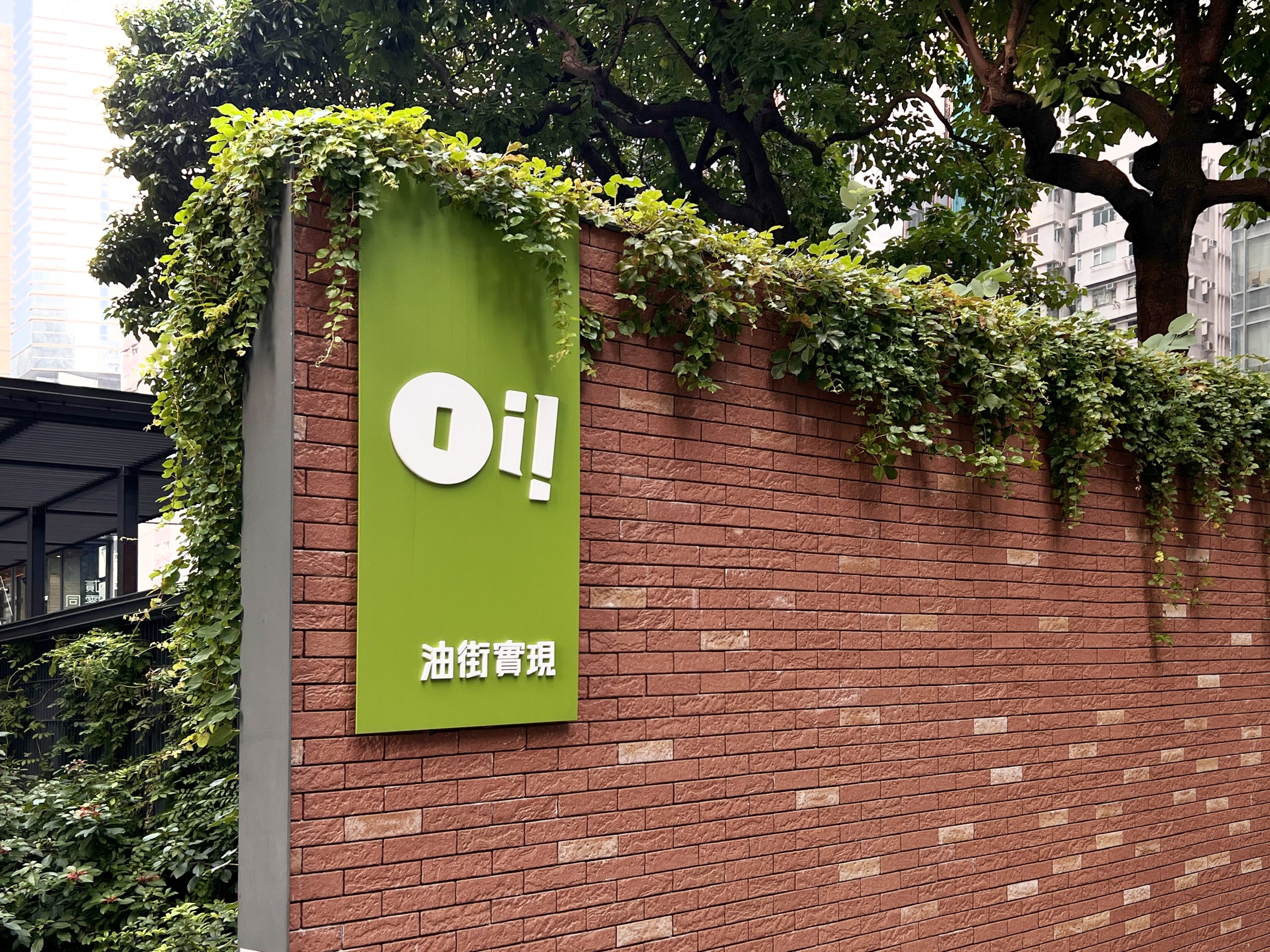
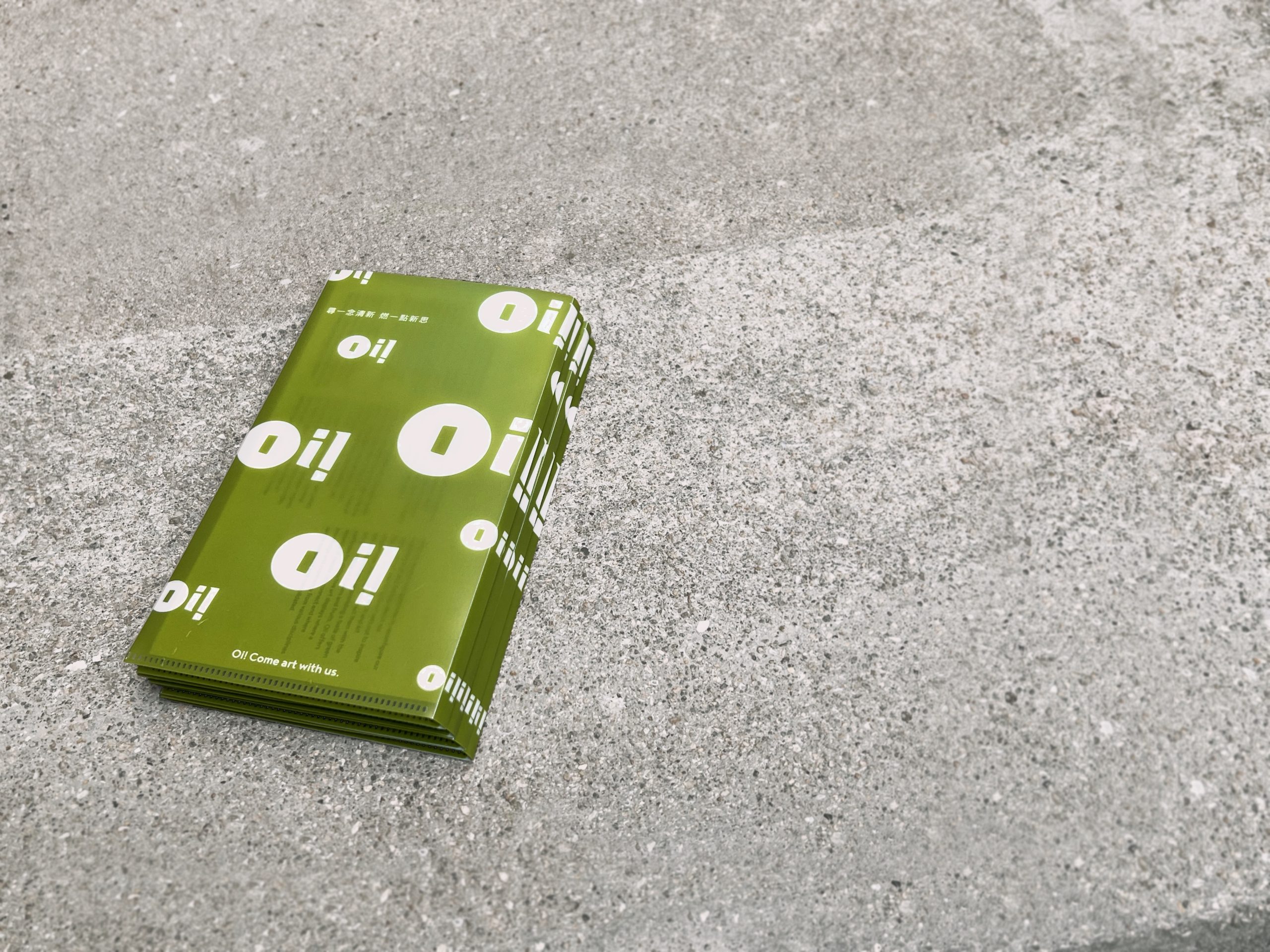
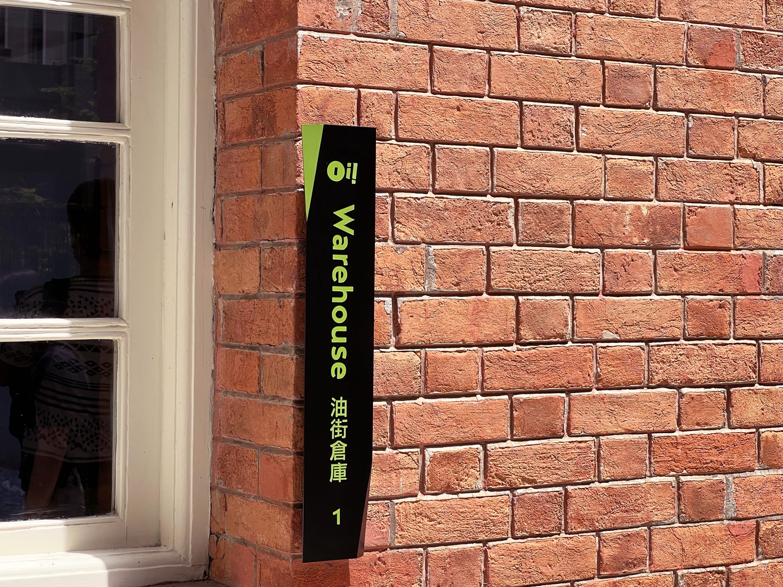
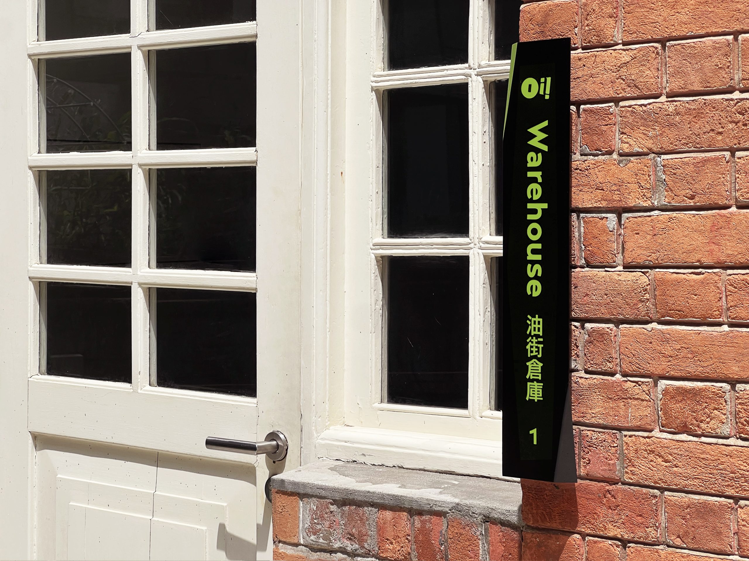
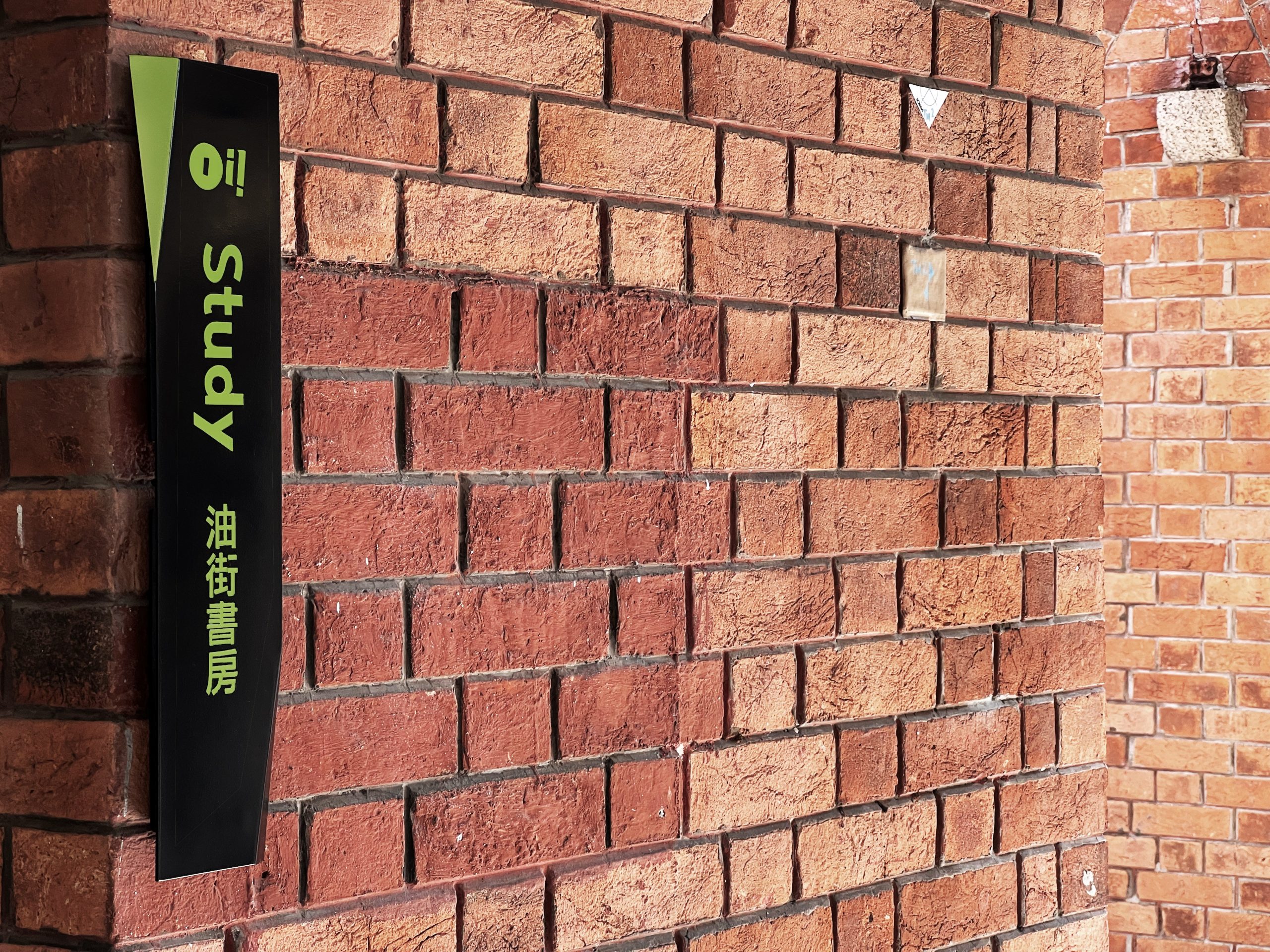
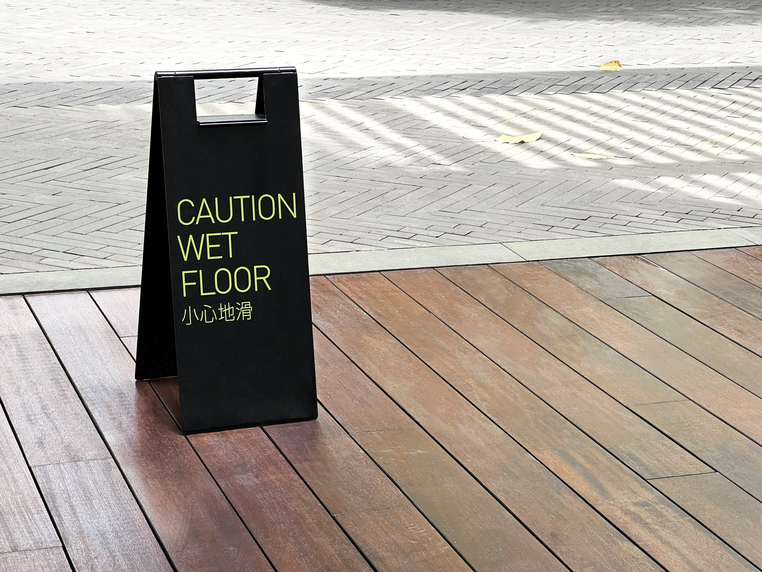
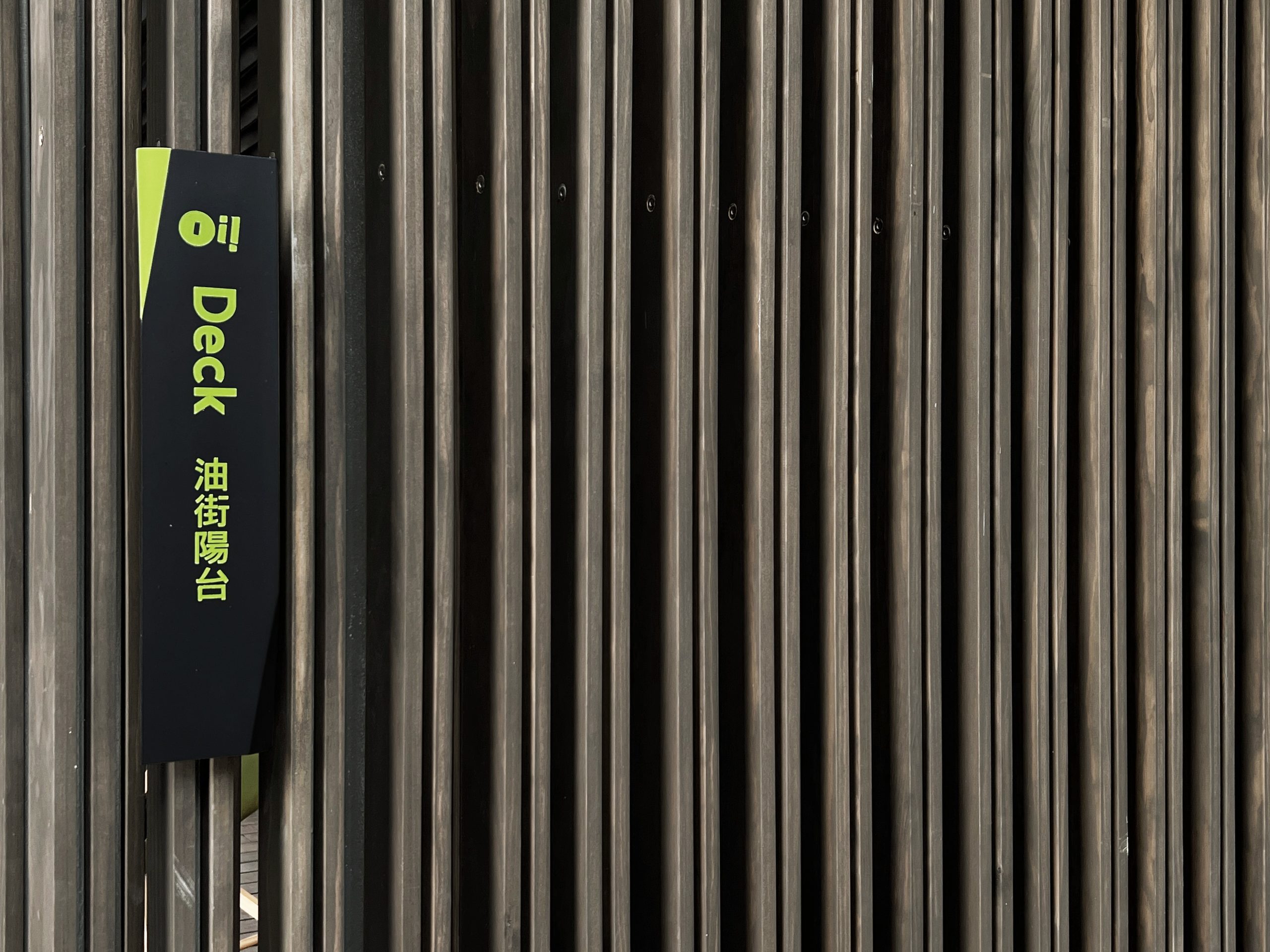
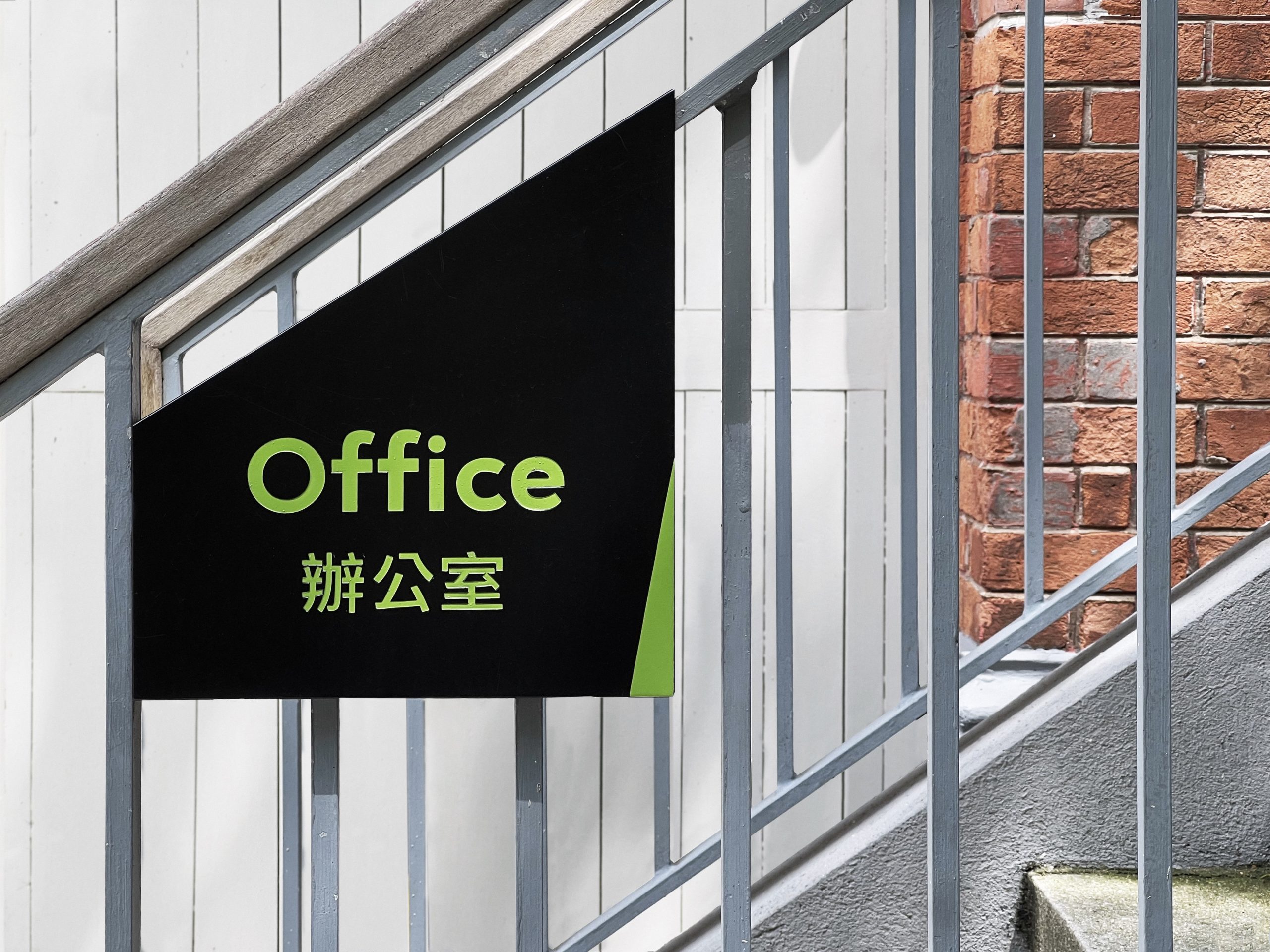
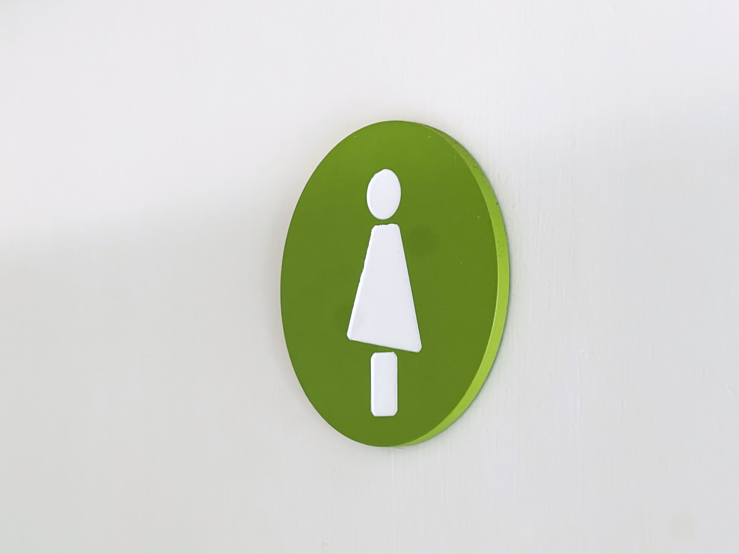
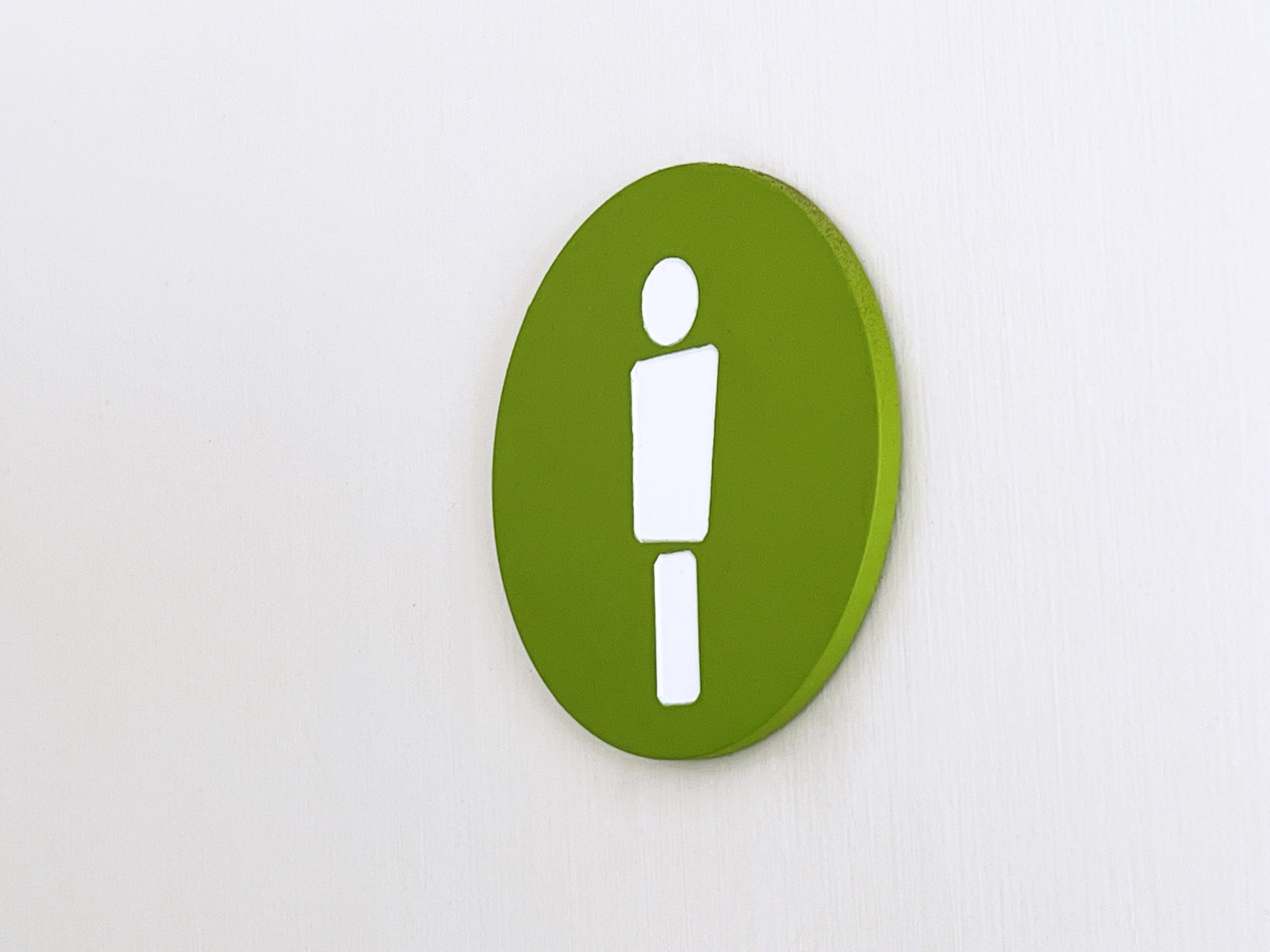
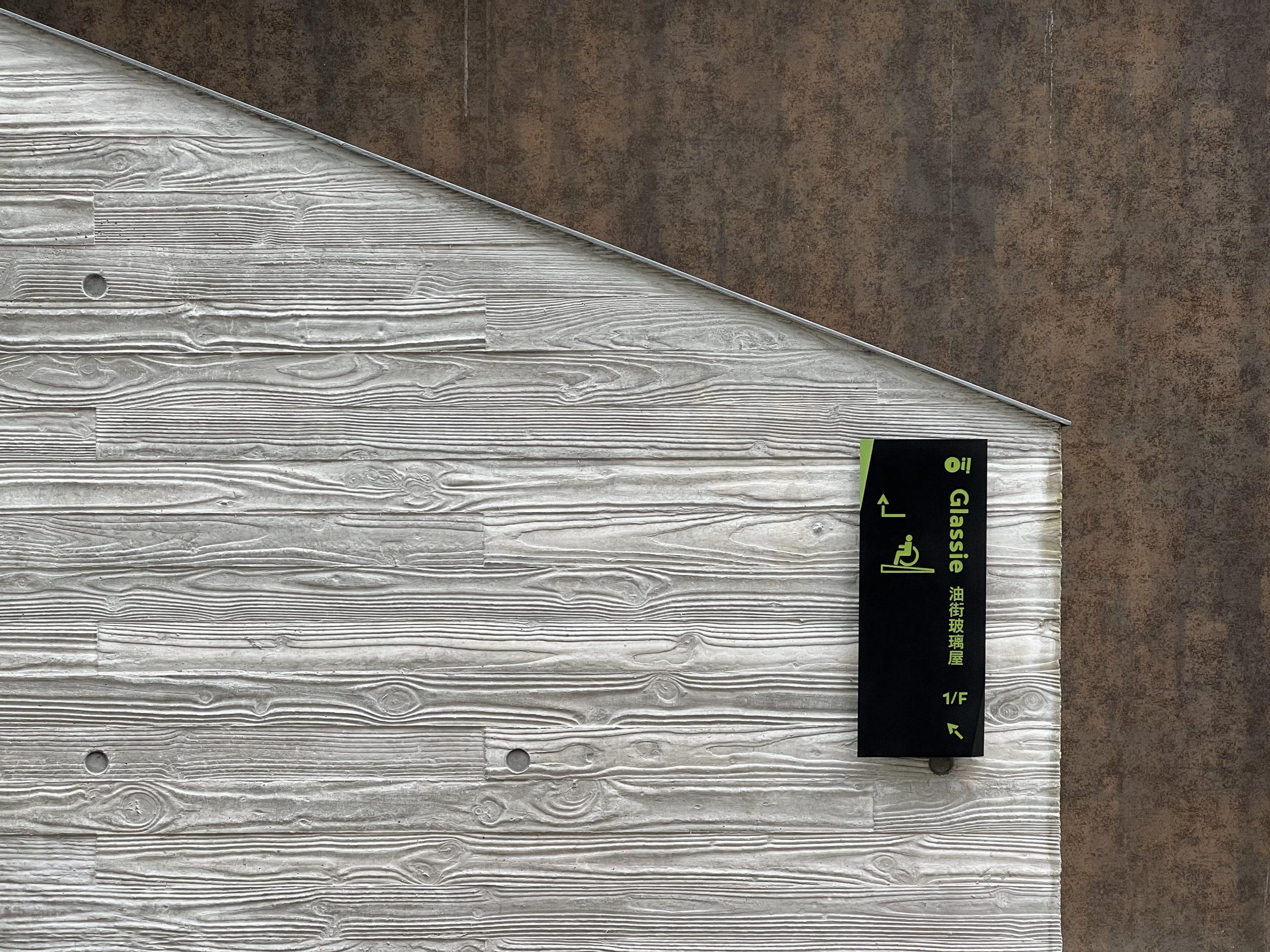
The visual identity for Oi! reflects these core ideas. The name itself features an exclamation mark replacing the “L,” serving as both a call to attention and a visual marker of the project’s location. The logo’s shape visually represents the act of calling out, grabbing attention in graphic form. The use of green as the primary color evokes the concept of an artistic oasis amidst the city’s concrete and steel landscape.
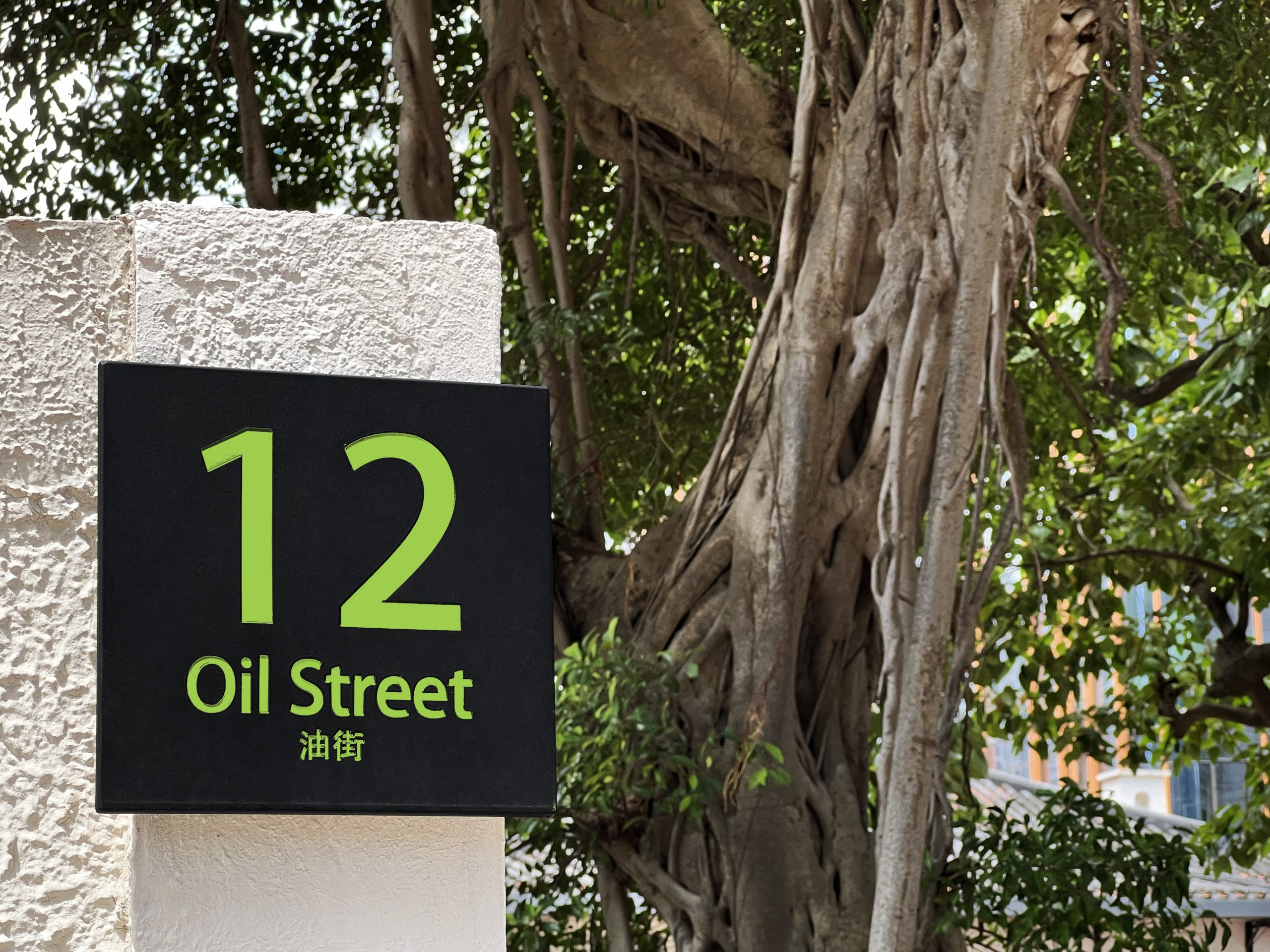
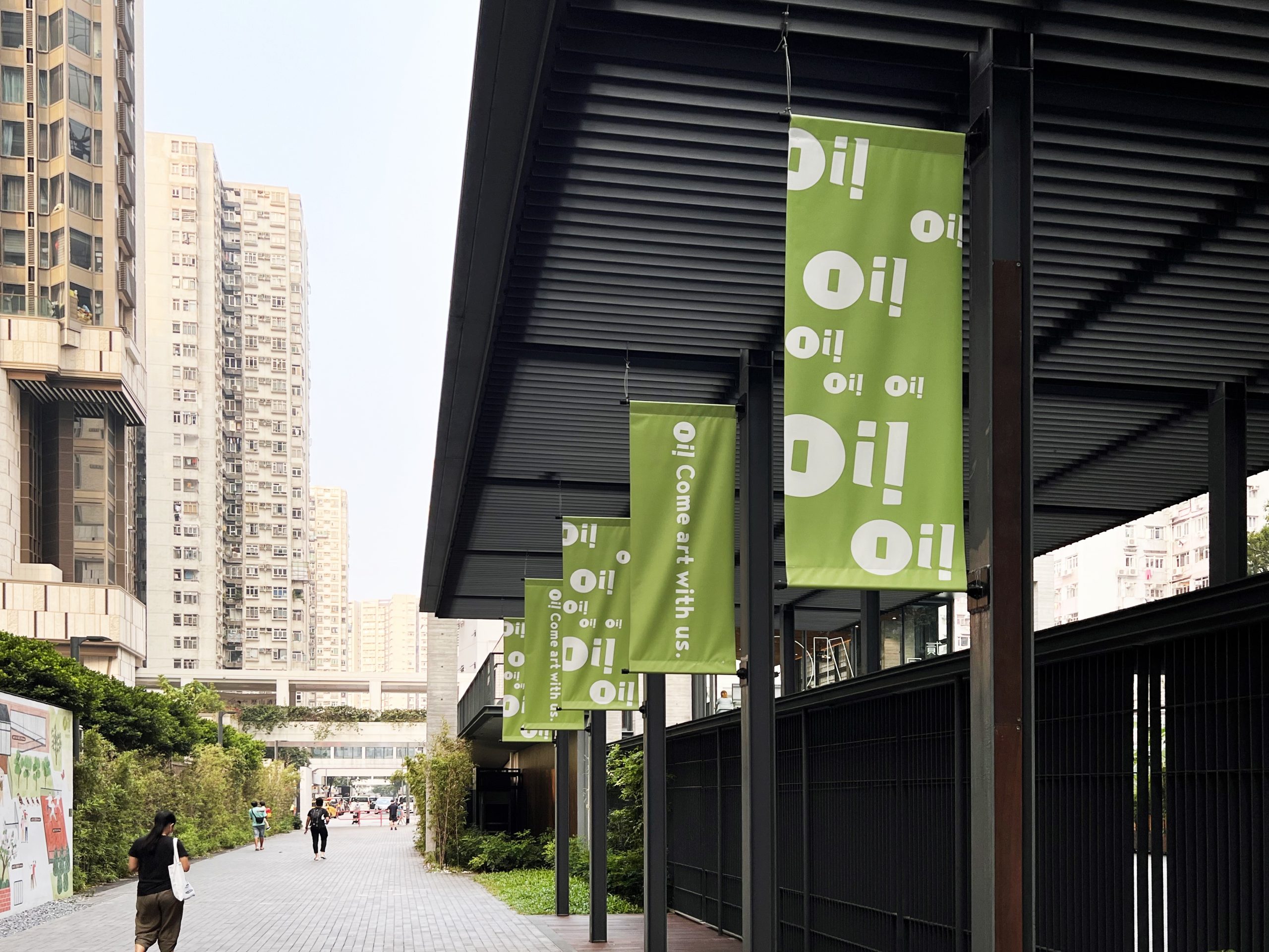
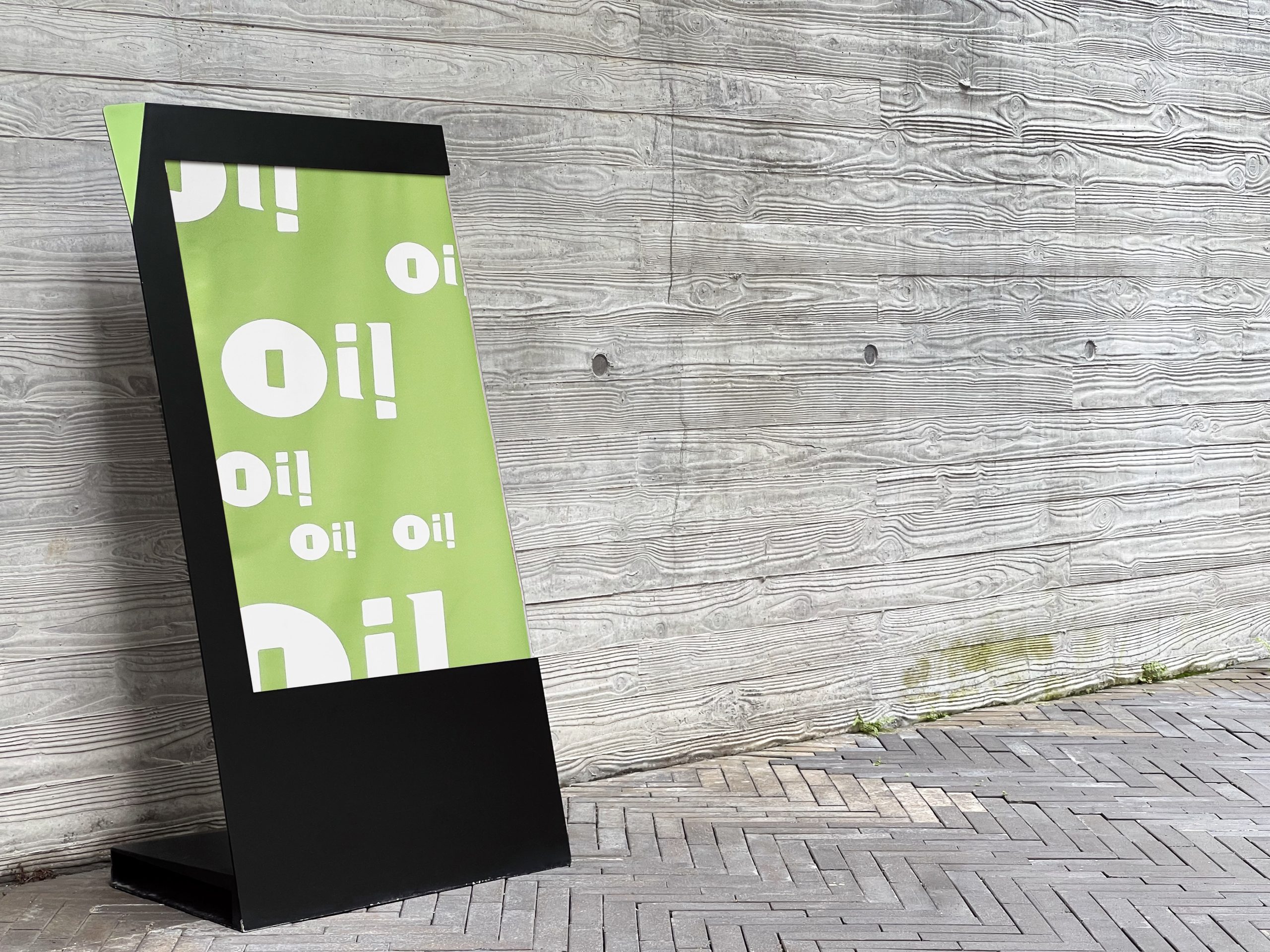
The wayfinding system extends the visual language, transforming the Oi! logo into informative and engaging signage. These signs, combined with three distinct surface areas, visually communicate the diversity and energetic vibe that Oi! brings to the community with the opening of its new phase.


rchitect")