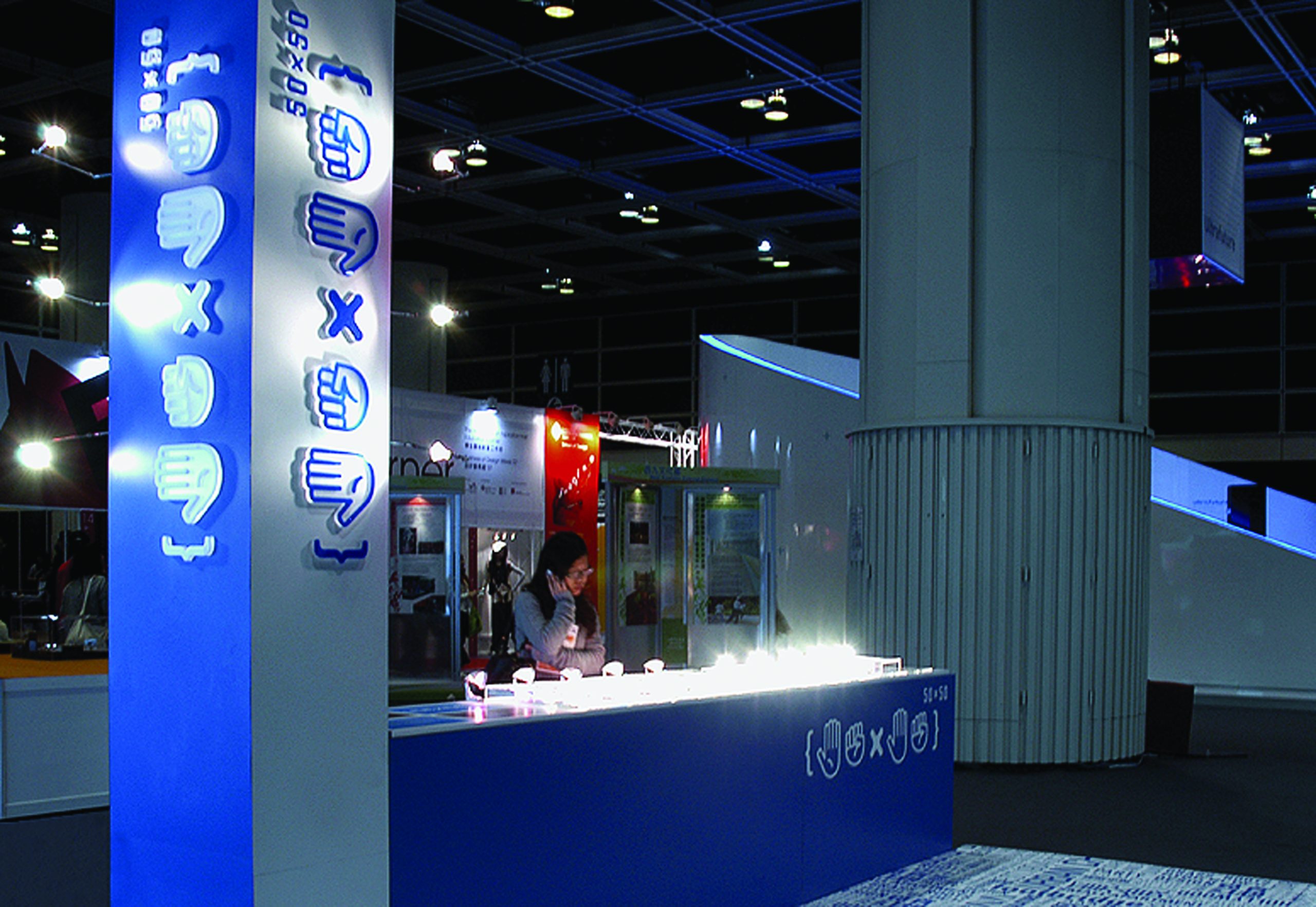
50x50
Project by c plus c workshop
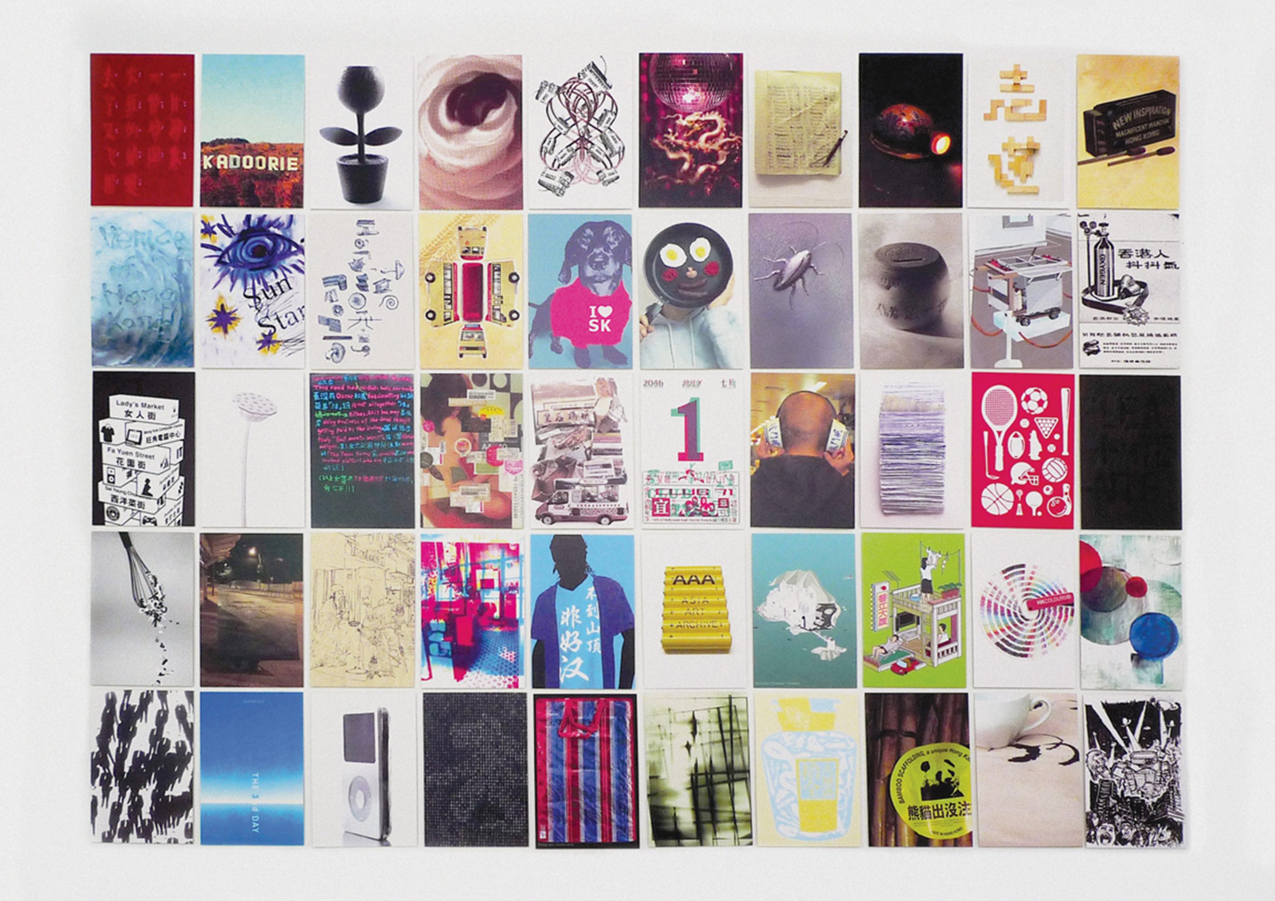
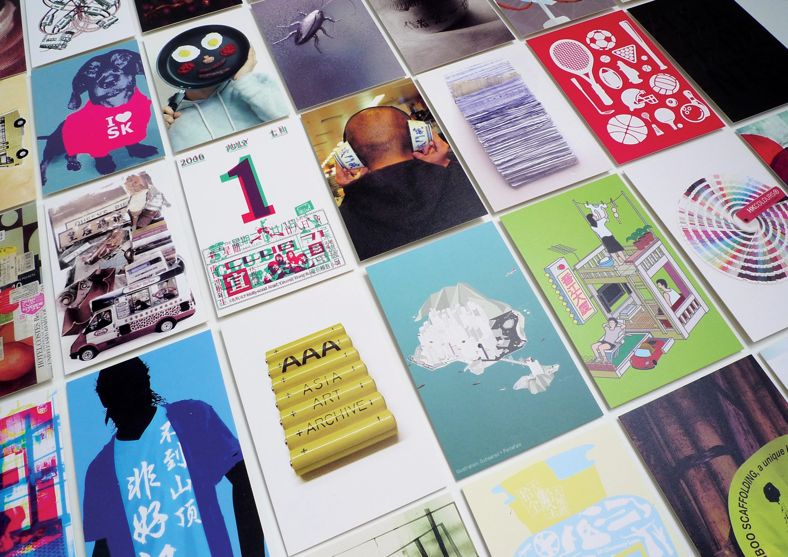
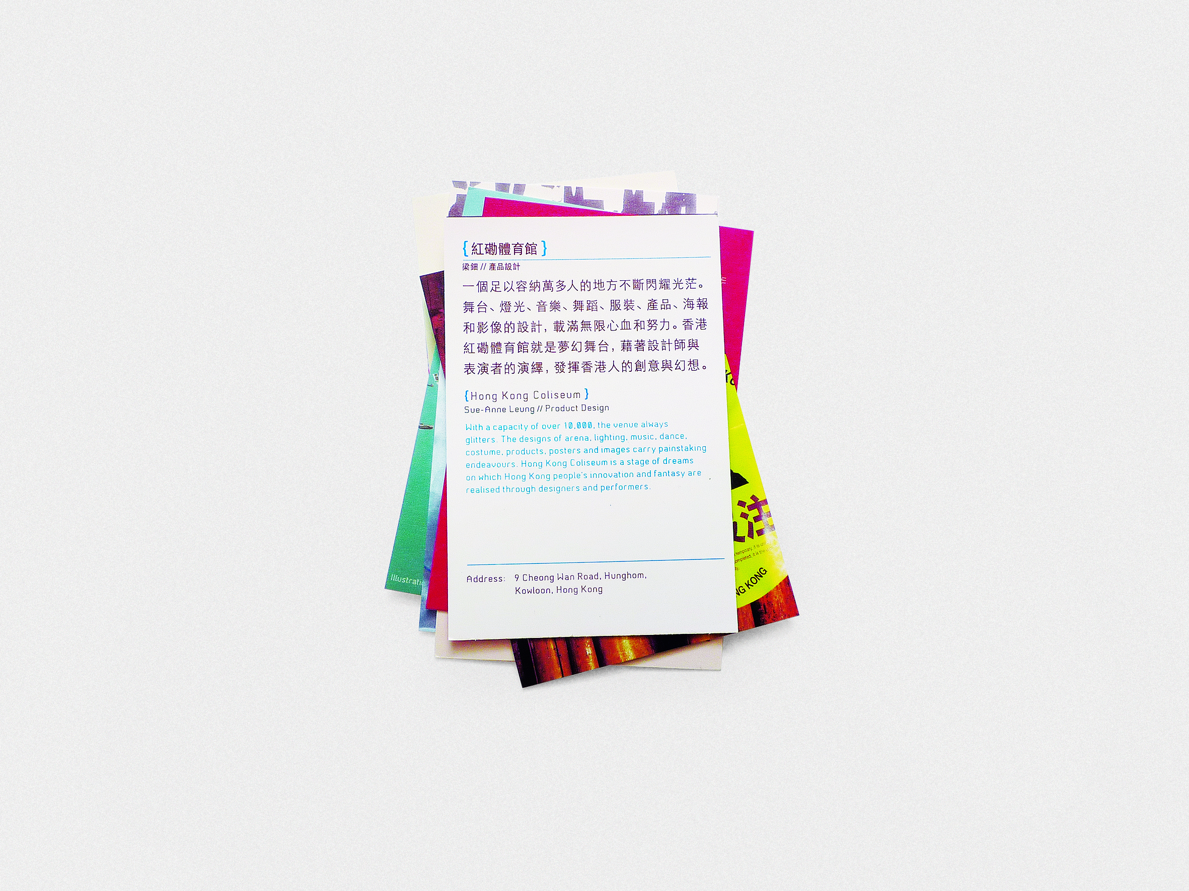
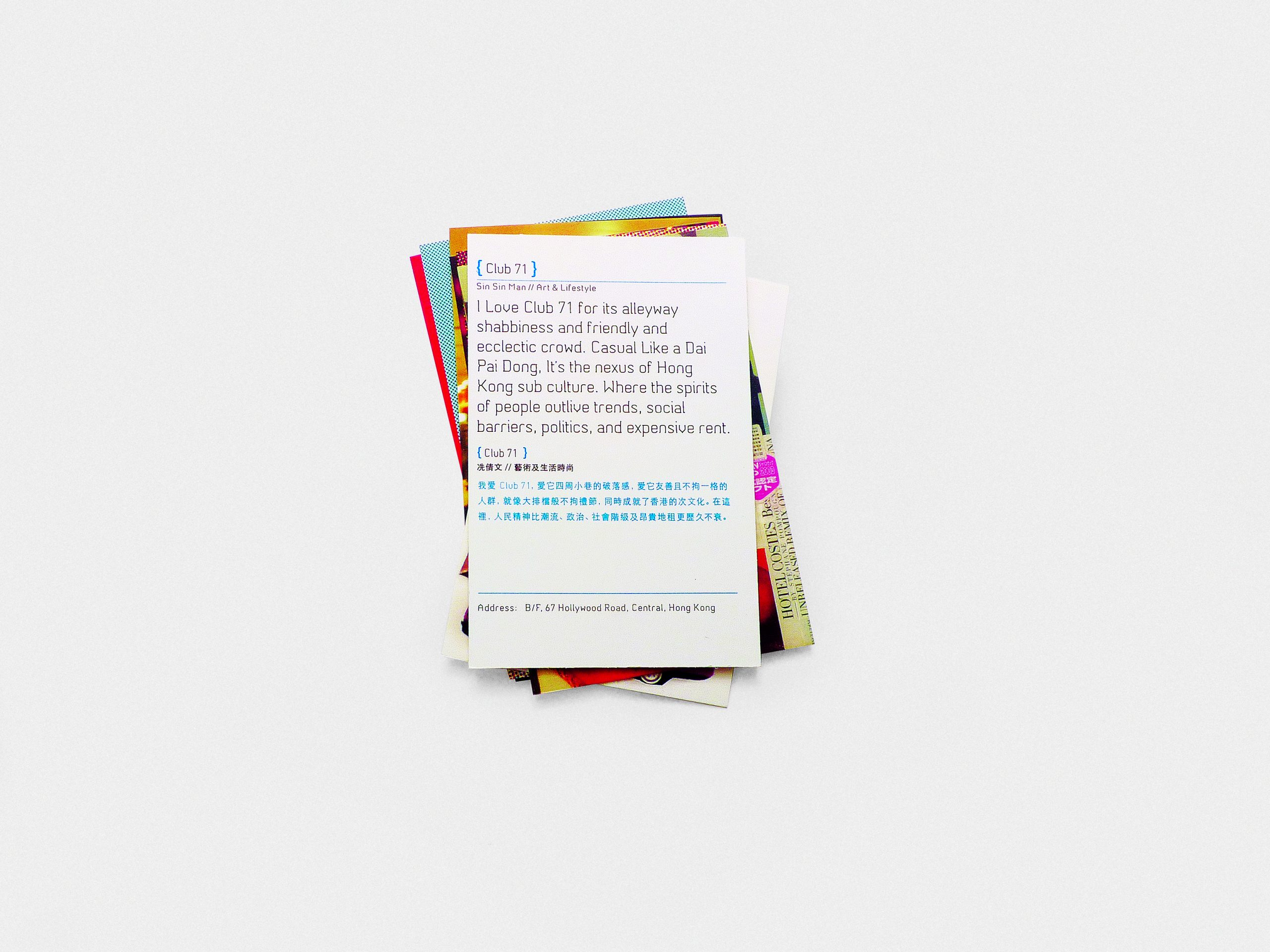
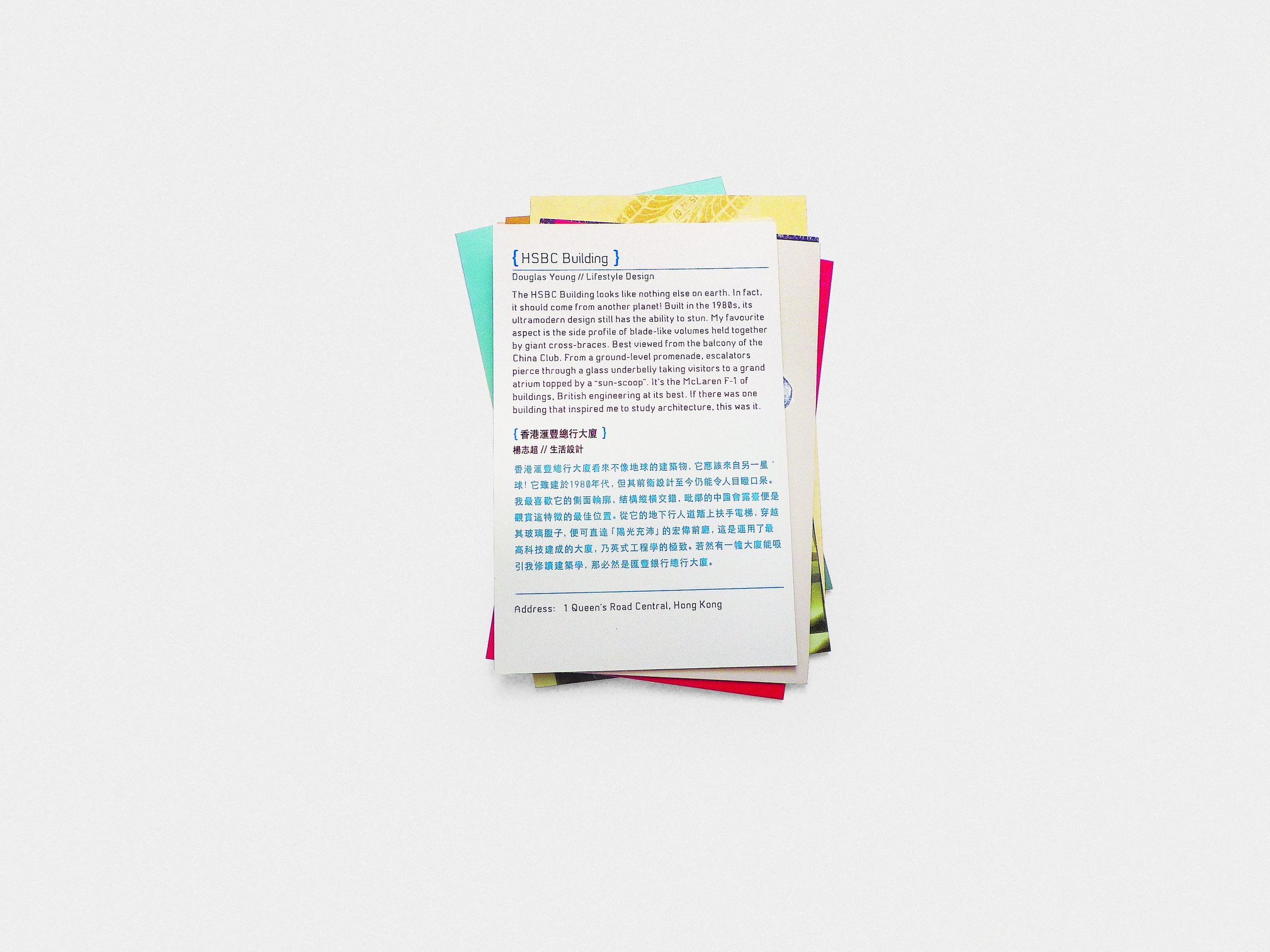
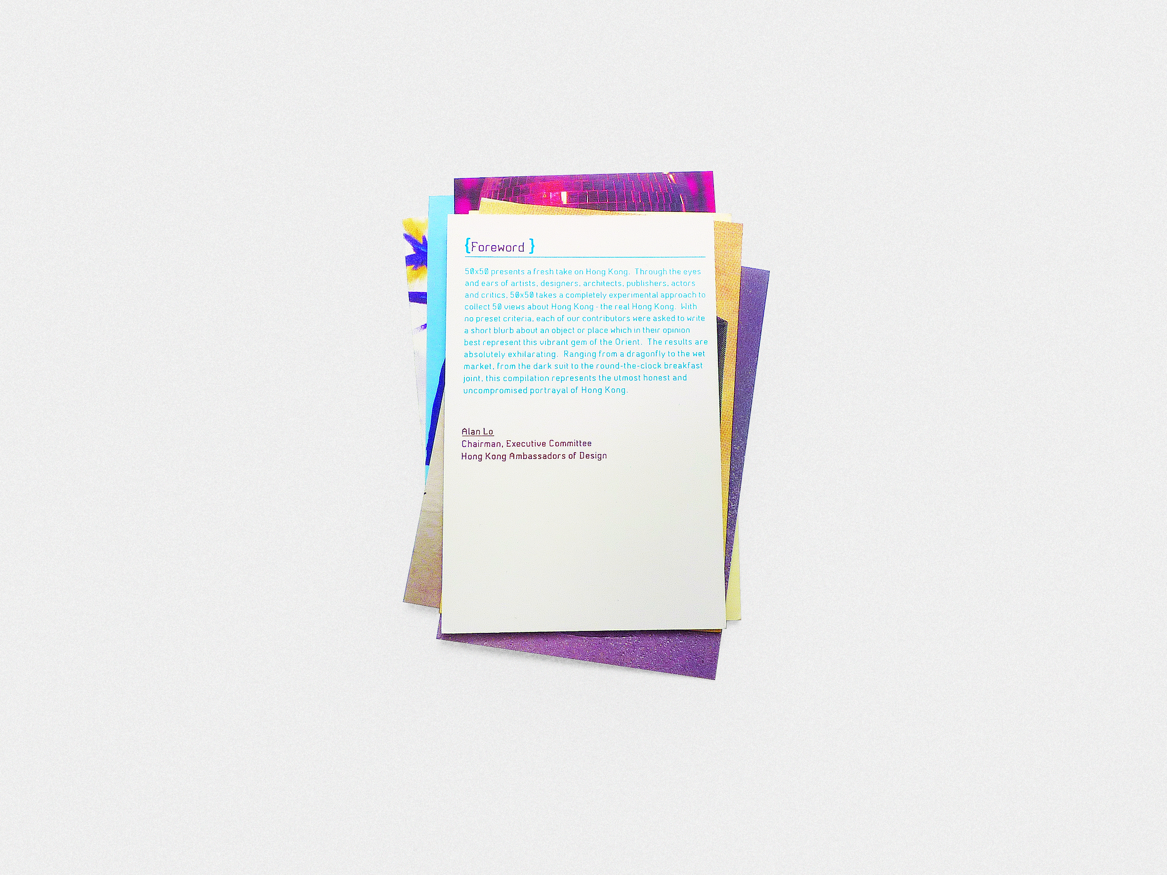
50×50 offers a fresh perspective on Hong Kong by presenting 50 unique interpretations of the city through the eyes of artists, designers, architects, publishers, actors, and critics. Each contributor selected an object or place that, in their view, best represents the authentic spirit of Hong Kong. The result is an exhilarating and honest compilation of stories ranging from dragonflies to wet markets and breakfast joints, showcasing the vibrant diversity of the city.
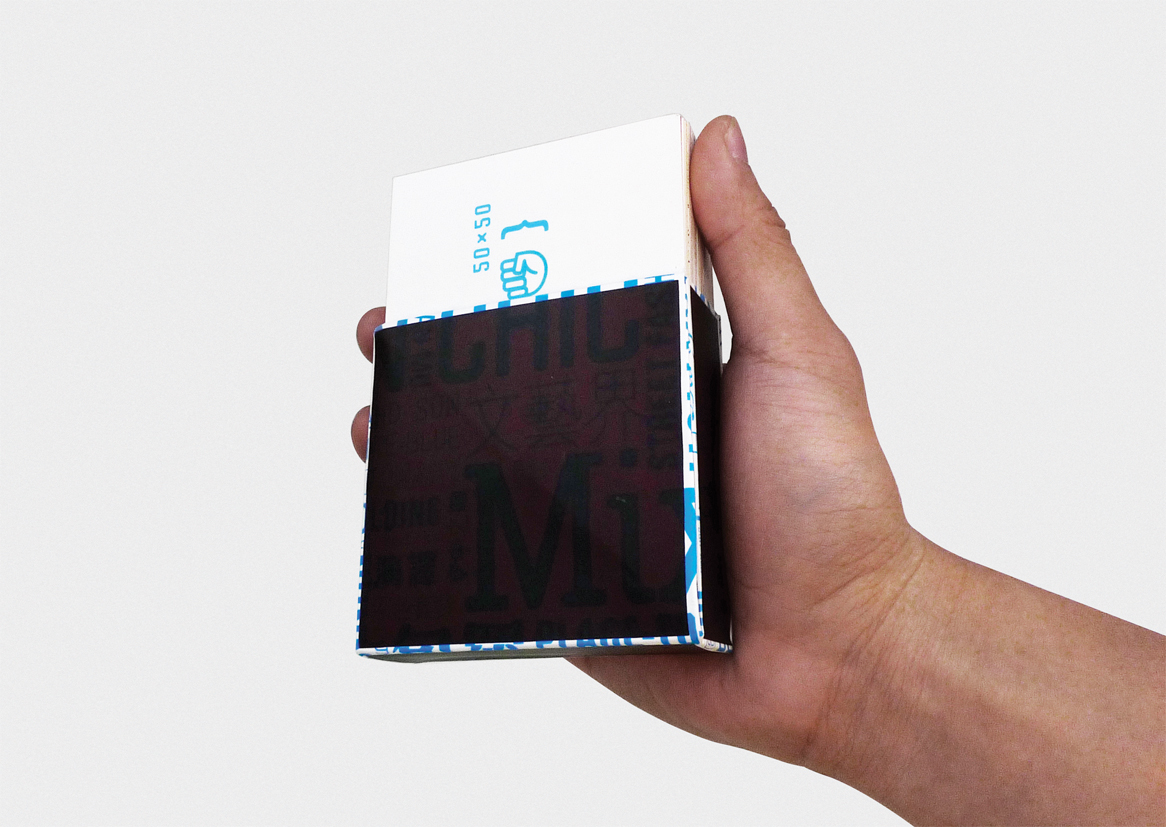
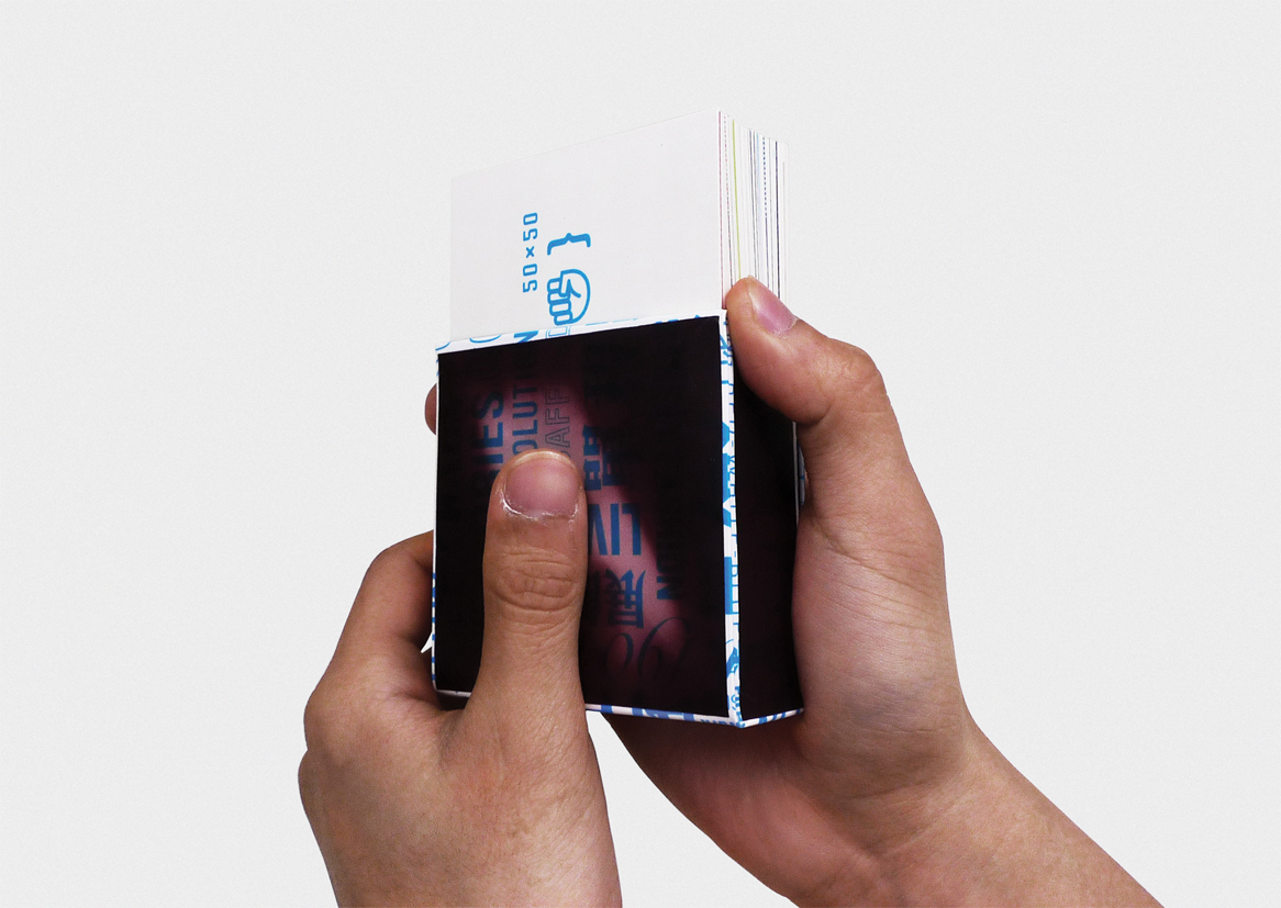
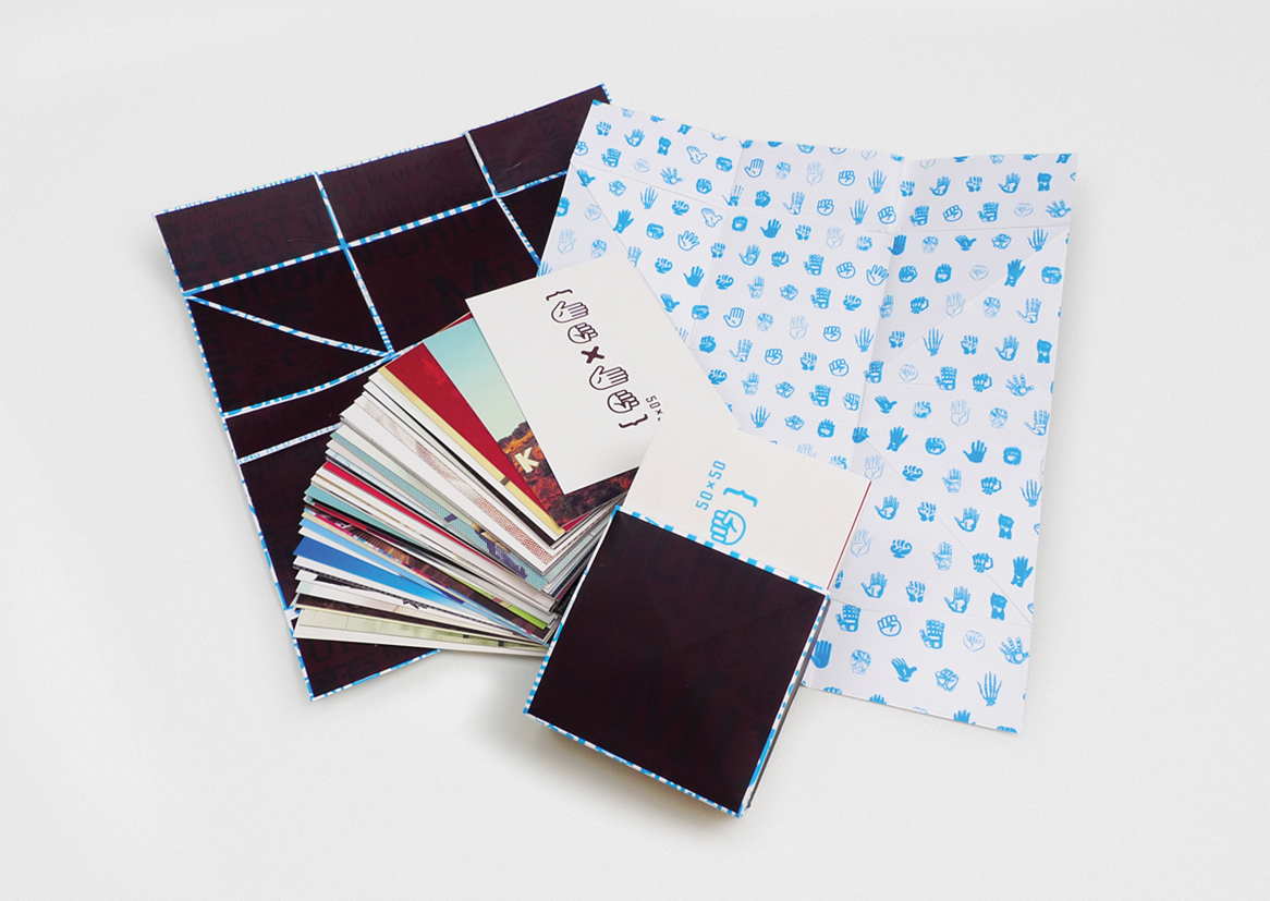
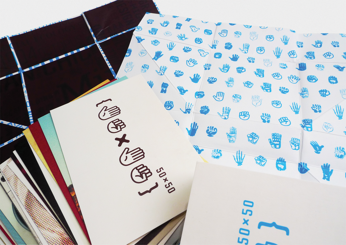
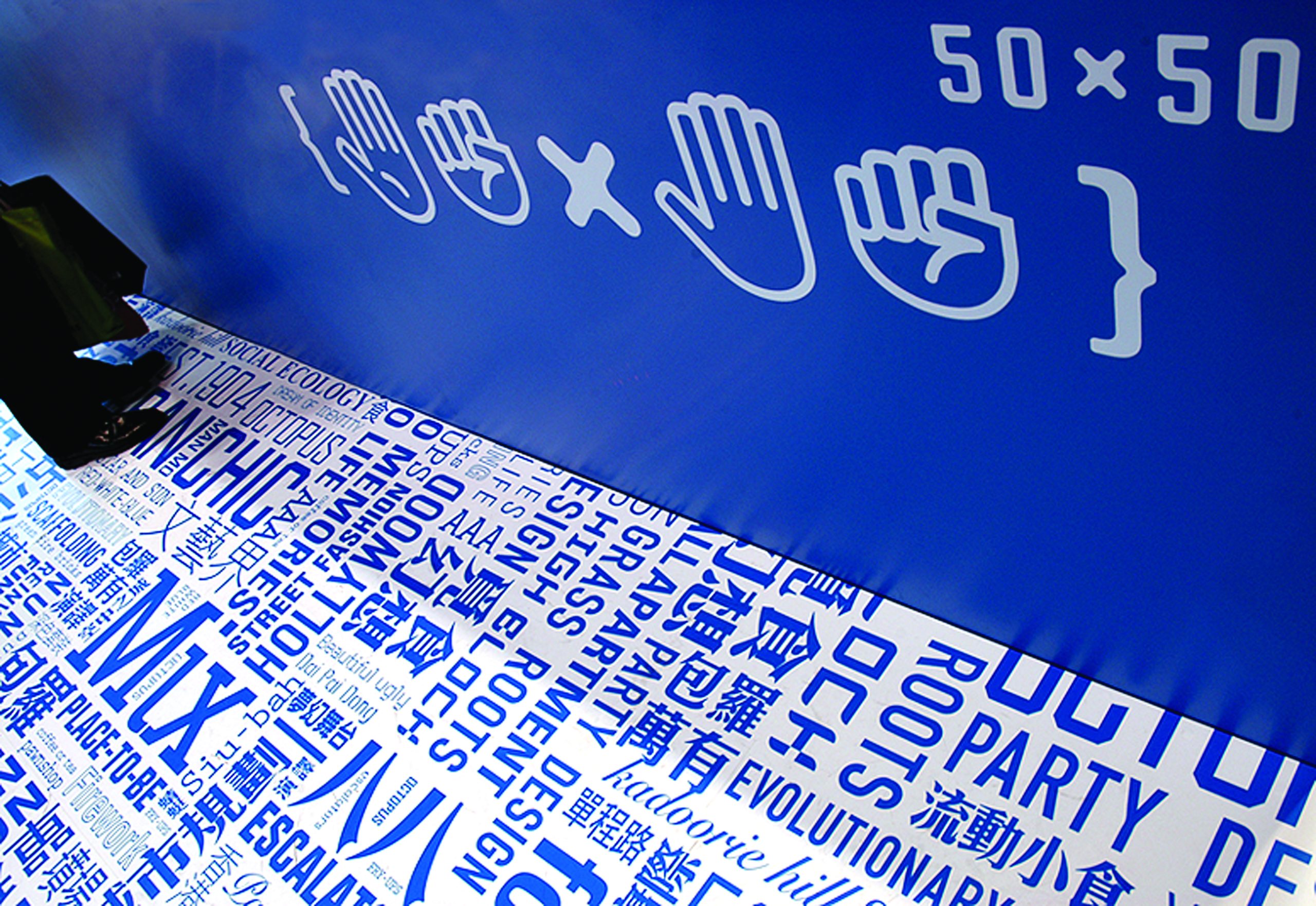
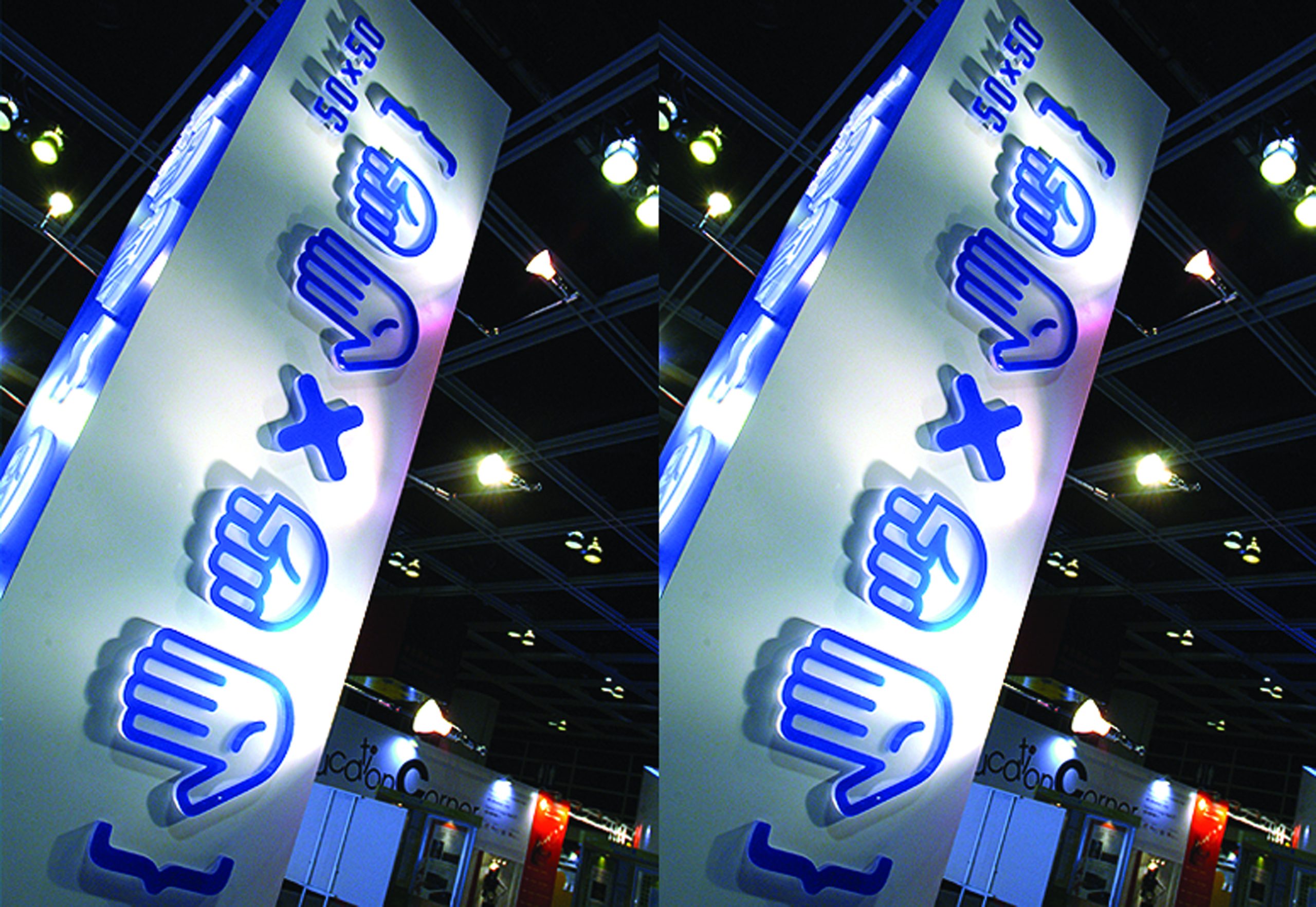
The branding for 50×50 incorporates playful hand gestures of “5” and “0,” reminiscent of childhood games like “15, 20,” to add an element of fun. The packaging features thermochromic ink that reveals hidden text when held, symbolising discovery. Inside, hand illustrations of various styles represent the individuality of the 50 perspectives.
A custom typeface was developed to give the text content a distinctive identity, and visual interpretations were crafted for most of the entries to add layers of engagement and creativity. The thermochromic ink packaging not only surprises users but also reinforces the theme of exploration and discovery.


rchitect")