HKMDC
Founded in 1989, the Hong Kong Mould & Die Council (MDC) embarked on a rebranding initiative in 2024 to inject new energy and dynamism into its image.
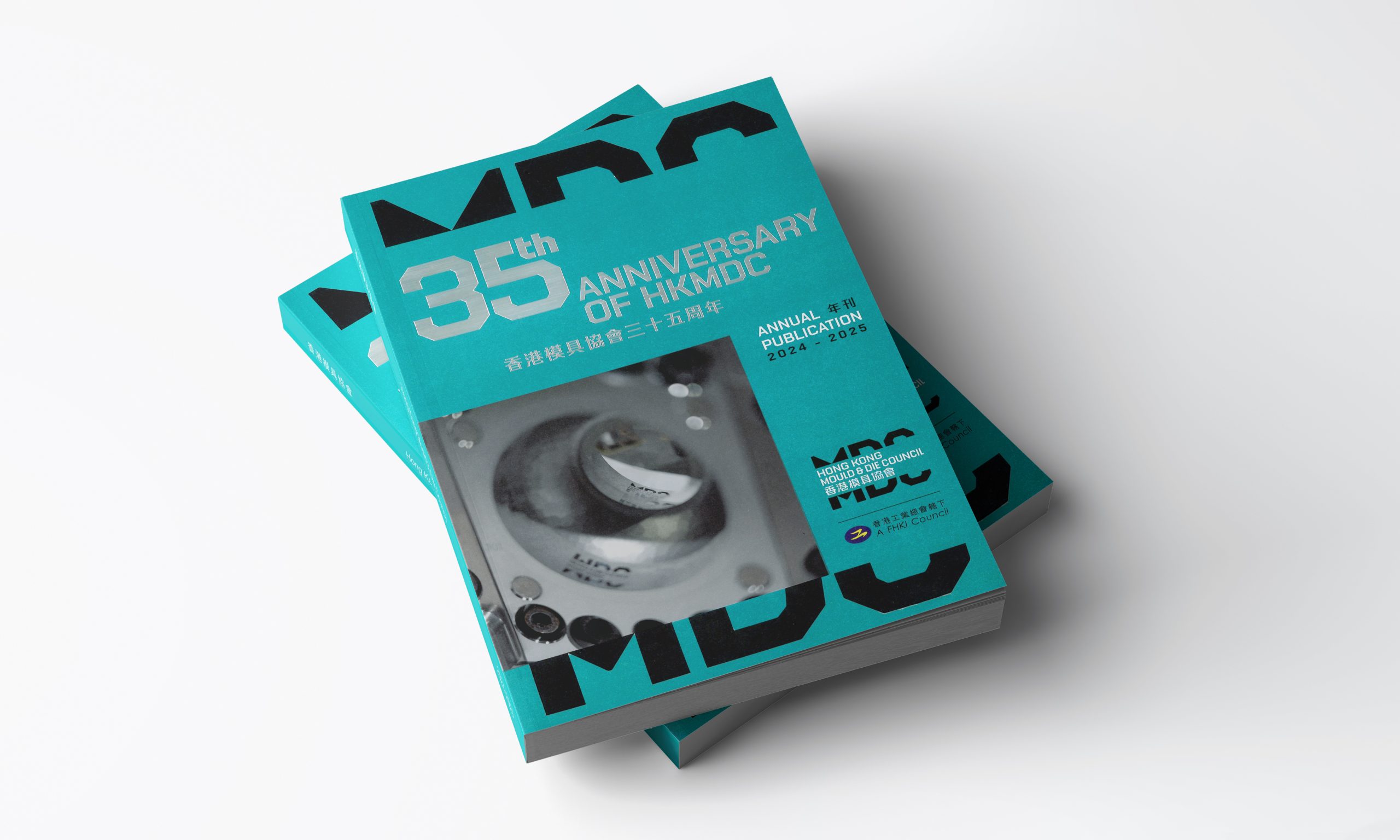
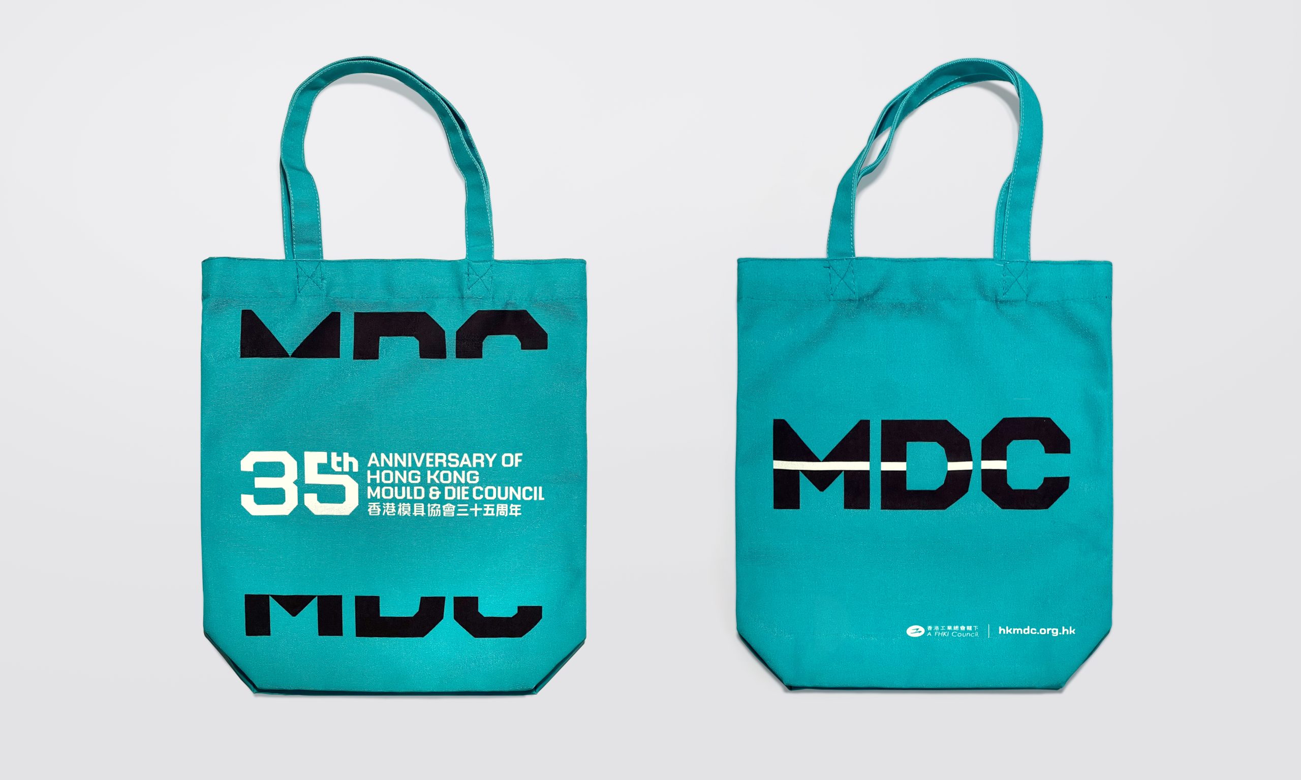
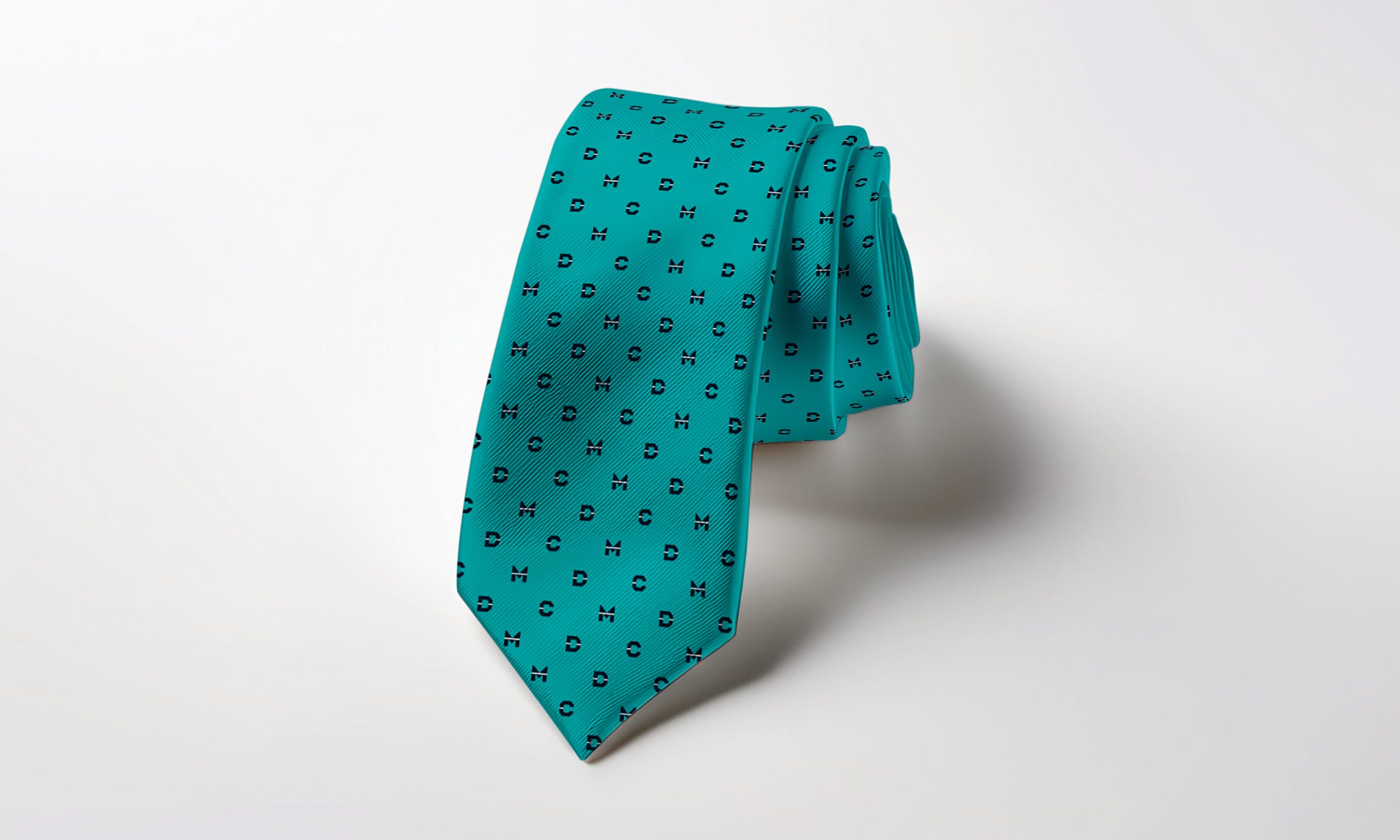
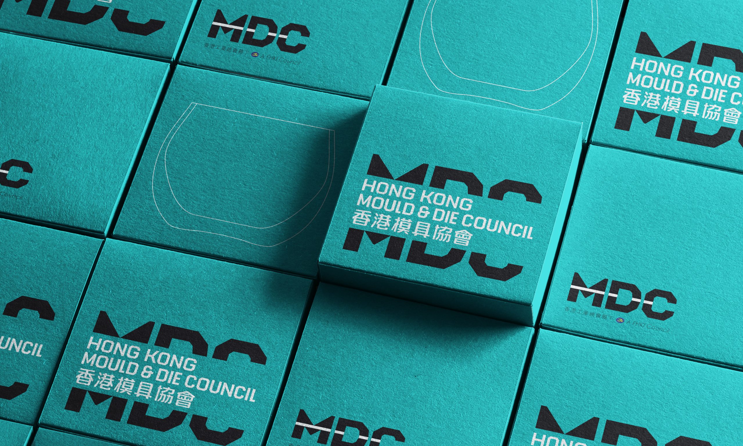
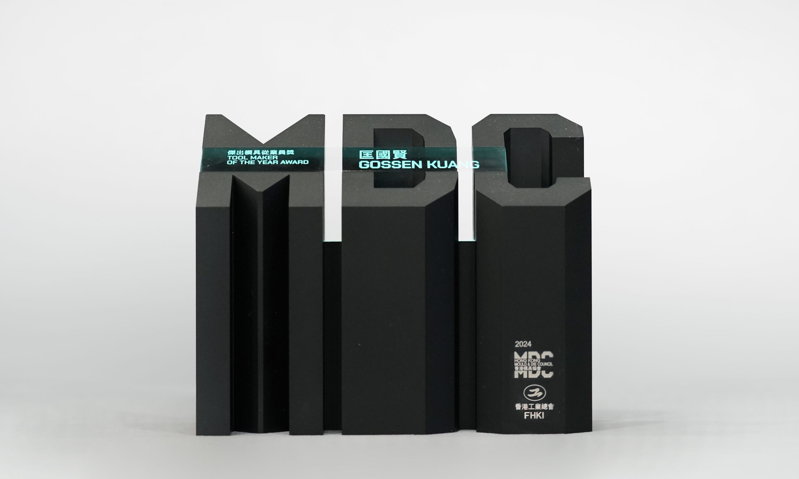
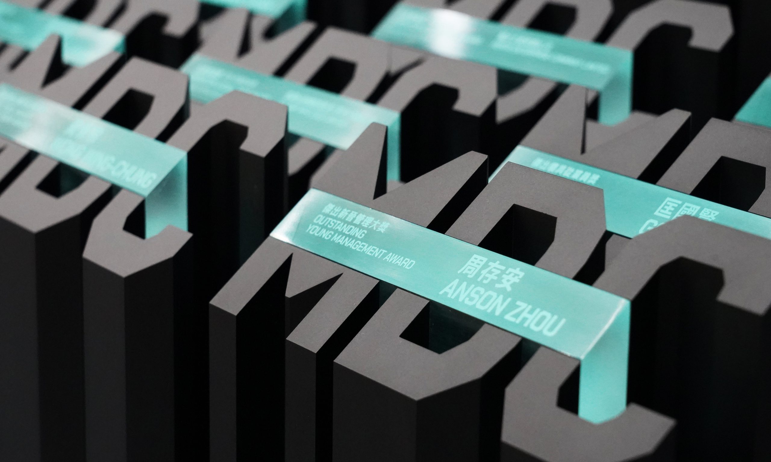
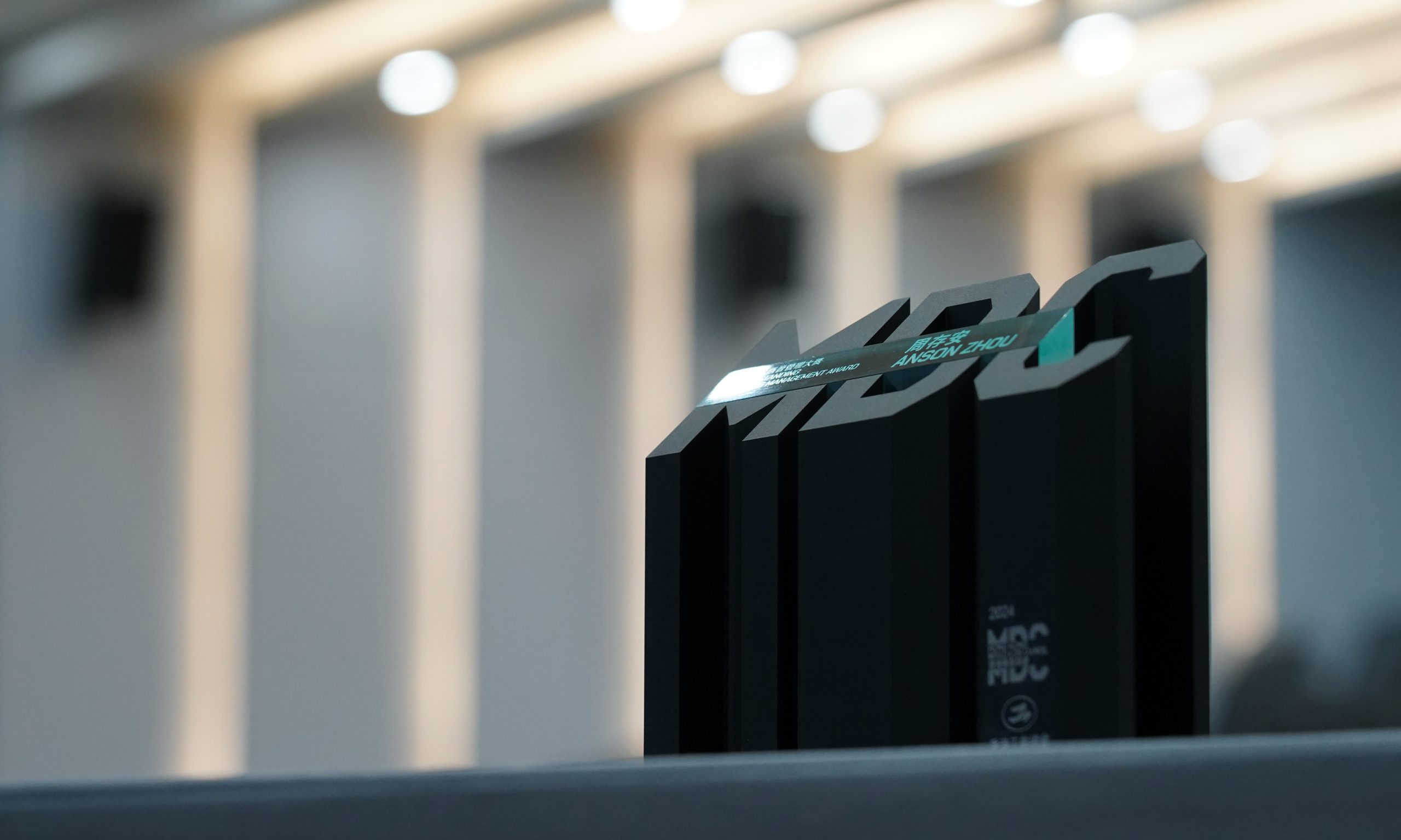
Inspired by the core function of the industry, the new brand identity centres around the dynamic process of moulding. This is visually represented by the reimagined logo, where the typeface is dynamically divided, mirroring the action of the mould top and bottom coming together.
A vibrant colour bar inserted between the typeface parts symbolises the infinite possibilities inherent in the moulding process. The expanded colour palette reflects the industry’s dynamism and innovation.
The MDC logo, a powerful symbol representing both the act of moulding and a platform for innovation, transcends a static mark. It functions as a dynamic identity system, adapting seamlessly across various applications, from abbreviated versions to impactful poster designs, each iteration conveying a unique message while maintaining brand consistency.