The Pawn
Project by c plus c workshop
-
Logo Design | Stanley Wong
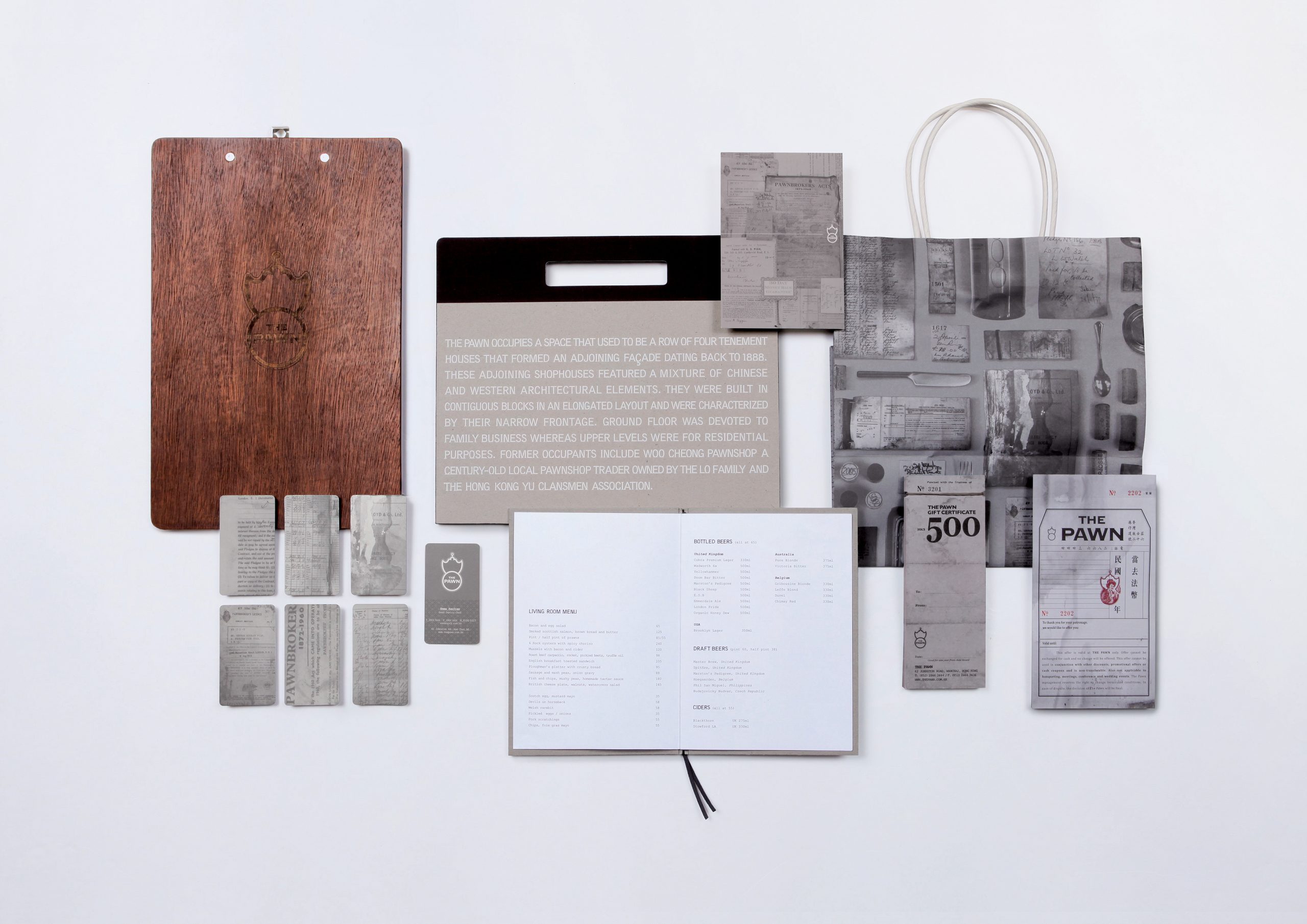
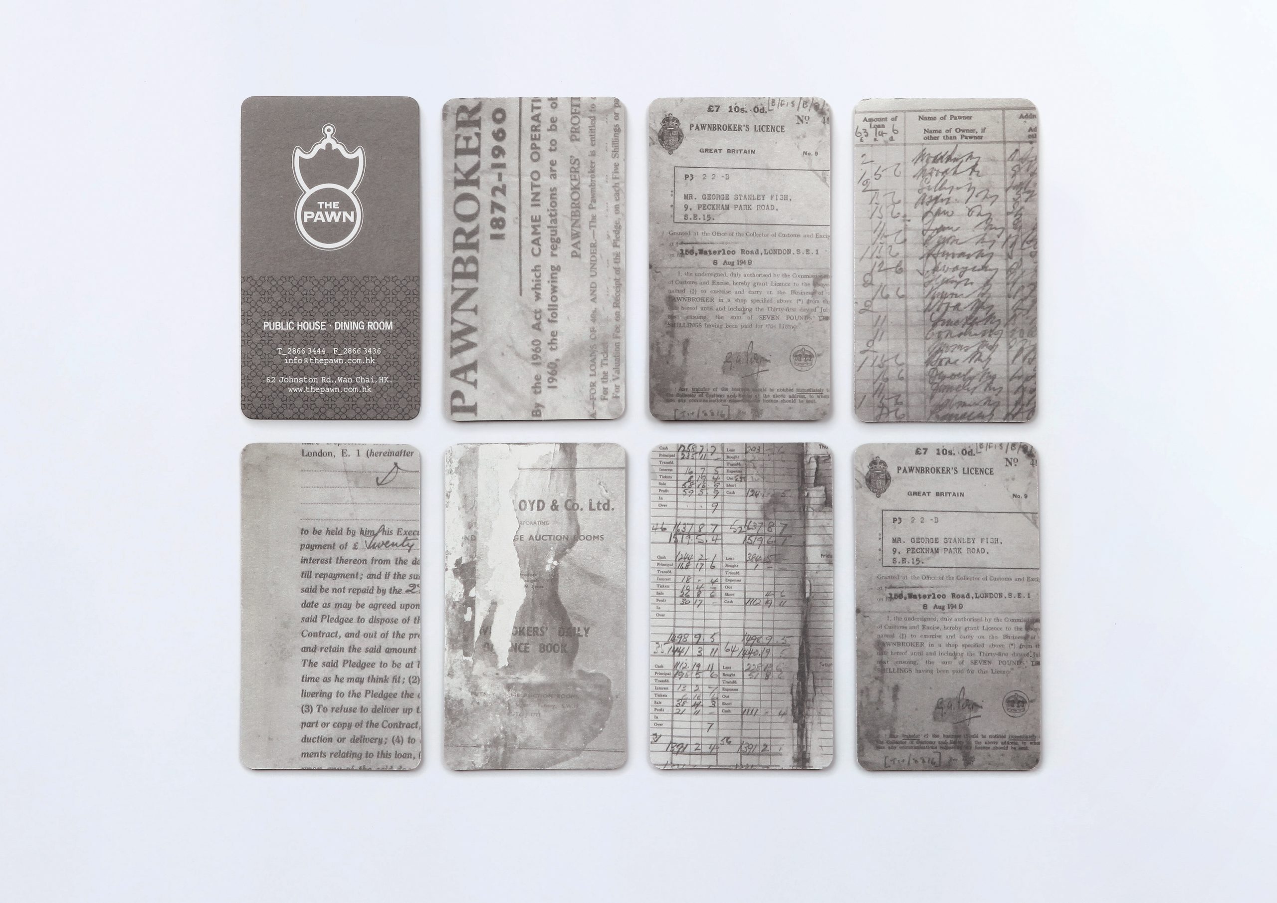
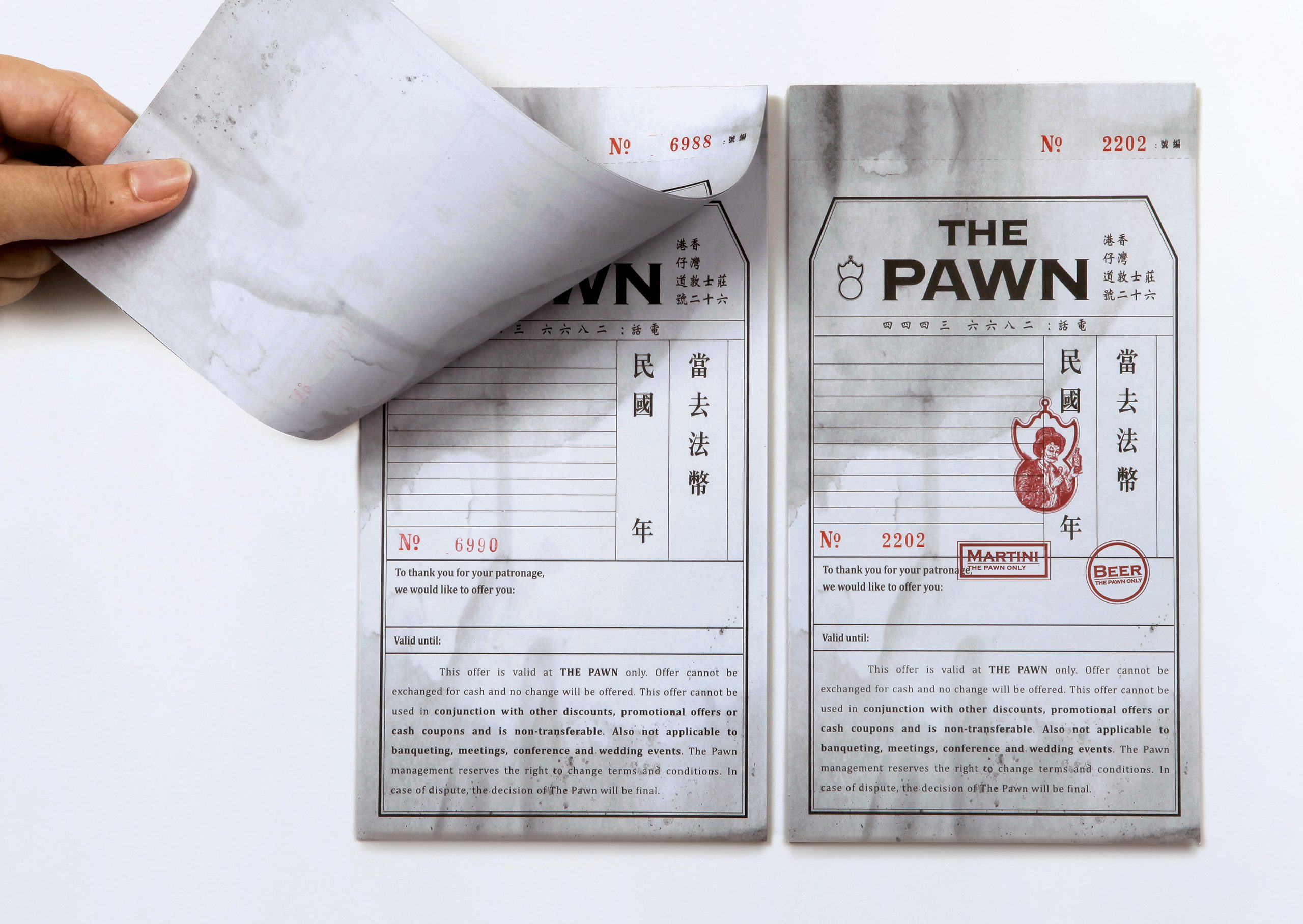
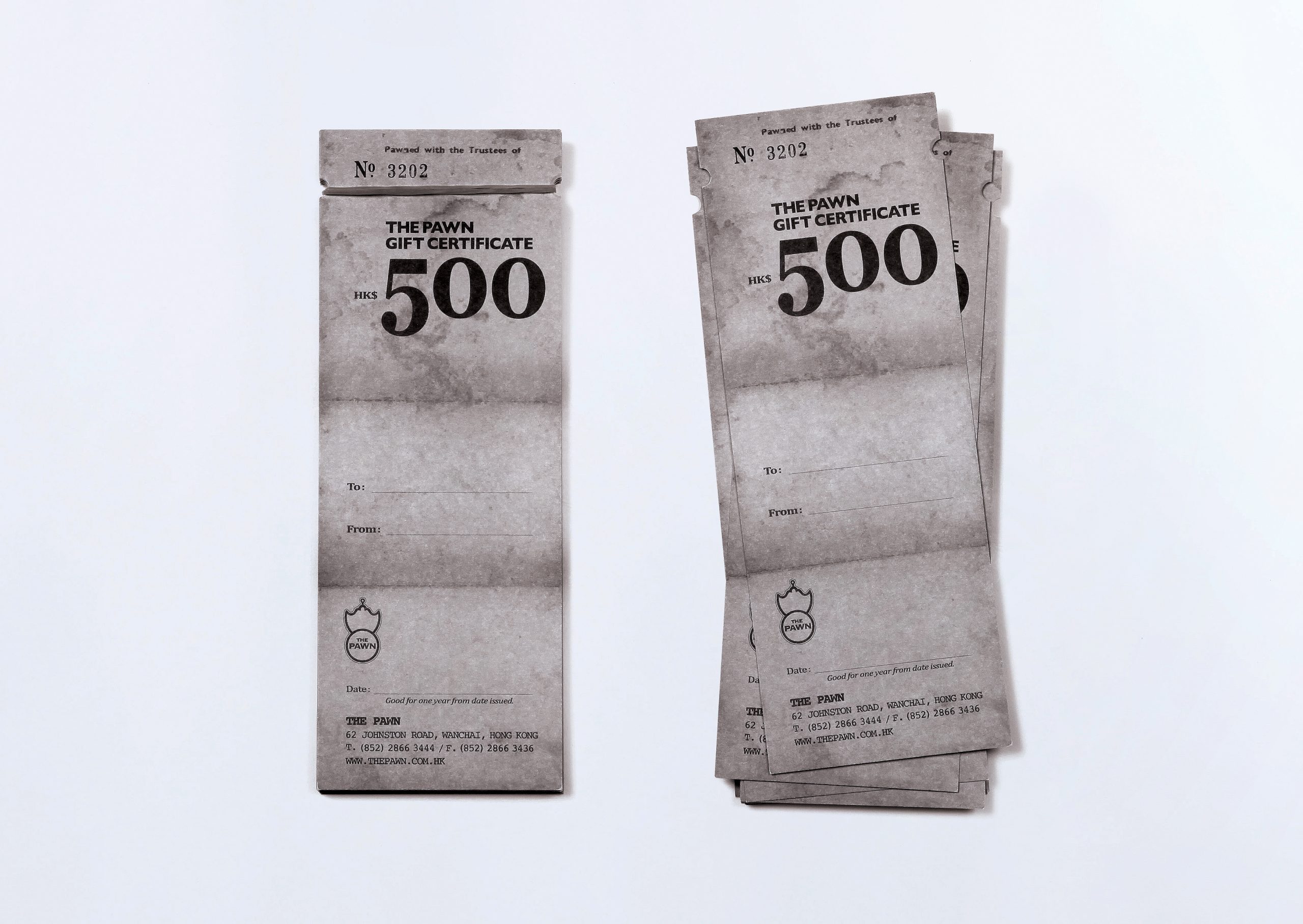
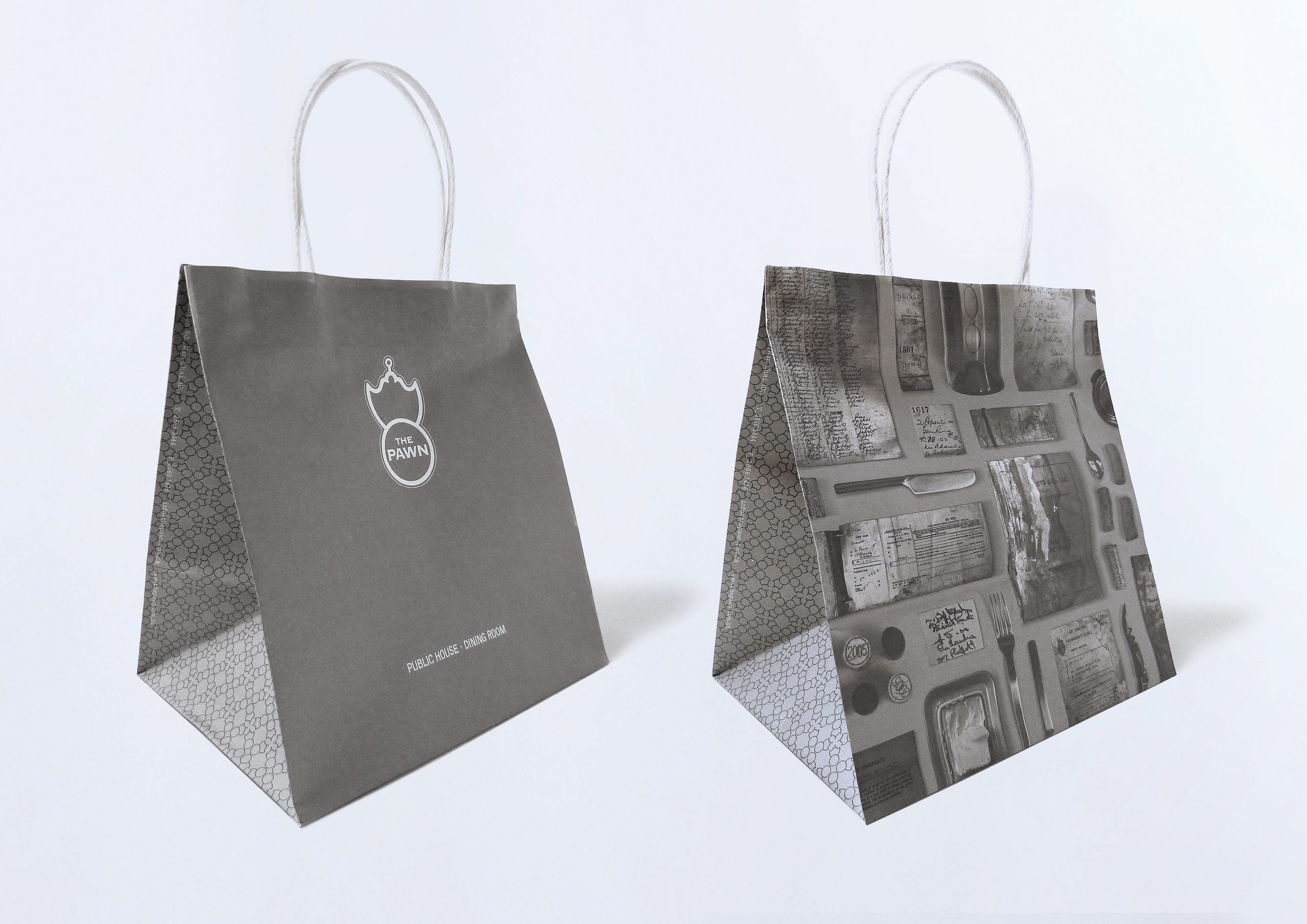
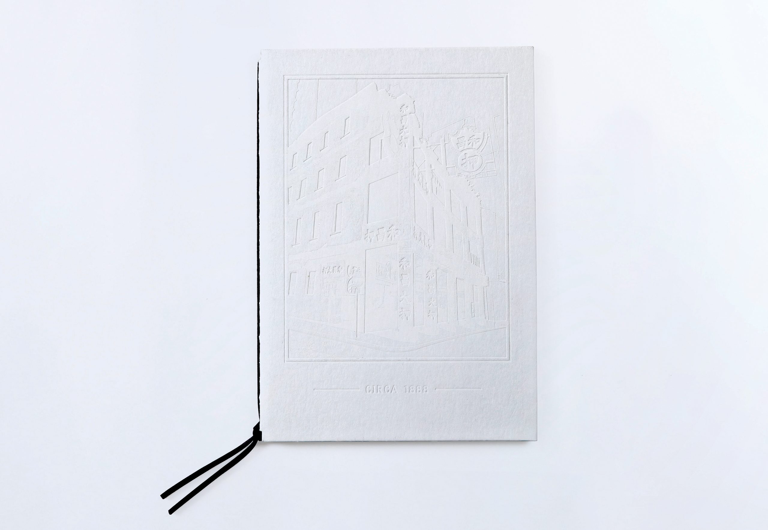
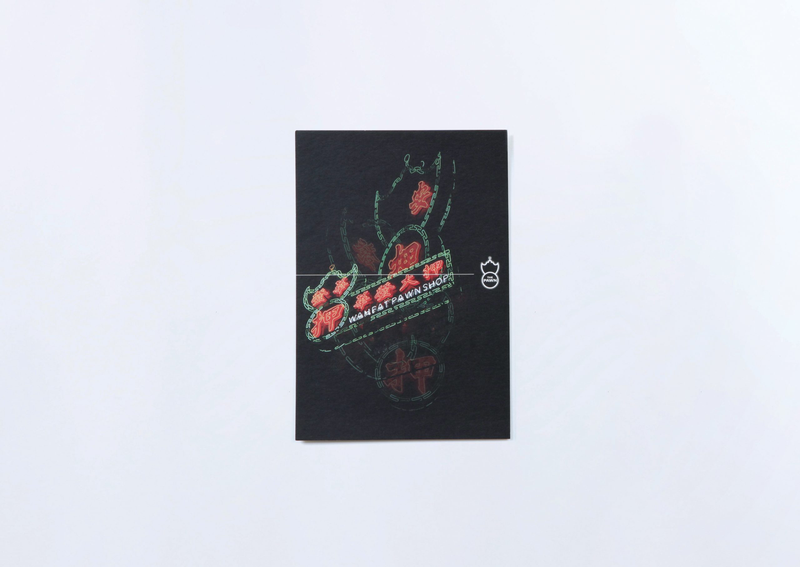
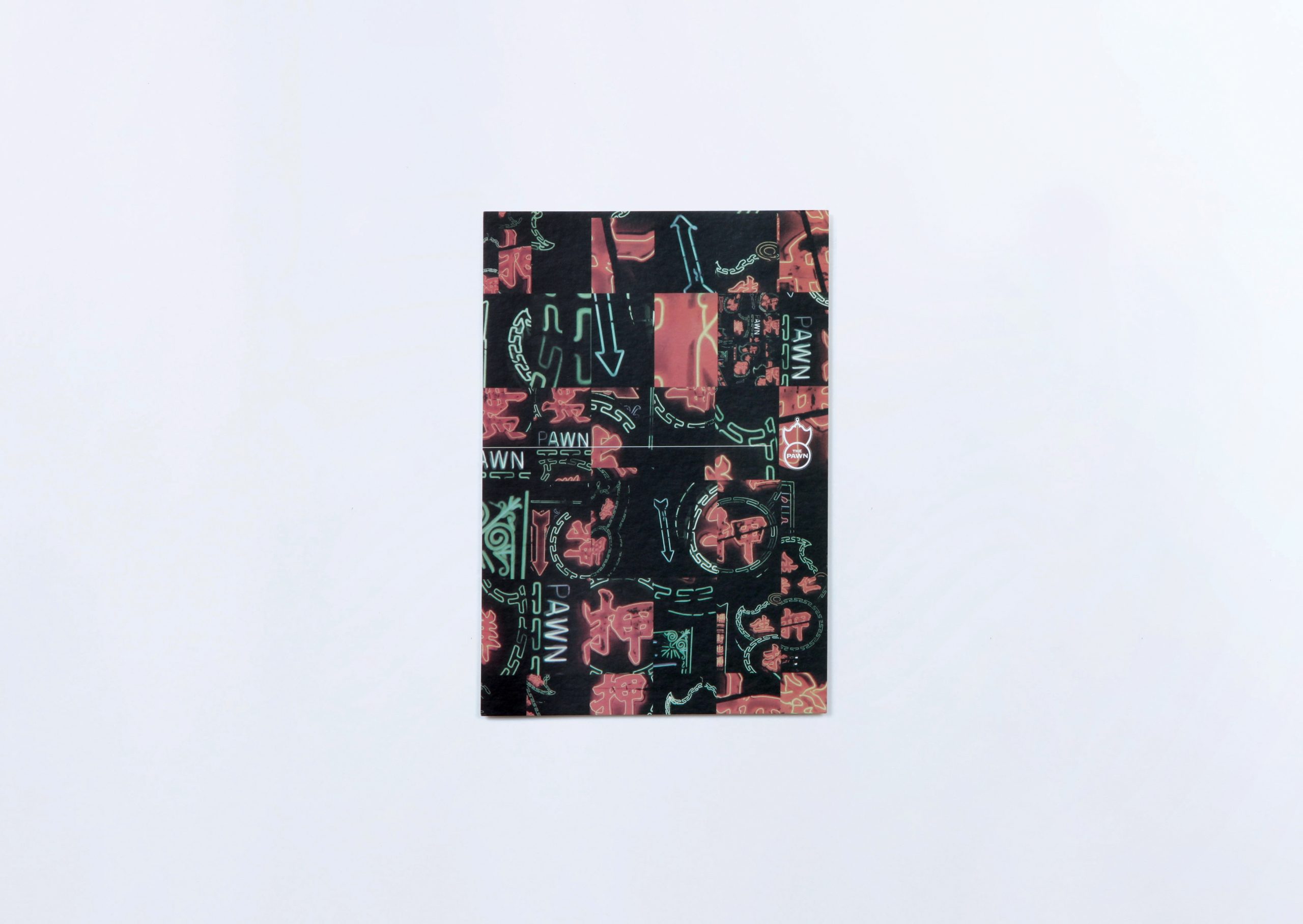
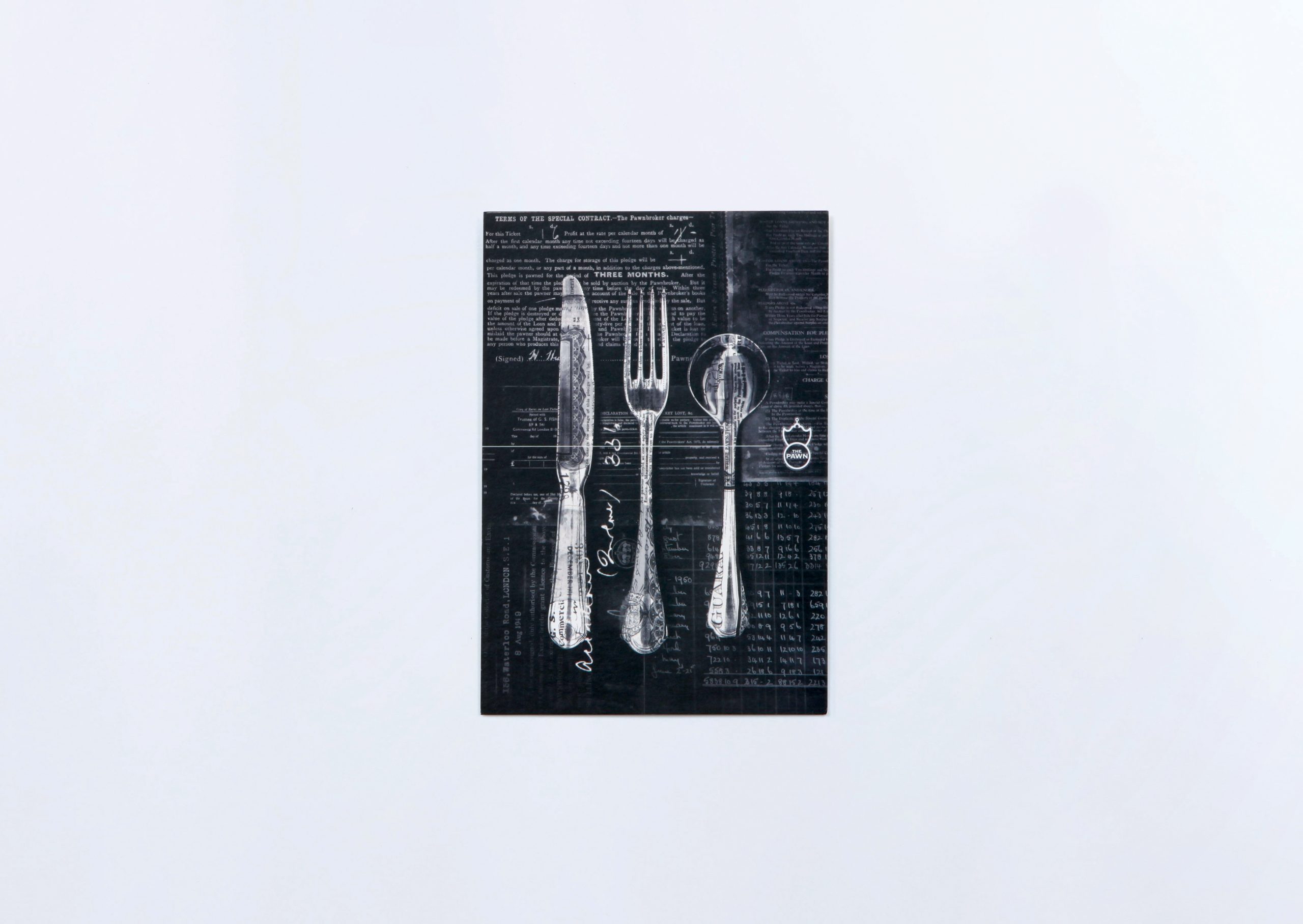
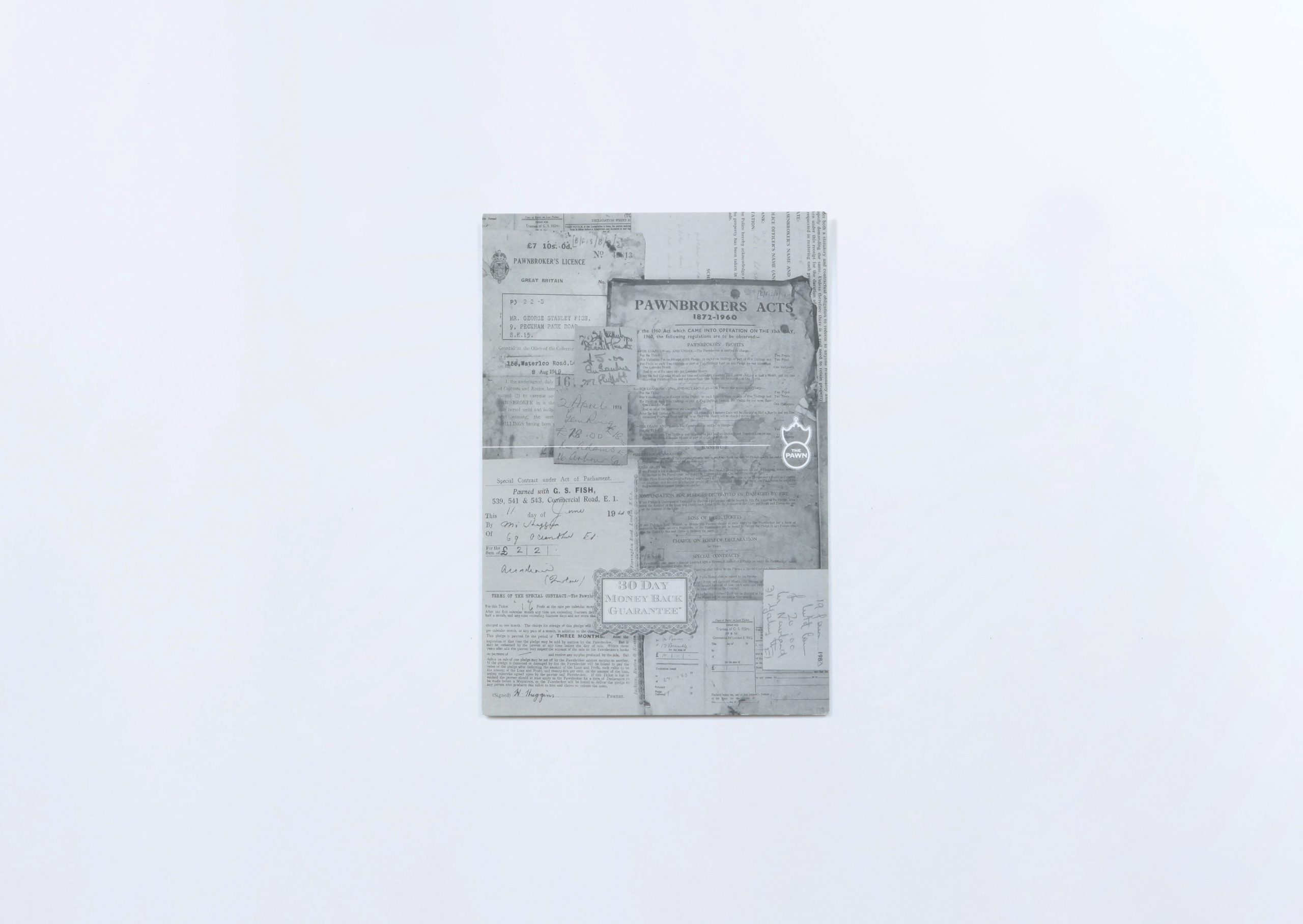
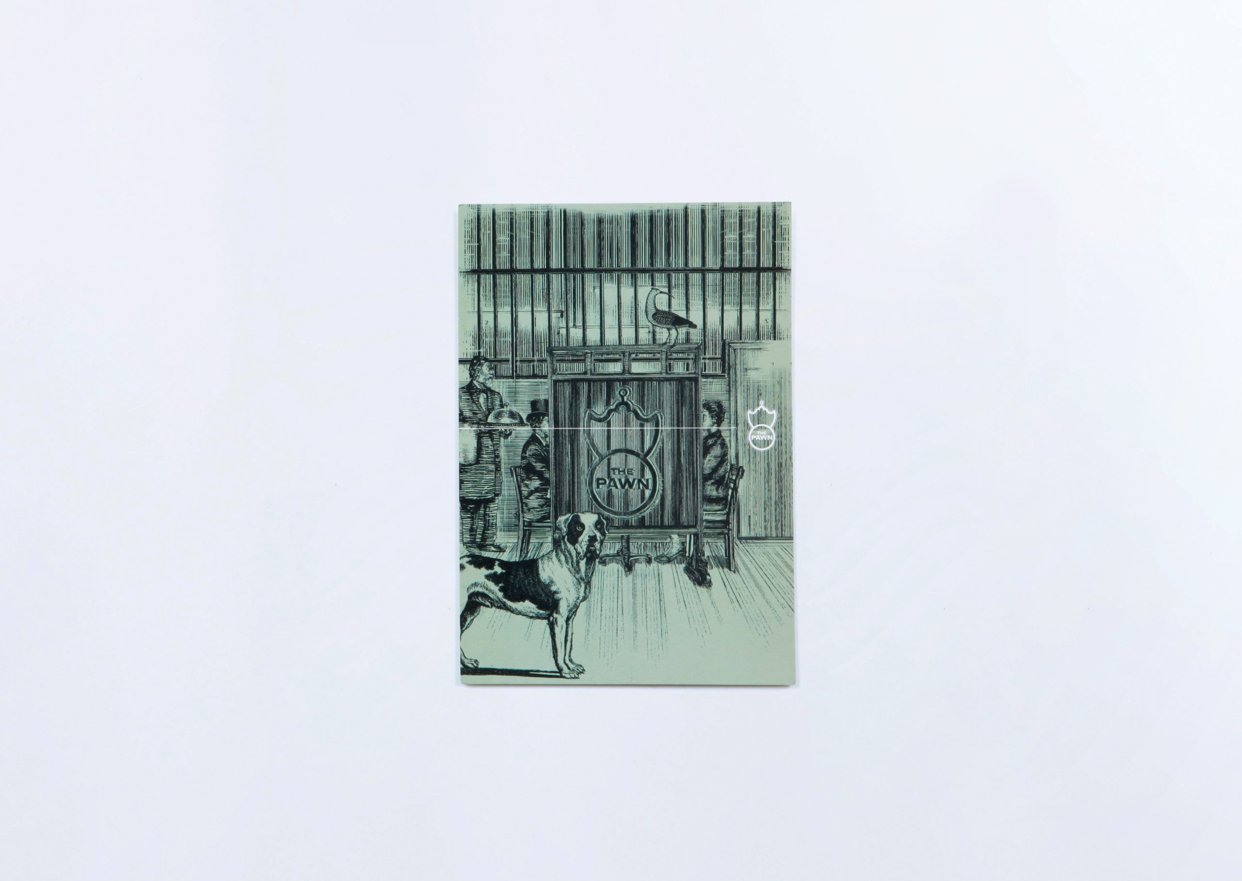
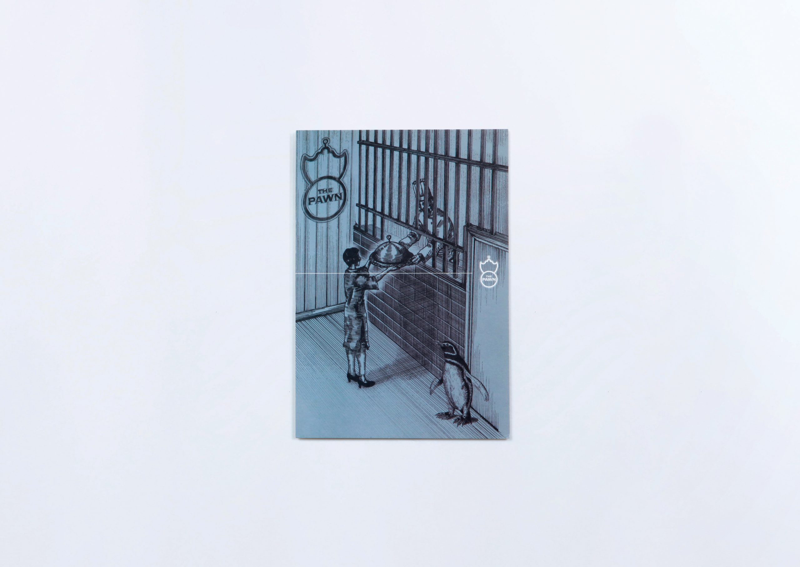
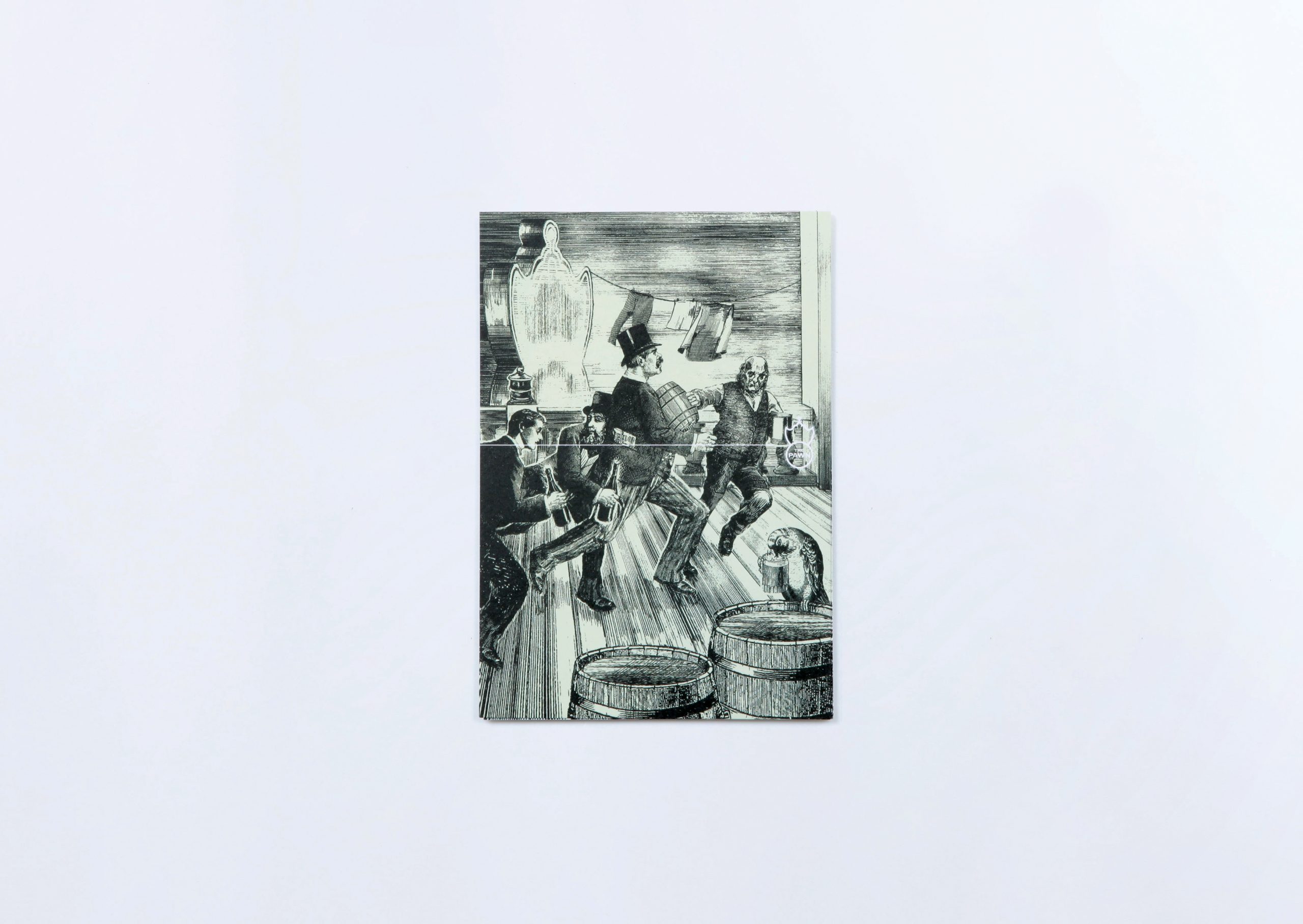
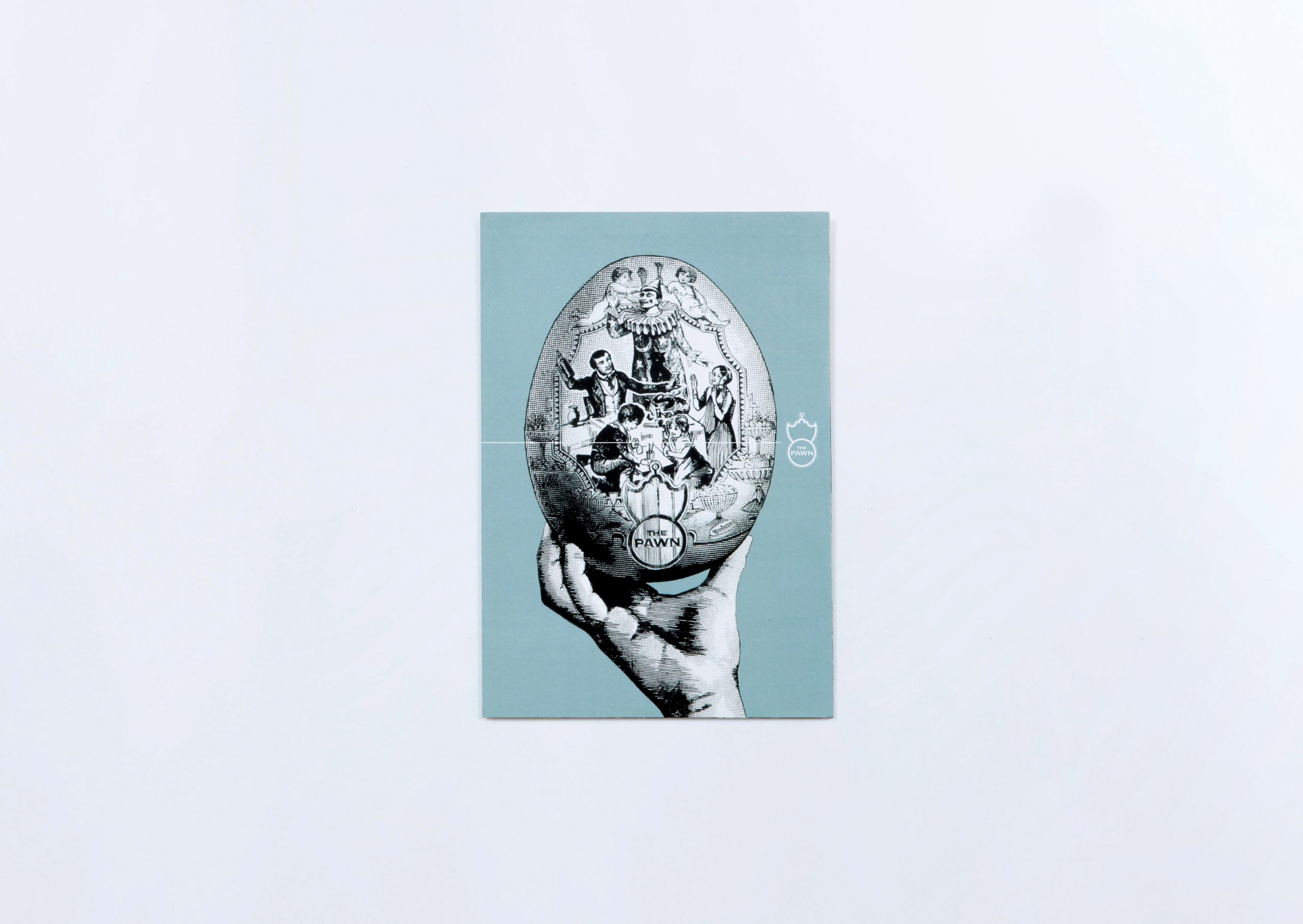
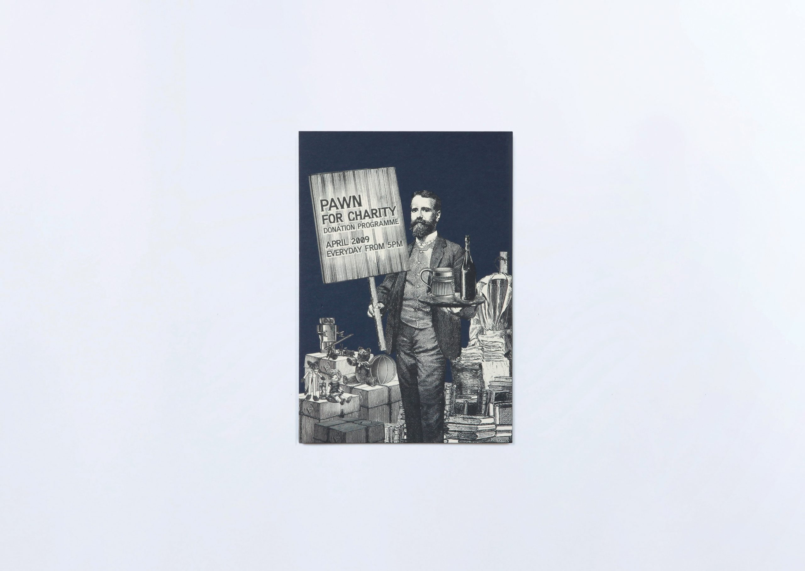
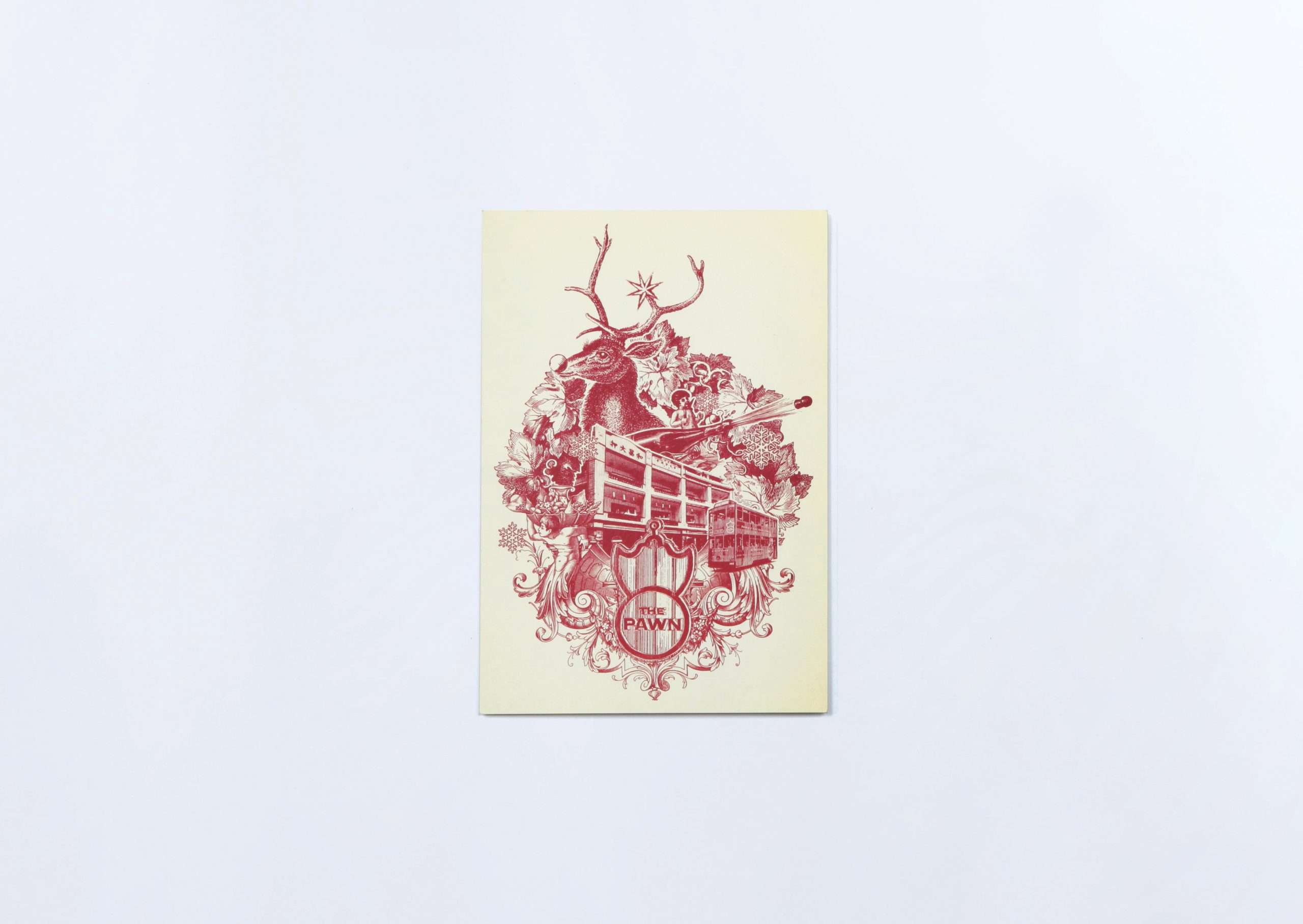
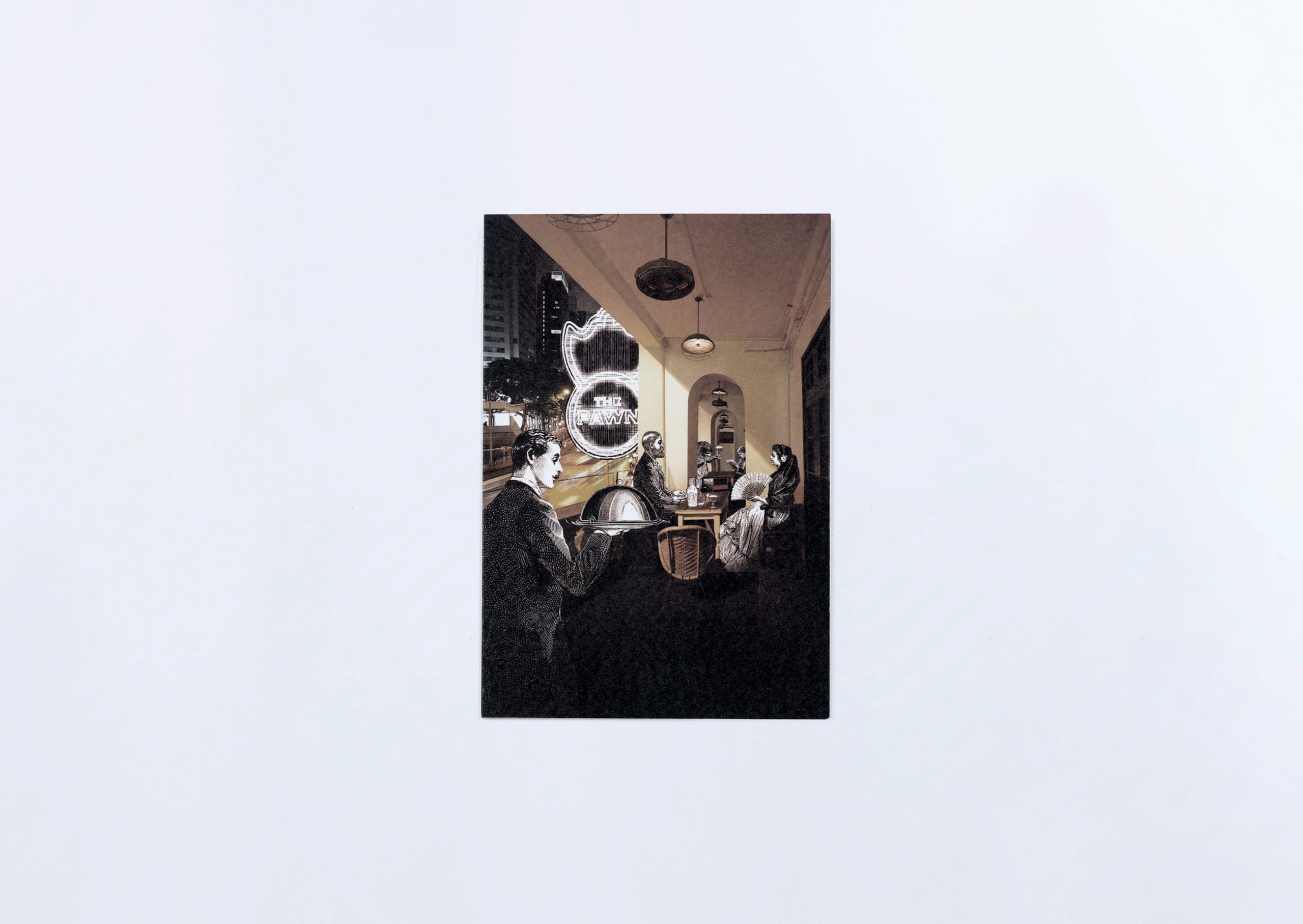
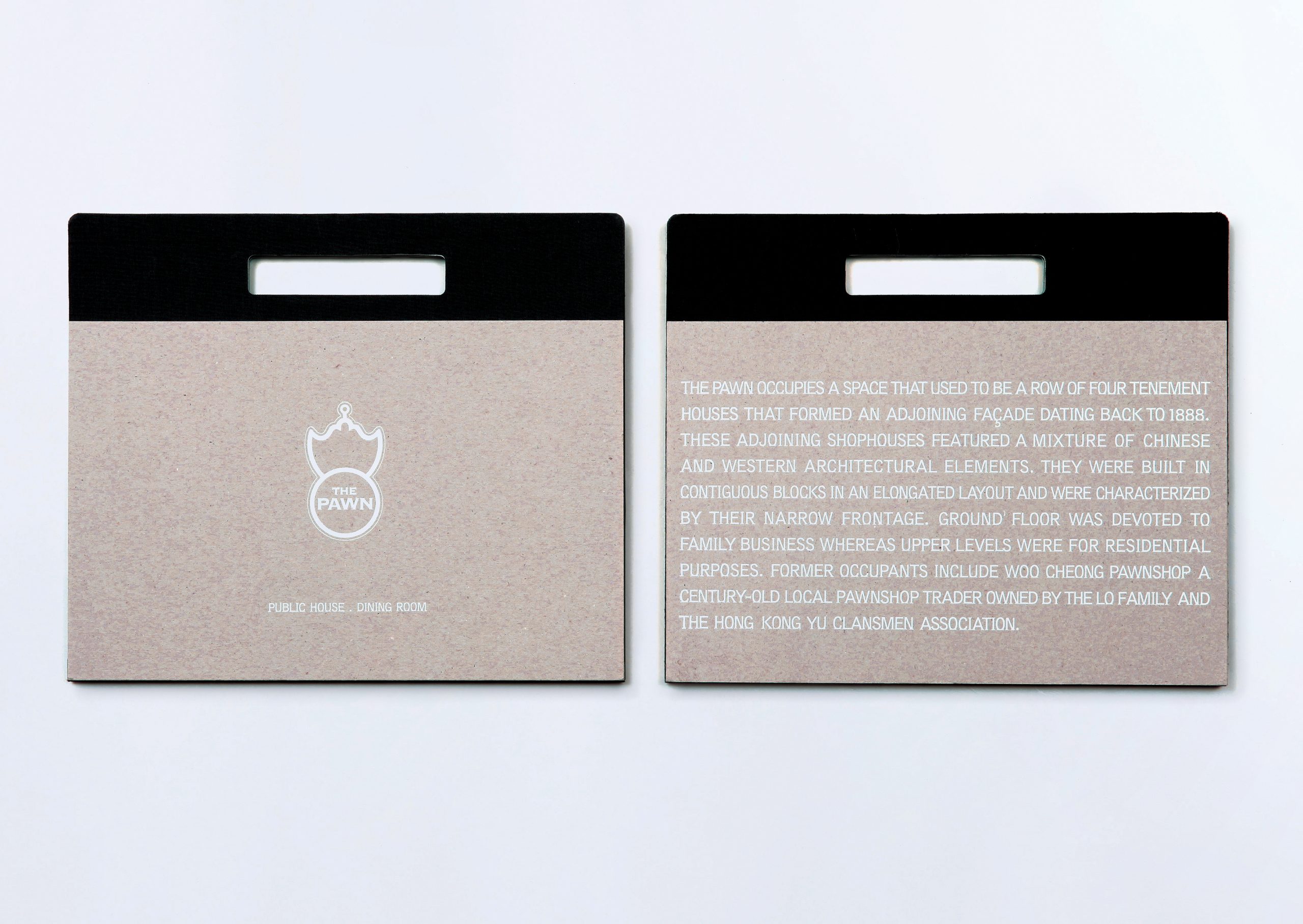
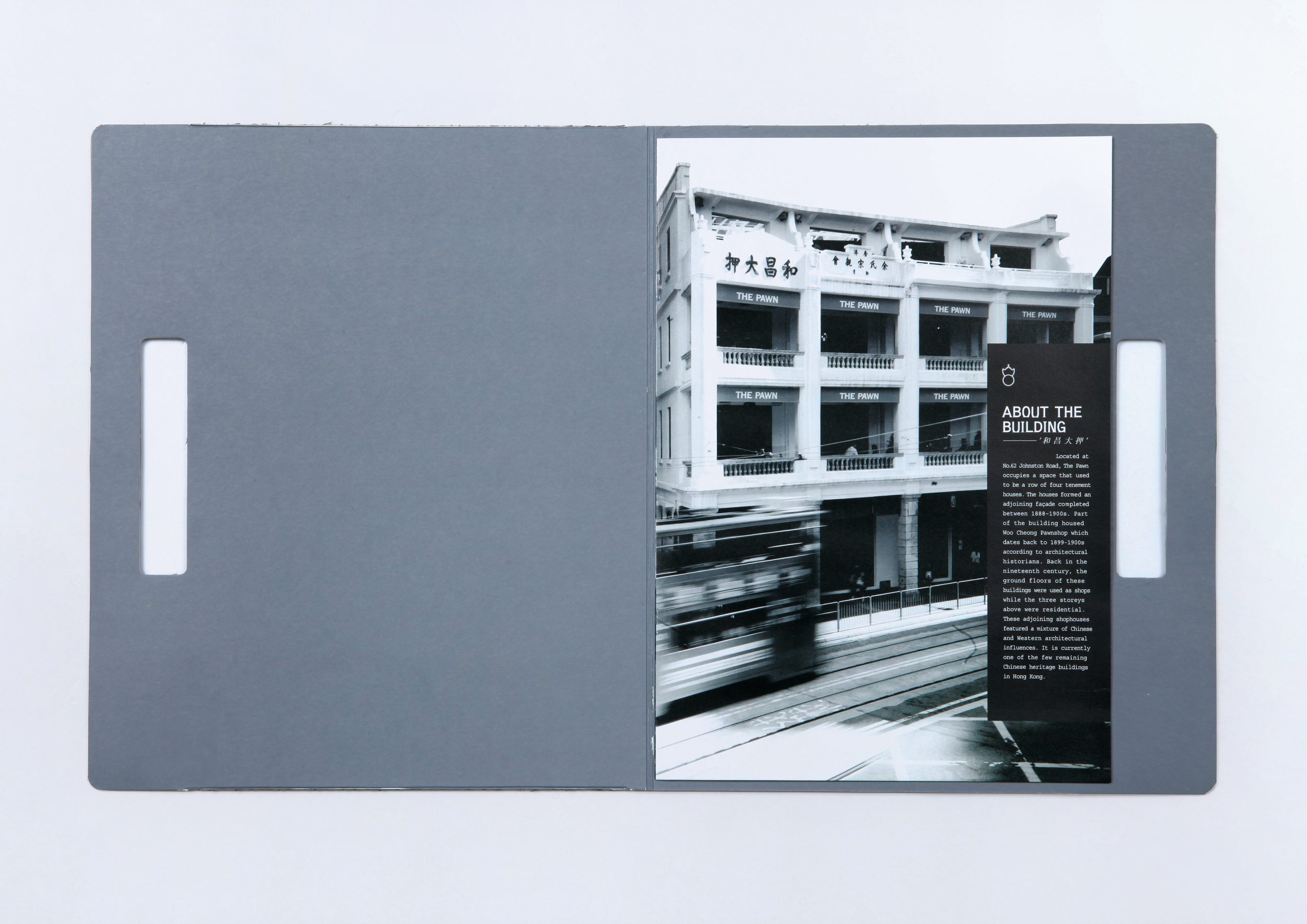
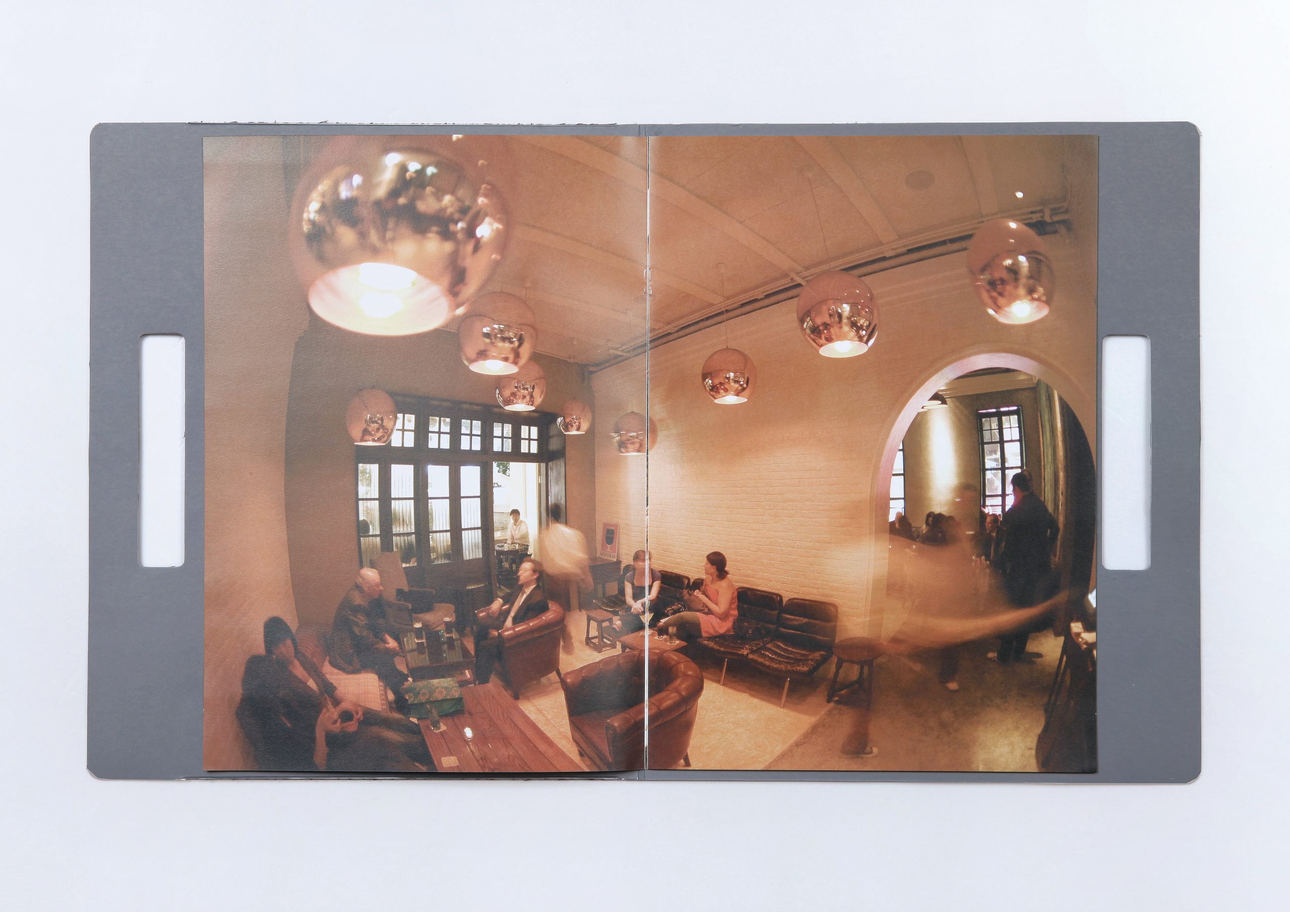
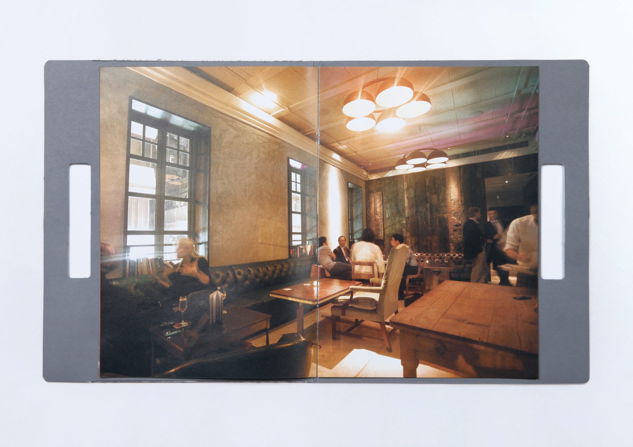
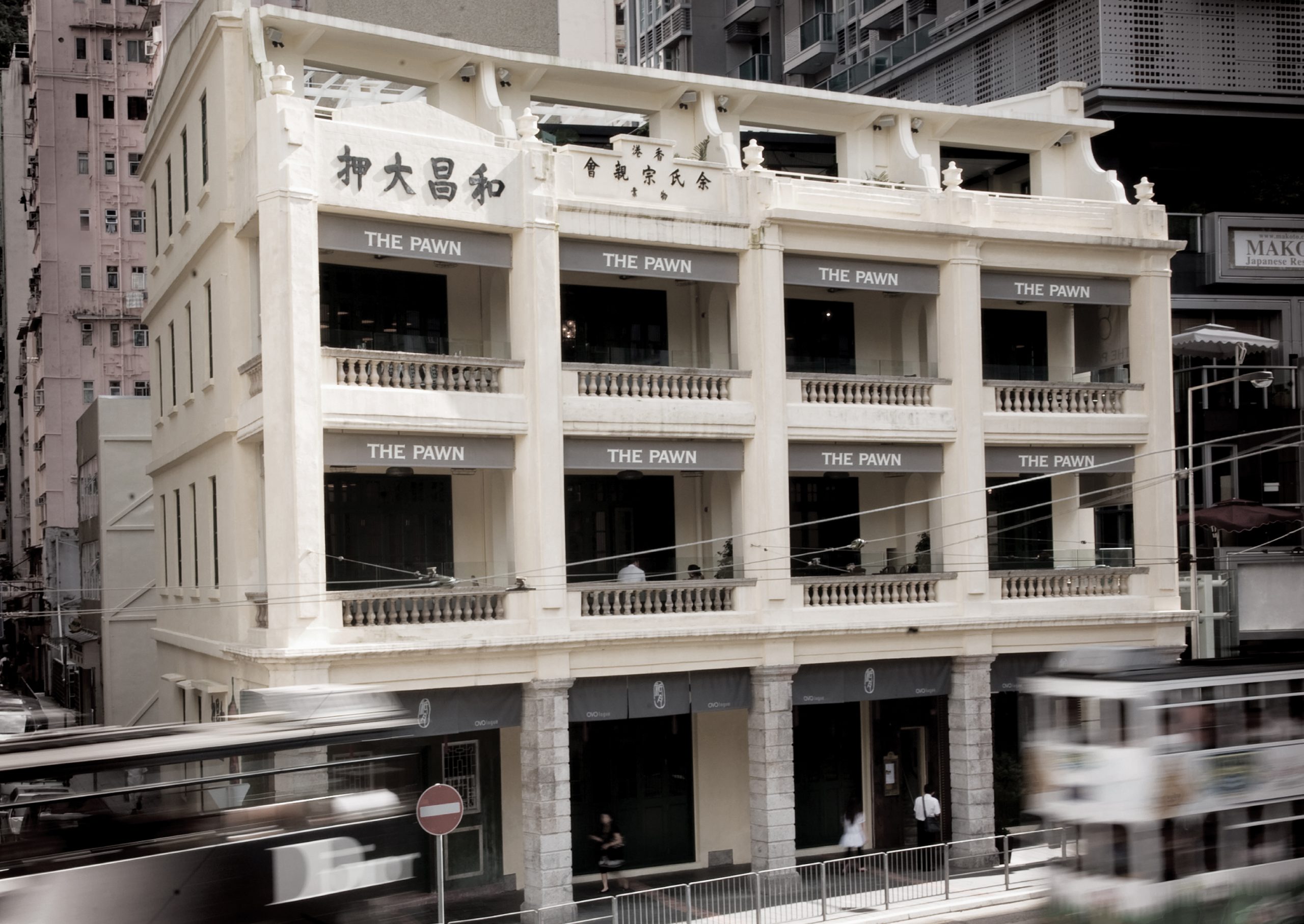
Located in a historic Hong Kong building with over 100 years of history, The Pawn is a British-style restaurant with a unique backstory. Originally the site of Woo Cheong Pawn Shop, the revitalised building preserves the iconic original lettering of “Woo Cheong Pawn Shop” on its façade, inspiring the restaurant’s name.
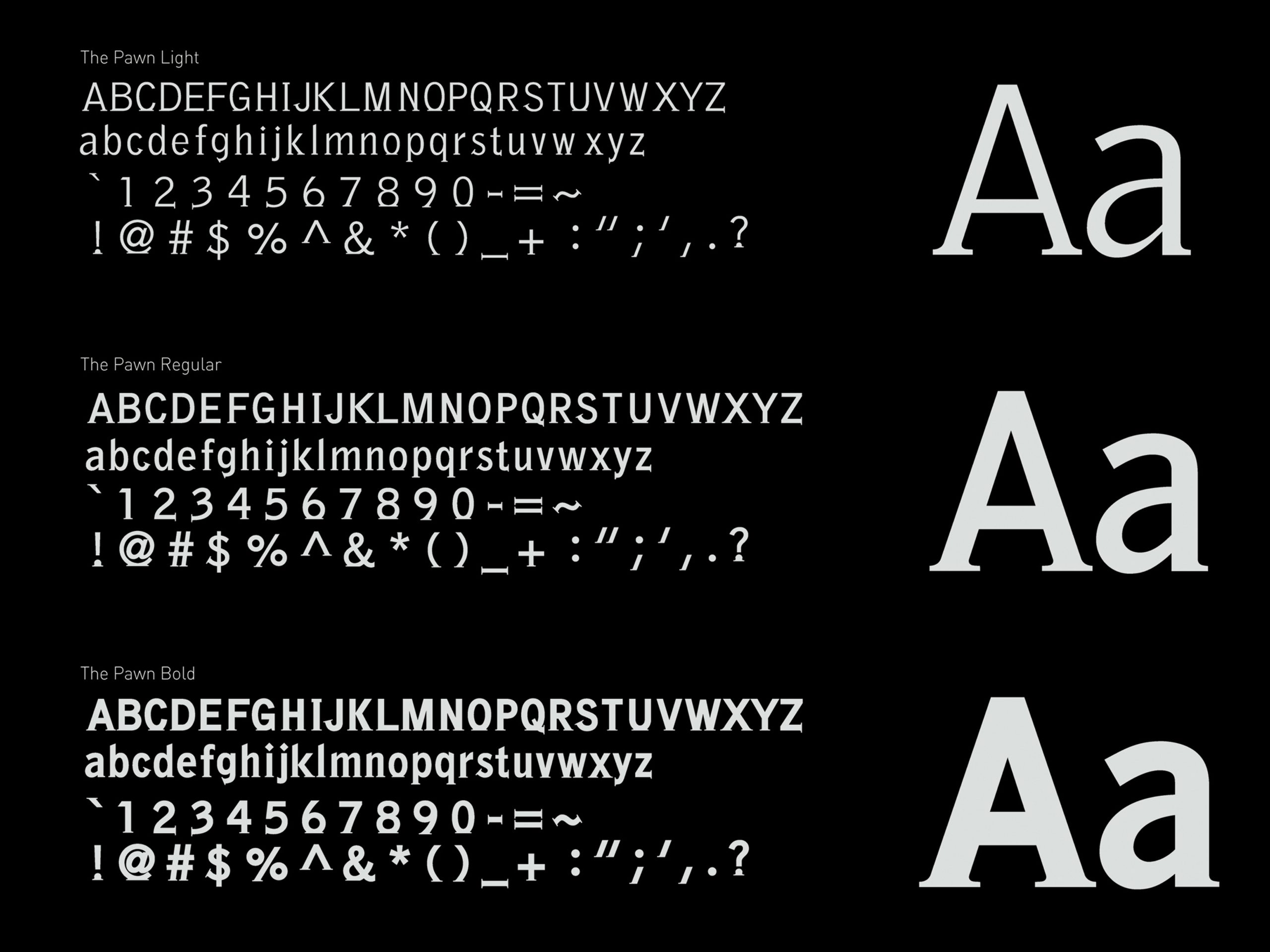
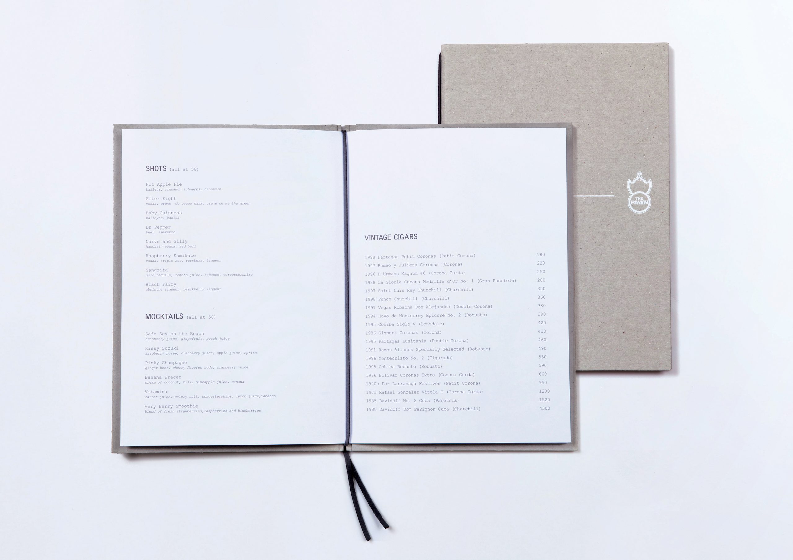
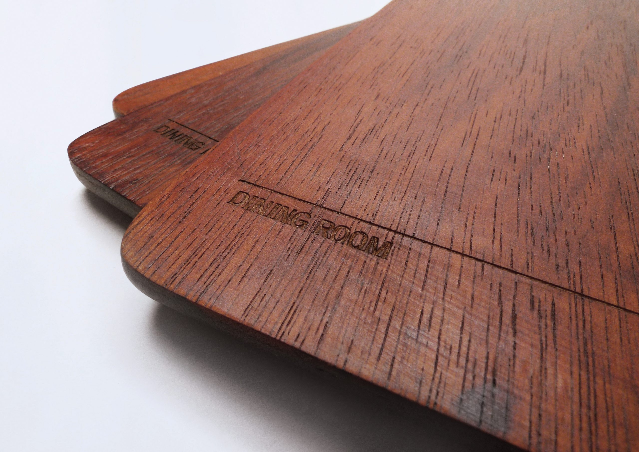
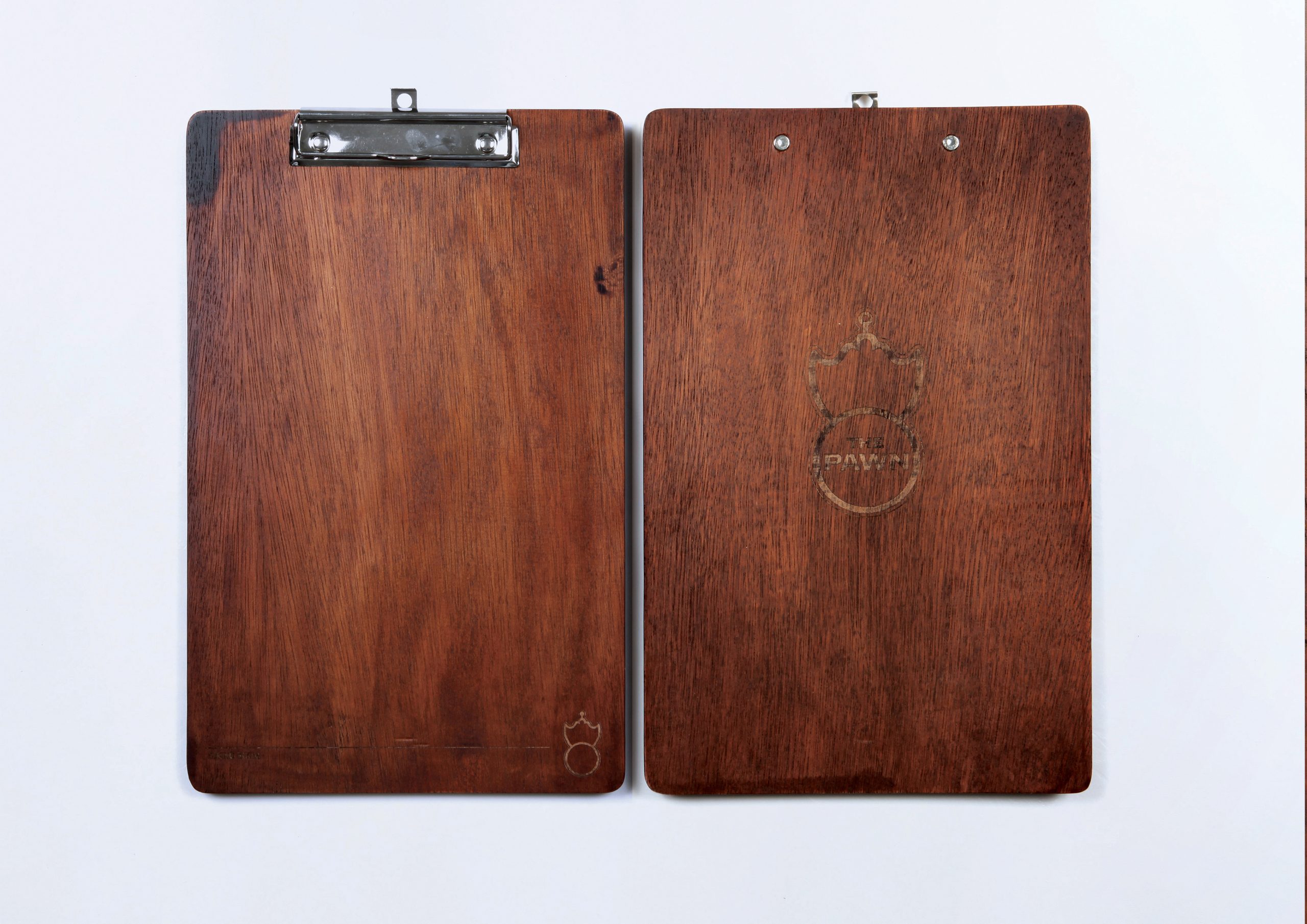
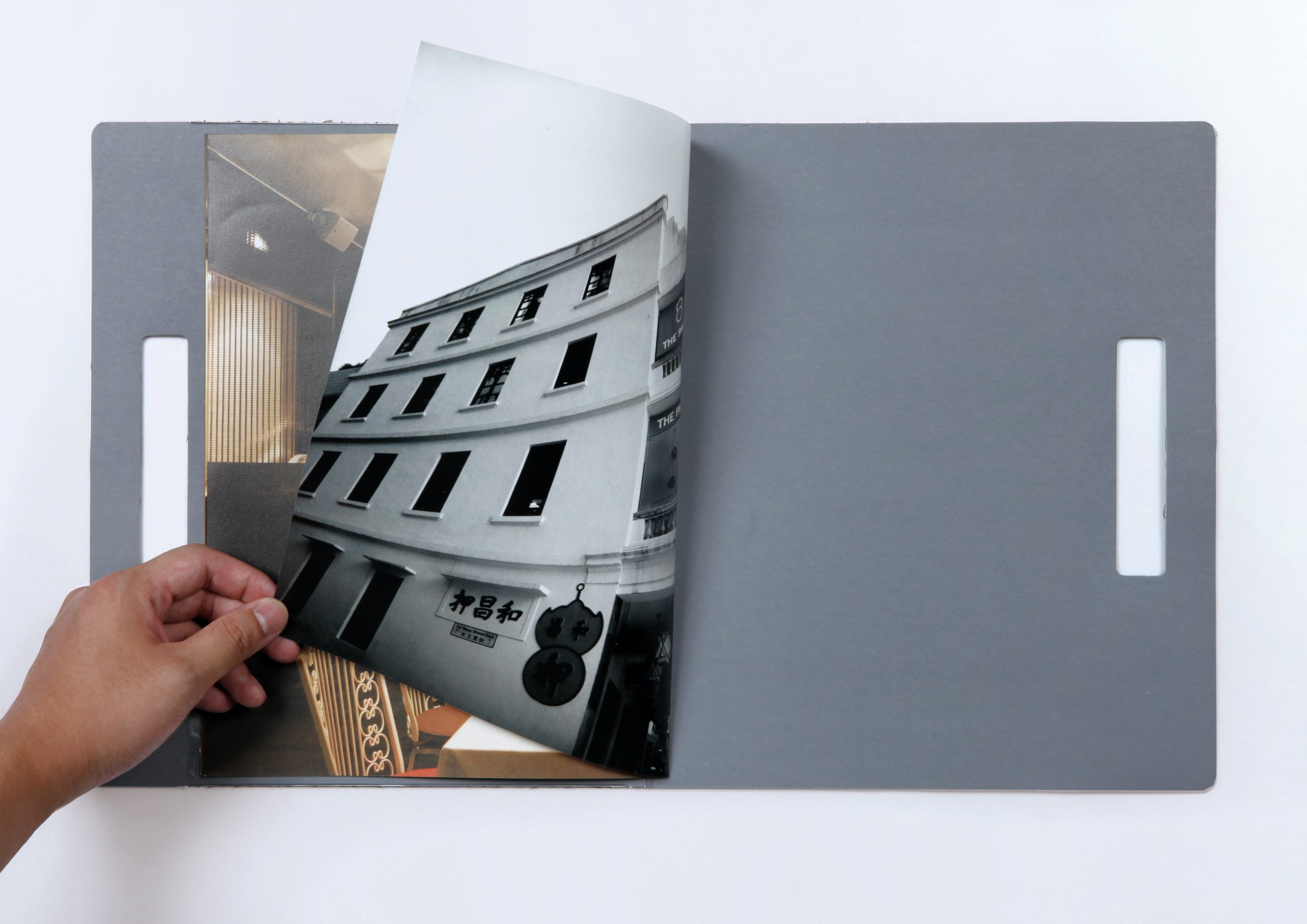
The Pawn’s visual identity is anchored by a custom font, a harmonious blend of serif and sans-serif styles. This unique typeface seamlessly connects the restaurant’s branding across all platforms. By incorporating elements of traditional Chinese pawn shops and Western engraving illustration, The Pawn creates a captivating fusion of Eastern and Western aesthetics, reflected in all its promotional materials and advertisements.